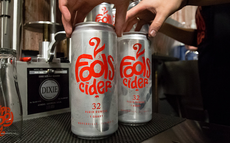
2 Fools Cider Brand Redesign & Packaging Design Case Study
Seedhouse redesigned the 2 Fools Cider logo and created a compelling packaging design system to help them stand out on crowded shelves.
Seedhouse redesigned the 2 Fools Cider logo and created a compelling packaging design system to help them stand out on crowded shelves.

Executed properly, a good logo allows for broad application and helps start a conversation. Because of this, we start every branding project by clearly defining the brand to help ensure that what we design is aligned to strategy, works to telegraph the right meaning and helps to spark an emotional connection or interest. (When developing a new logo, never review it simply on a white piece of paper or just on a white screen, as that’s not how they actually live or are viewed by others).
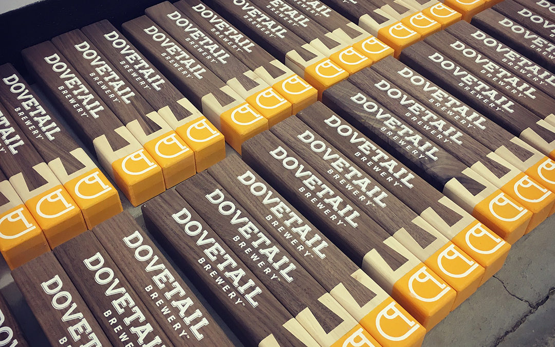
In honor of Chicago Craft Beer Week, we’d like to give a sneak peek into some of our work with amazing local brewers, Dovetail Brewery.
In order to demonstrate the alchemy that is turning a brand strategy into a brand story, I have constructed a mini-case study. Our gracious and awesome clients at Westminster Bakers Co. have agreed to pull back the curtain on the work we did for them a few years ago.
Let’s start at the beginning. Why do you need a Brand Story? The simple answer is – because this is how we as humans connect to our world. Creating a story around your brand allows your users or customers (or humans) to connect to what your brand has to offer.
It started a few years ago. Brand owners and marketers finally shifted from “we’ll make it and they’ll buy it” to a more nuanced appreciation of the implicit contract between consumers and brands.