It’s pretty cool to walk into a grocery store and see a brand you’ve strategized, designed, and poured effort and thought into sitting there on the shelf. One of the benefits of working with aggressive challenger brands is that they move fast to realize an opportunity, which means we get to see our work come to life within months of that first creative deep dive exploration.
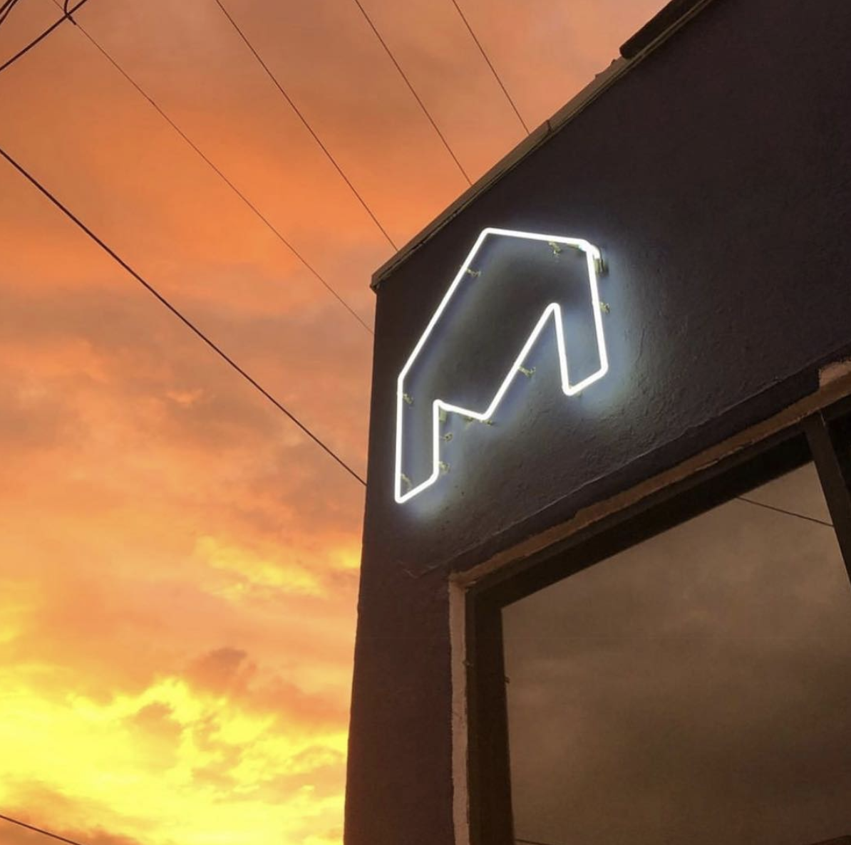
Recently, we had some of our work executed in some awesome ways: Maison Restaurant had their logo made into a neon sign; Dovetail Brewery created an actual physical brand to mark their casks; and Lucy Sparrow of @sewyoursoul reproduced the Gold’s Borscht packaging in felt!
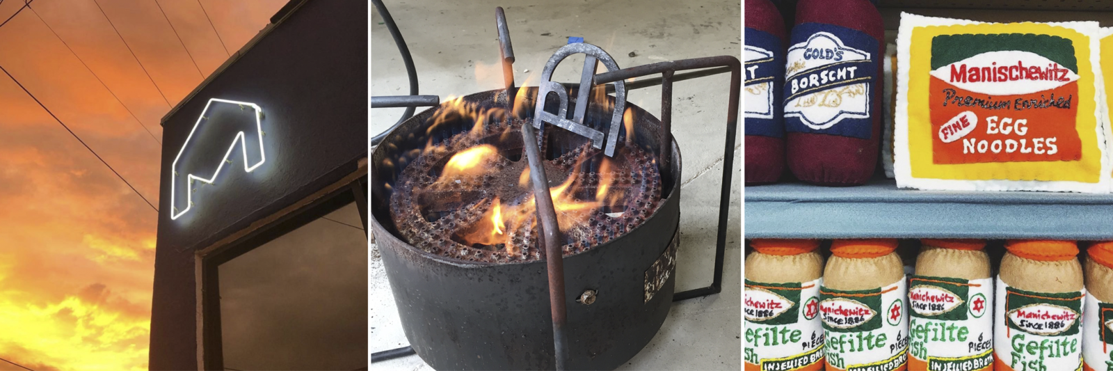 (Maison Restaurant neon sign; Dovetail Brewery brand; @whatjewwannaeat’s shot of Lucy Sparrow’s @sewyoursoul)
These are good reminders that a logo must be adaptable enough to live in and on different mediums. But also that logos can’t and shouldn’t be expected to do everything by themselves. They live in context; on packaging, inside presentations, on exterior walls, on a website, etc.
Executed properly, a good logo allows for broad application and helps start a conversation. Because of this, we start every branding project by clearly defining the brand to help ensure that what we design is aligned to strategy, works to telegraph the right meaning and helps to spark an emotional connection or interest. (When developing a new logo, never review it simply on a white piece of paper or just on a white screen, as that’s not how they actually live or are viewed by others).
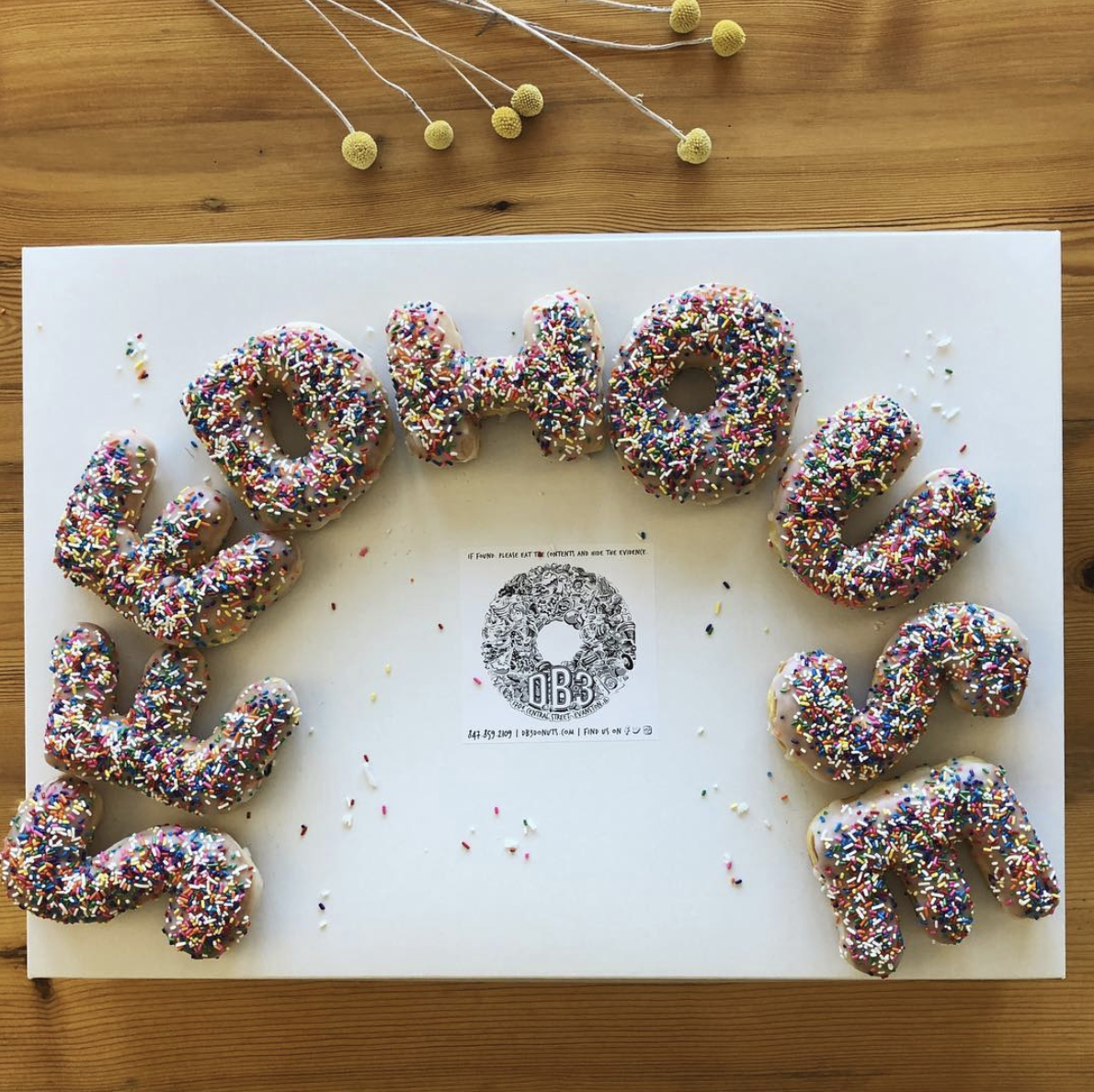
A well defined and properly crafted logo allows for plenty of elbow room to gain meaning and momentum through each and every brand execution whether that’s in a trade show booth, on packaging, on the side of a plane, or as sprinkle donuts.