The first quarter of 2020 has been a busy one.
We’ve been apart: from our office, from each other and from our awesome clients. But we’re still working hard to bring your design dreams to life. We hope you all are safe & well, and we hope to see you soon. In the meantime, we’ve rounded up a few of our recent projects below.
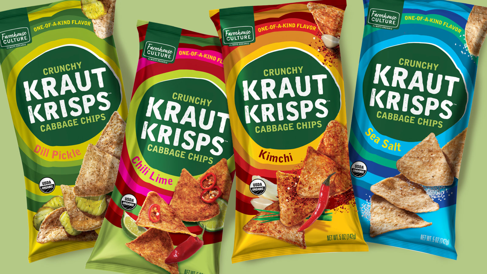
Farmhouse Culture
Packaging, Line Extension, Photo-Retouching
Fermenting away, Farmhouse Culture just keeps growing. Seedhouse got to design the re-launch of their amazing, organic, gluten-free Kraut Krisps – the only chip made out of cabbage! Our design aims to communicate the awesome fermented flavor and up the funk, a colorful hand drawn illustration makes for a bullseye on-shelf; that’s stopping power in the snacking aisle.
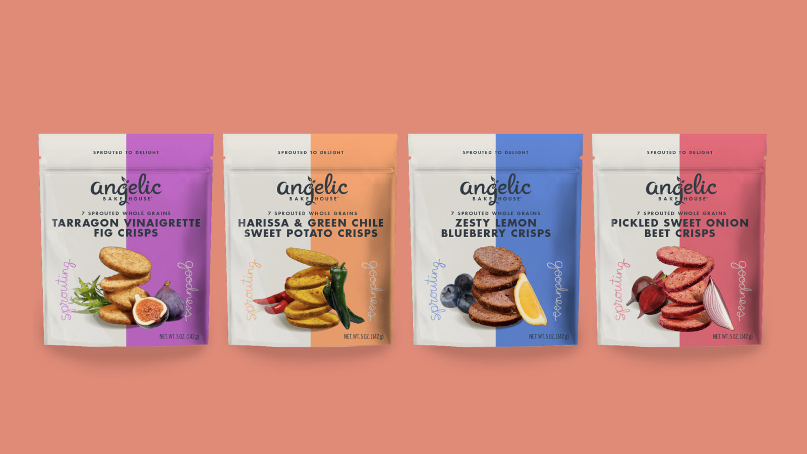
Angelic Crisps
Packaging, Line Extension, Photo Styling & Retouching
A structural change allowed these crisps from Angelic Bakehouse to pack more of a punch on-shelf with the addition of photography. Having previously developed the Angelic package design system, we were given the chance to update it again, this time with the inclusion of food photography. We did a fun photoshoot – right in our very own studio, and retooled the design to align with a more sophisticated structure and help boost appetite appeal.
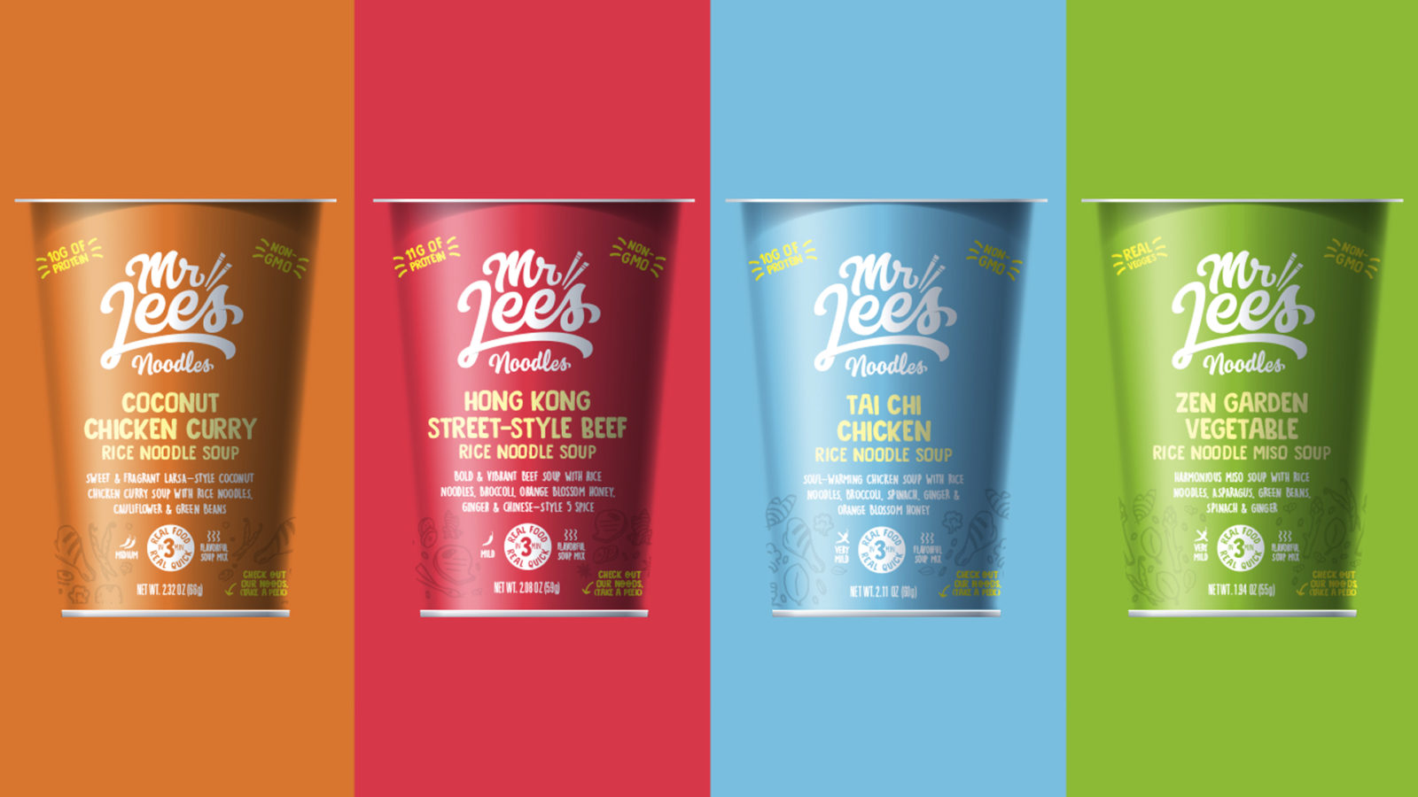
Mr. Lee’s Noodles
Packaging Optimization, Illustration
 [image credit: Old Line Spirits]
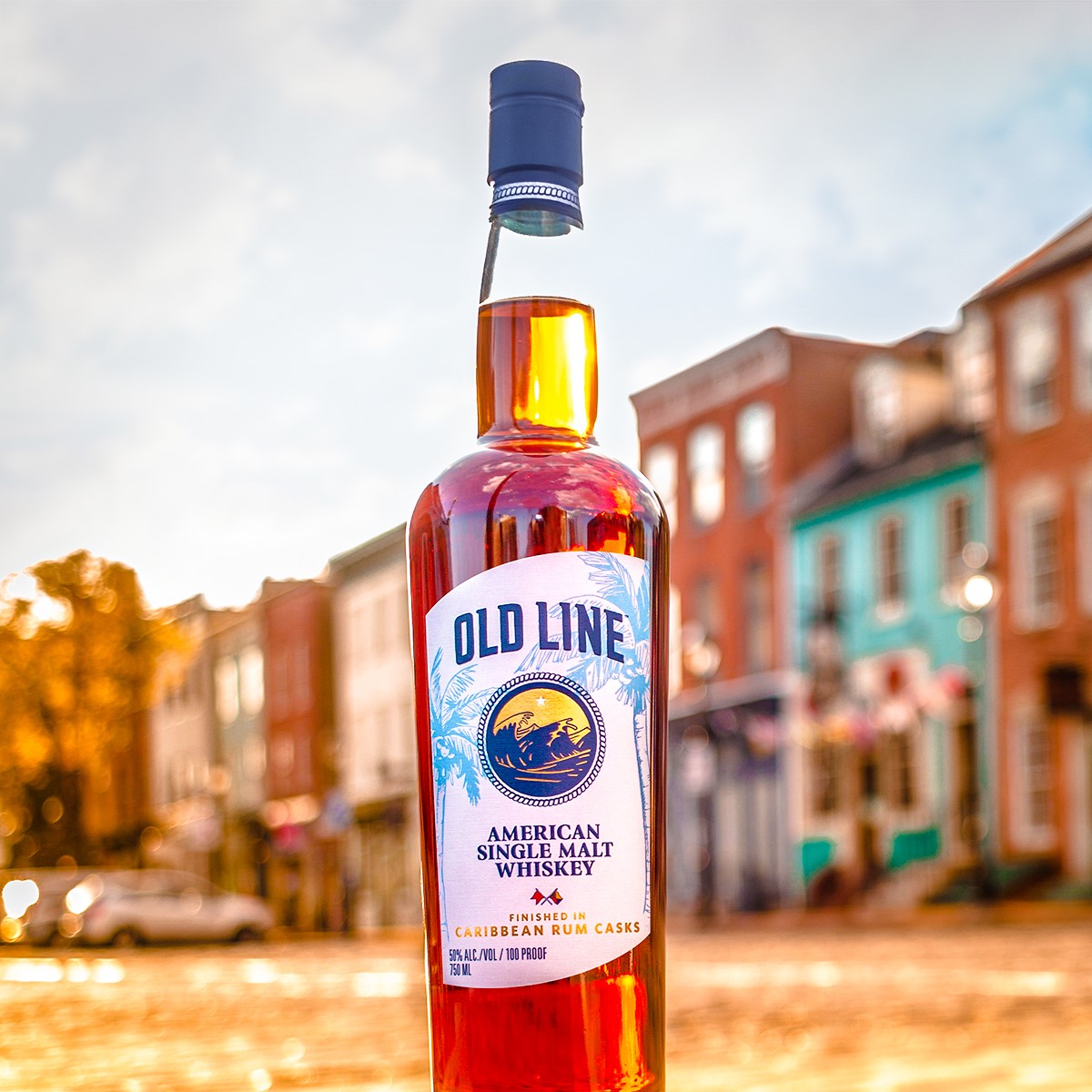
Old Line Spirits
Packaging, Line Extension.
Seedhouse worked on a new label for Old Line Spirits’ launch of American Single Malt Whiskey, finished in Caribbean Rum Casks. To expand on our family look without straying too far away, we developed Caribbean-inspired botanical illustrations for the background to inspire a sense of place and set this limited-edition special whiskey apart. Cheers!
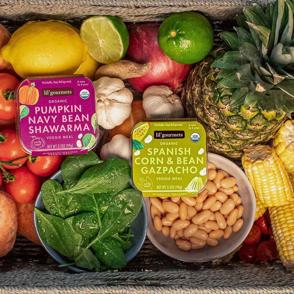 [image credit: lil’gourmets]
lil’gourmets
Packaging, Line Extension, Illustration
lil’gourmets, a line of organic veggies meals for kids, is rapidly growing, so we’ve been expanding their package design system to add new flavors like Pumpkin Navy Bean Shawarma and Spanish Corn & Bean Gazpacho. Each package features new hand cut paper illustrations to cue flavor and are arranged to dance across shelf from pack to pack—catching parents eyes and cueing organic baby food in a sophisticated, fun way.
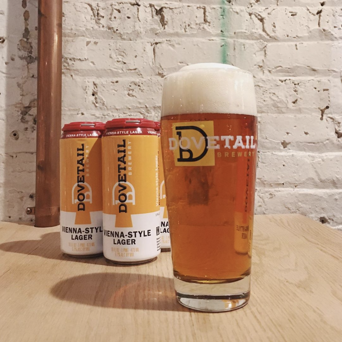
[image credit: Dovetail Brewery]
Dovetail Beer
Packaging
Our neighbors and clients, Dovetail Brewery, is canning beer as fast as they can brew it. Retail sales have been climbing quickly for these “open hearted alchemists” so Seedhouse crafted up packaging adjustments to help a growing line of products better differentiate both on-shelf and in bars and coolers across Chicago.
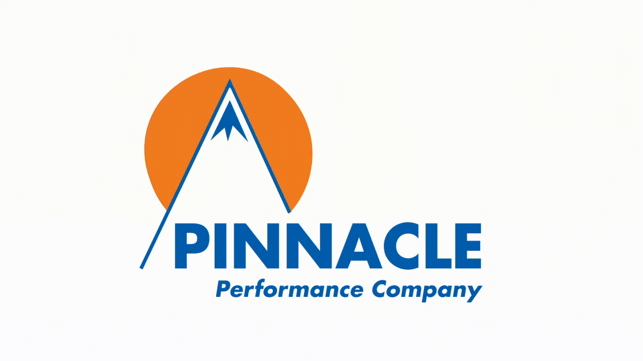
[image credit: Pinnacle]
Pinnacle Performance Co.
Branding & Identity
We also had the opportunity to recraft the brand identity for this corporate communications training company. Pinnacle had all the right energy in their workshops and online content, so we brought it to life in the new logo. Multiple interpretations in a brandmark are a strength. What do you see? A crowd? A hero in a cape? A mountain? We’ve engineered their symbol to be all of those and more, and paired it with a wordmark that communicates mature leadership with energetic, contemporary methods.
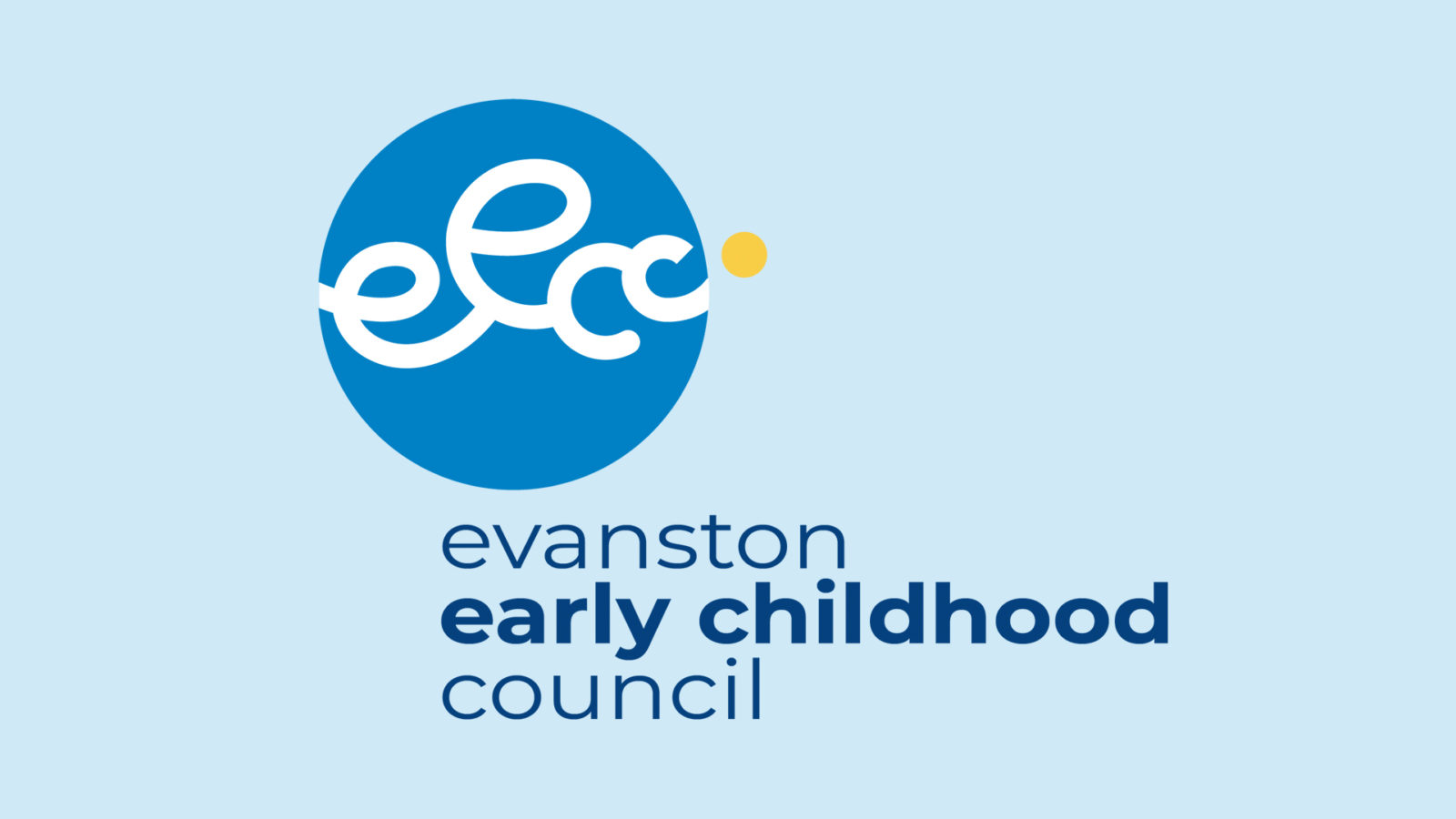
Evanston Early Childhood Council
Branding & Identity
For the past 50 years EECC, a local advocacy group, has been championing the early childhood community. Comprised of 15-20 different area organizations, they have been sharing info and resources; “united in growing our youngest learners”. We designed a logo to capture the spirit of childhood & uplifting connectivity. It’s heartening to help those that are doing good.
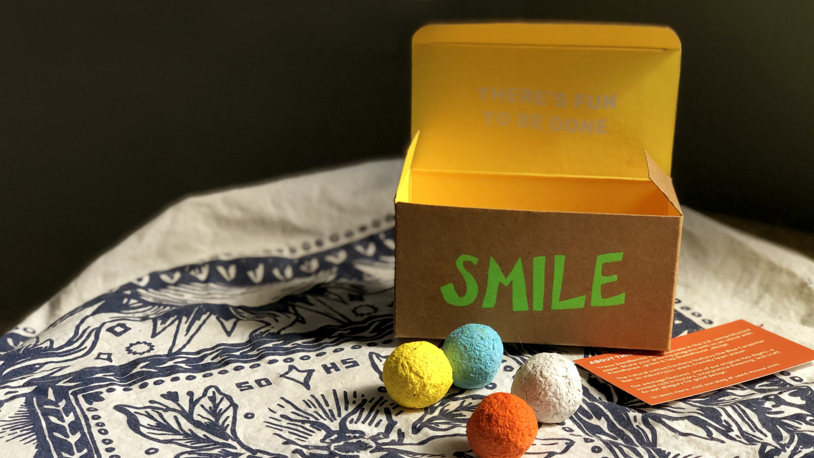
Seedbombs!
Packaging
As your packaging design partner, we couldn’t help but come up with our own product & packaging to celebrate and thank you all for our 10th anniversary this last February. Have you planted your seeds? Let us know how they’re growing with #seedhouse_grows.