First off, Seedhouse is a brand and packaging design studio that is constantly curious – so to scratch our itch for curious tidbits, we created this series “Signs & Symbols”. In this post, we’re investigating the signs and symbol of Chicago’s Grocery Store Signs. No, we don’t make them, but below we point you to the best resources.
Signs & Symbols: They’re all around us. The visual vernacular of advertising shapes the way we think about things. We’re big fans of getting out into the grocery stores to see what’s happening in the real space and the aesthetics of hand-painted sale grocery store signs struck us as unique and useful. As designers, in a world inundated with digital printing, digital advertising—digital everything, evidence of the human hand really stands out.
Wandering through the grocery retail experience
Our CPG work leads to spending a lot of time in retail grocery spaces of all varieties. We don’t just look at packaging though. Approaching the experience holistically through the eyes of the consumer, we get a better idea of what we can do to help a package stand out on shelf. But also, we hone in on details others might miss. Enter: The grocery store sign.
It’s about taking a moment to appreciate the things that are right in front of you.
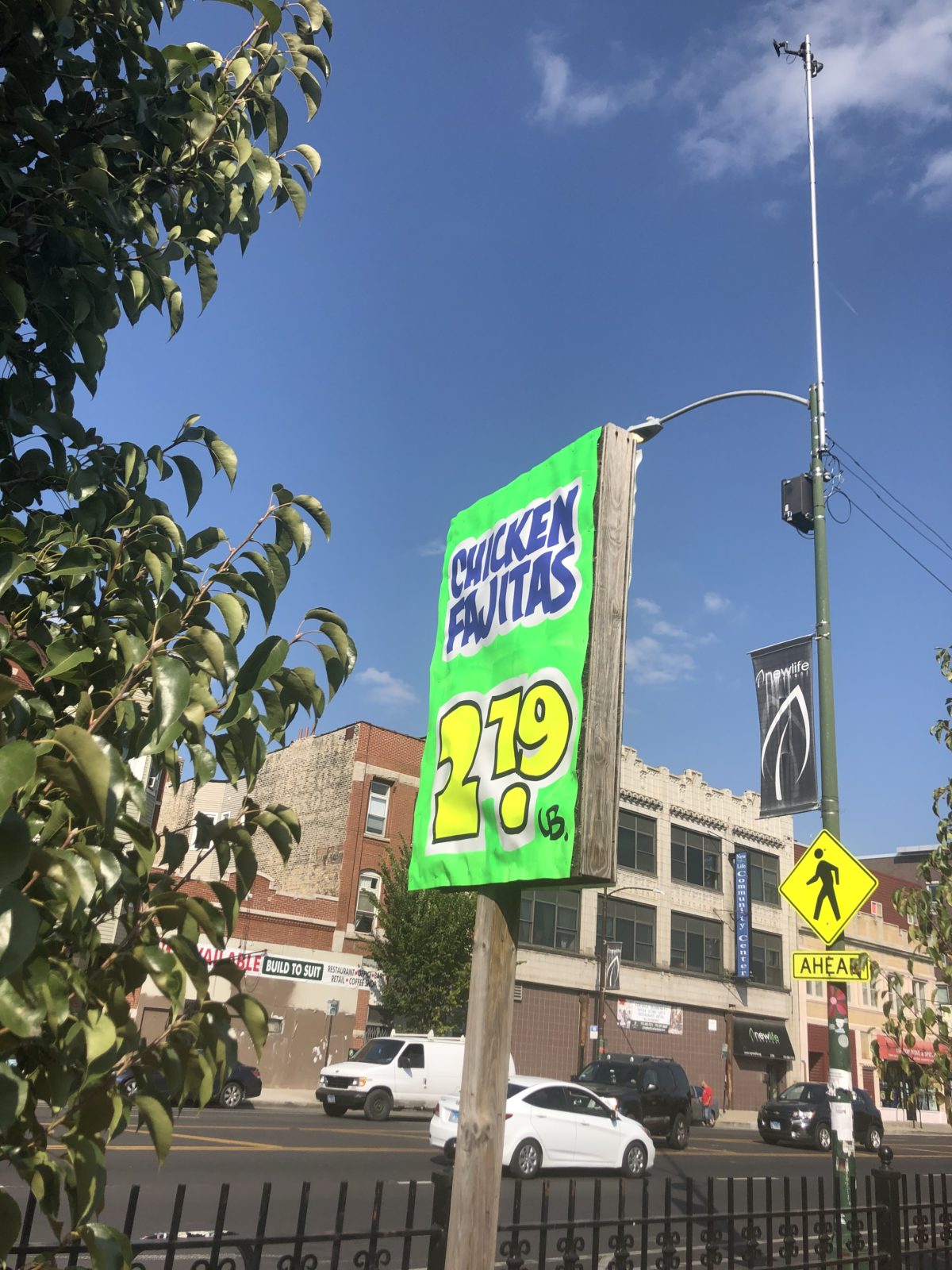
You know the type—seen in corner shops, independent stores or ethnic local grocery mainstays. The hand painted grocery store signage is simplicity at its best: a handwritten advertisement that quickly and loudly communicates the sale of the week, a new item, or whatever current promo the store is offering.
Set apart from the functional, digitally printed window ads of national chains, the human craft grabs our attention. Hand-painted grocery store signage is lush with brushstroke texture, subtle hints of graphite ruling, and a little spattering of paint. All of this is invisible from afar, but up close reads more as a work of art.
On the persistence of the hand painted grocery sign
With quick turnaround, unique appeal, and low cost, hand-painted grocery store advertisements have persisted despite the rise of large format digital printing. Hand-painted signs scream immediacy. There’s a bit of a FOMO feeling to them even. Another may be nostalgia. Something special comes from the aesthetic that a hand-painted sign lends to a shop. It speaks to old-school quality while also communicating value. We also love the small local businesses supporting each other.
Design rules still apply
Typographic hierarchy, the use of colors to emphasize a message, and decorative design elements all work together to craft a meaningful message with high impact. This is the same type of thinking that we apply to designing brandmarks or packaging. Throughout the US, there are even color schemes specific to different cities!
[above, the Southwest Signs storefront]
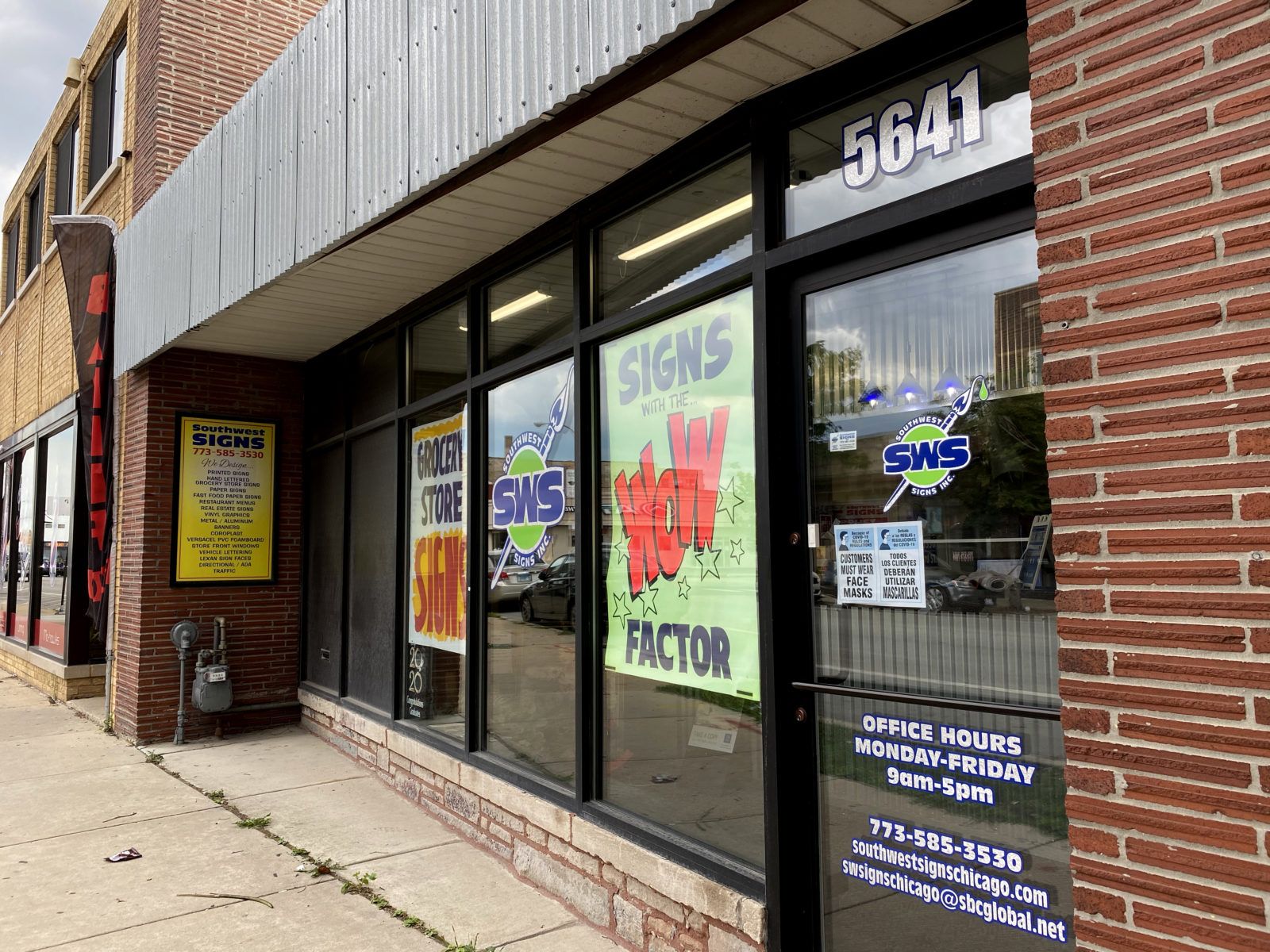
A collaboration with Southwest Signs
Southwest Signs is a legendary, family-run, old school sign-painting shop on Chicago’s Southwest side, just a hop away from Midway airport. They’ve been painting signage for grocery stores across the Chicagoland area for over 60 years! And since they started they’ve been vetted by international artists, museums, and even movie directors for their craft and expertise in the field.
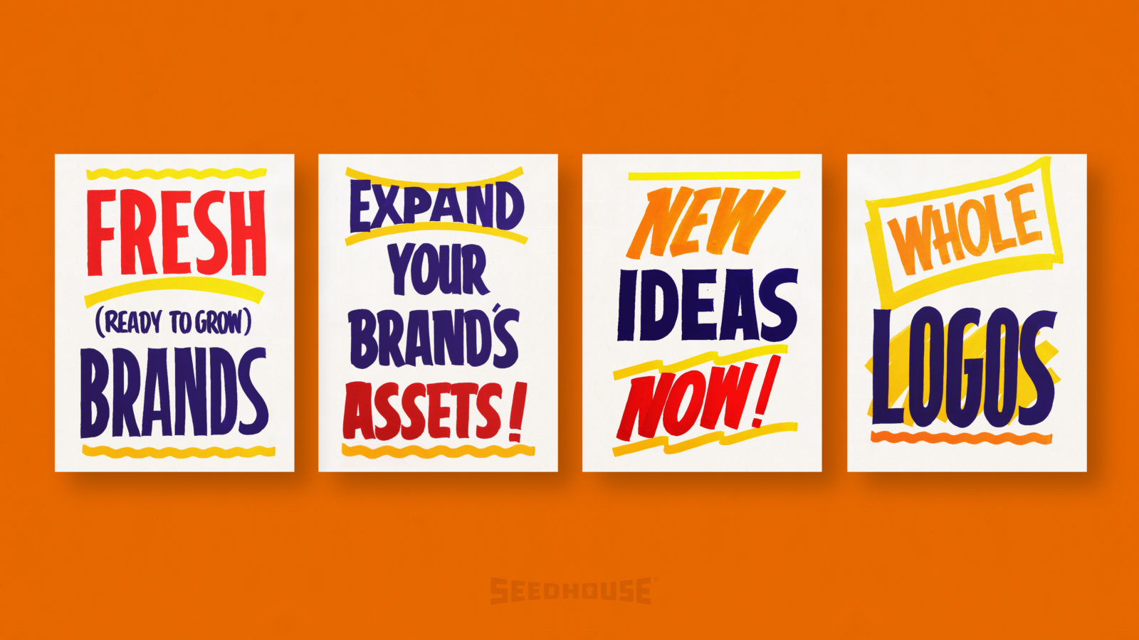
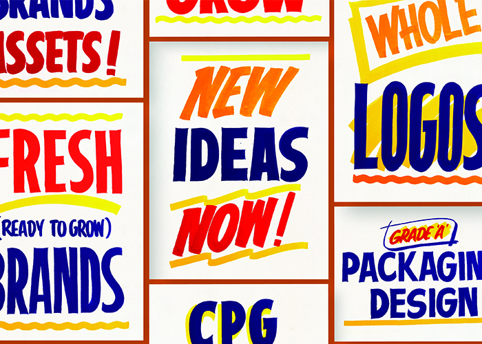
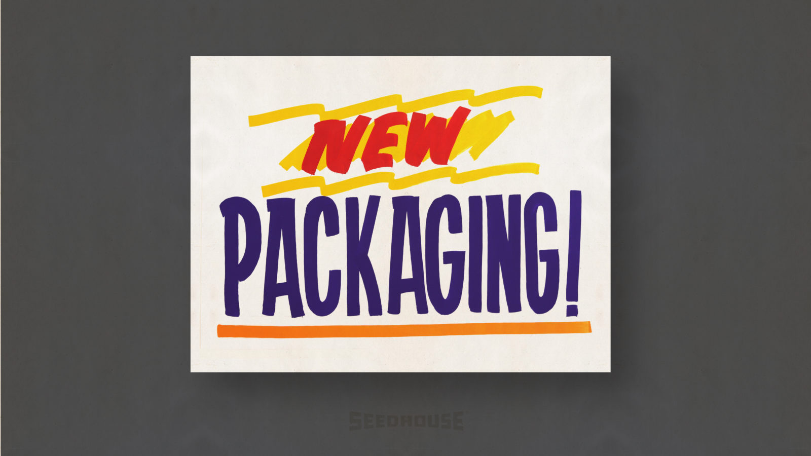
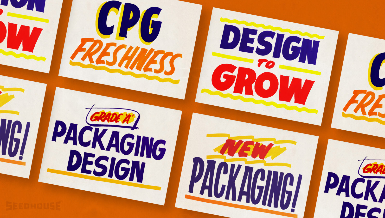
Seedhouse reached out to them for a collaboration on signage that ties in the same visual language of our focus – CPG & Branding design. Throughout the process, Southwest Signs taught us about the standard Chicago signage colors (Vienna Beef Hot Dog-inspired Red, Blue, & Chrome Yellow). Also, they gave us insight into their process. We added in the Seedhouse bright orange to the Chicago palette. Different marketing phrases that advertised our “deals of the week” went into the mix with our other special offerings.
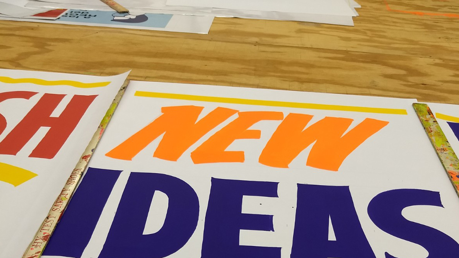
[image: up close on the drying desk from Southwest Signs]
We took visual cues from the retail grocery space and paired them with our messaging to create a fresh way to advocate for the importance of design services. Thanks to Southwest Signs, we ended up with a remixed showcase of old-school-cool, traditional lettering, and digital collage.