Overview
Client: Railhead Corp
Delivered: Portfolio Strategy, Brand Identity, Logo Design, Retail Packaging Design System, Video Storyboarding, Brand Extension Items
Railhead Corporation® was founded in the rugged rail yards of Chicago. For over 56 years Railhead has developed material that’s tough enough to handle the rigors of the rail industry. As a respected manufacturer and supplier of professional grade air tools, safety products and locomotive video equipment systems Railhead keeps growing.
Building on its rich history of product innovation, commitment to continuous improvement and superior customer service Railhead wanted to align its portfolio, update its brand presentation and create a strong foundation for the next 50 years before expanding into new product lines, industries and channels.
Engineering Solutions.
Railhead is an enterprising company full of engineers and tinkerers. They find a complex problem to solve in the rail industry and go to work. Their brand needed to capture that attitude and sense of grit. We consulted on the brand portfolio strategy, updated their brand identity, created a new retail package design system and a few other brand executions.
Portfolio Strategy—Alignment & Focus
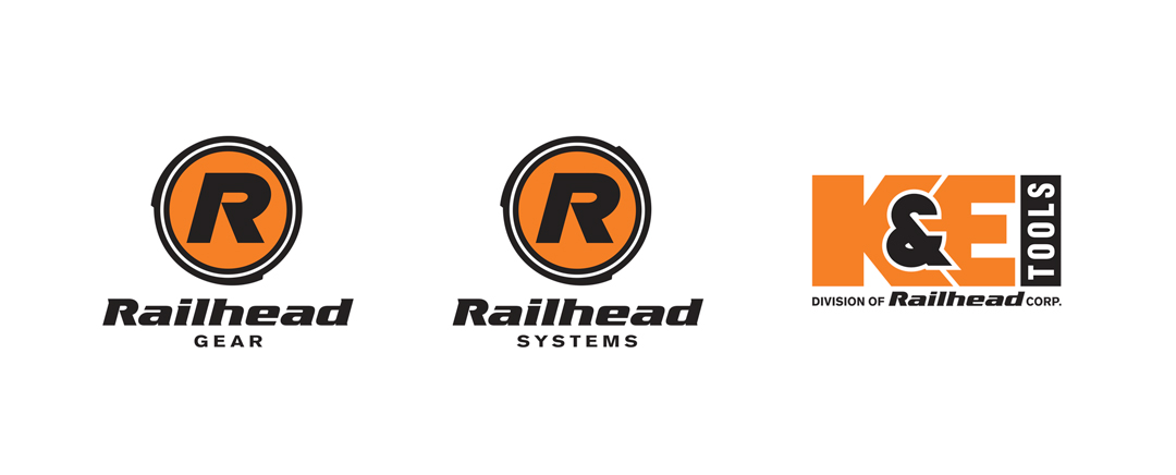
The brand portfolio needed to be consolidated and focused so that the marketing effort could be effective in building one or two brands rather than be fractured across eight. In addition, we updated the sub-brand logos to better align to the new corporate logo. This new brand family reinforces the Railhead corporate brand.
 New Product Brands
Identity in Design
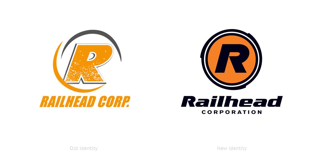
We re-engineered the brandmark to have a more focused and bolder brand presentation that captures the feeling of industrial strength and safety in motion, much like the rail industry they serve.
Packaging & Illustrations
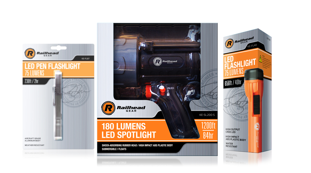
Ready for prime time: we also created a new retail package design system so the brand could extend into new channels.The new packaging design had to work across a wide variety of product types and sizes and needed a standardized way to present key product info. We developed a clever architecture by using black and orange bands that run horizontally across the packaging, like a train track, and house key product info.
We also developed an illustration style, icon system and packaging guidelines to effectively build future packages in the line.
![]()
Icons & Details
The design process continues until we drill down into the most minute details. Our goal is for any designer to be able to pick up a brand or packaging guidelines document and know exactly what to build – no questions asked.
Experience the Railhead difference.
Case Studies
Did you enjoy reading about our process to create the Design Integrity Logo Design? Next, see other case studies and head over to other project highlights like Quari, Pinnacle Performance Company or Beechworth Windows.
—

 New Product Brands