Overview
Client: Pinnacle Performance Co.
Delivered: Brand Strategy, Brand/Logo Redesign, Copywriting, Brand Guidelines, Brand Applications, Incidentals.
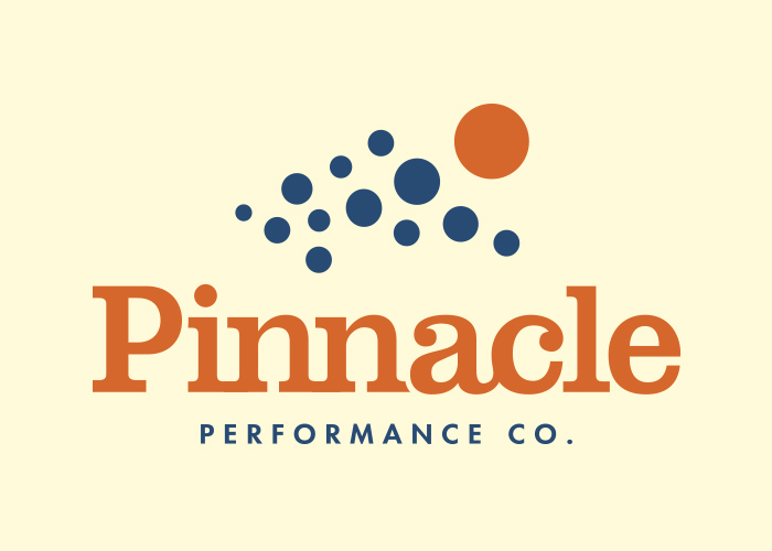
Pinnacle Performance Co., a corporate communications training company had all the right energy in their workshops and online content, but the Pinnacle Performance Co. logo or brandmark wasn’t communicating that same dynamism. Pinnacle engaged Seedhouse to retool their brand look and refine their brand strategy. The new look vanquishes boring on first impression – especially in a category where stock photos and staid navy blue reign supreme.
Strategy Leads the Way
Before we got started on any design work, we did a full immersive process upfront. We interviewed both Pinnacle employees and clients to get a read on what they felt were the company’s strongest traits. We also attended Pinnacle training sessions to get a consumer perspective. An audit of the competitors—both in the communications training market, as well as those who share the Pinnacle name – helped us understand where there was opportunity to emotionally connect with buyers. Seedhouse also led a workshop with the Pinnacle leadership team. The workshop ensured consensus on the target customer and how far the brand identity could push. Overlaying data sets, we could better define a unique space in the marketplace and craft a compelling brand story.
In developing strategy, we work to define a specific target consumer. In each step of the process, our target consumer was our barometer—allowing us to effectively guide our visual strategies and bring objectivity to what can otherwise devolve into a subjective design process.

More than just a Logo
Throughout every step of the design process, from creative concepting to refinements, we also showed how the brandmark could roll out to both existing and imaginative assets. These pro forma pieces demonstrated the marketability and recognizability of the brand, as well as inspire future brand expressions. The extension of the brand identity to supportive elements (i.e. favicon, home web page, swag) allowed for the brand identity to really sing. Each element allows us to dial up and down different aspects of the personality and allows the client to see the full potential of the mark.

[image credit: Pinnacle Performance Co.]
Respect for Brand Equity
One of the key differentiators for Pinnacle is their level of expertise. Pinnacle has been around long enough to have real experience and demonstrated global leadership in the field. We didn’t want to sacrifice the recognizability of the previous brandmark, so we crafted “breadcrumbs” or visual ties back to the old brand.
This also allowed for some interpretive design magic. Multiple interpretations in a brandmark are a strength. What do you see? A crowd? A hero in a cape? A mountain? We’ve engineered their symbol to be all of those and more.

[images of the dots being used in different applications]
The Magic is in the Details.
Color also ties back to the previous brandmark. The orange and blue were reinterpreted. To better support Pinnacle’s experience & leadership, we shifted to a dark teal blue. For their modern methods & energy, we went with a bright orange. The wordmark is an interlocking slab serif, showing communication through connection.
—
Mini Case Studies
In this section of our blog, we highlight some of our favorite projects that aren’t currently in our showcase on the site.
—
Want to see more of our work? Check out our showcase, or contact us to get a custom portfolio suited to your needs.