Overview
Client: Quari Ice
Delivered: Brand Strategy, Branding, Packaging Design, Copywriting, Photo Retouching, icon generation
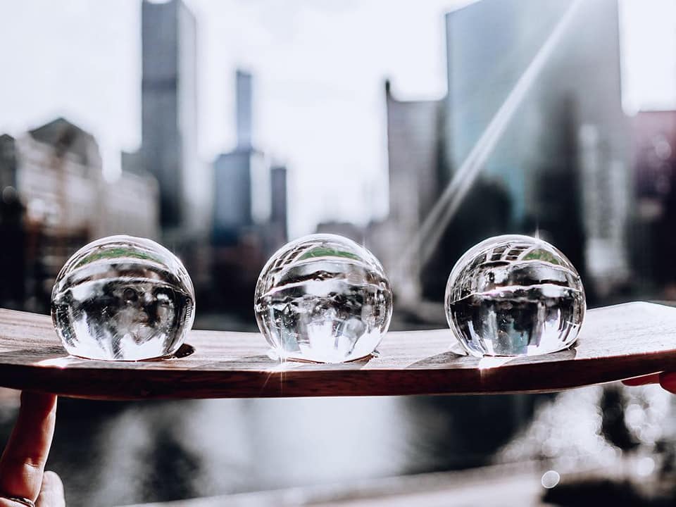
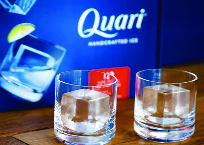
Quari Ice handcrafts beautiful slow-melt ice meant to help you slow down and savor the moment.
[Image Credit: Quari]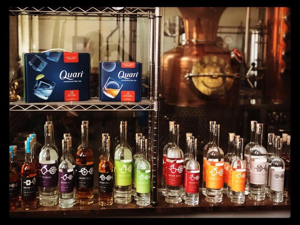
The Making of a Challenger Brand
Seedhouse worked with Elevation Industries to bring their newest product, Quari Ice, to life through their branding and packaging design. Quari Ice is created using a proprietary water purification & freezing process, yielding absolutely crystal clear ice that melts slowly. The Quari innovation woke up this sleepy category – mostly consisting of 5 lb. and 10 lb. bags of mass-produced ice. As a cocktail accompaniment, Quari’s brand and packaging design needed to communicate its premium value. Also the design needed to convey the romance of the elevated cocktail experience and catch consumer eyes in coolers.
Signature Style Design
The Quari brandmark developed to communicate a graceful, high-end feeling, that paired with a precision-forward font style to impart the level of detail in their cut ice forms.

A Packaging Design of Contrasts
Our packaging system pairs beautiful photography set against a deep-blue glowing background to highlight the perfection in the ice. It features a color pop on the side panels to help with product differentiation. The logo contrasts with the blue background, polished and fresh. The packages help create a calm space for the eye to rest on-shelf, in cooler. By paring the Quari orange with the navy background, the packaging instantly calls attention and ups readability.
Communication is Key
Quari is different than other ice. Set apart and above by a specialized purification process, the ice itself is crystal clear and comes in 3 unique forms: a large cube, a small cube, and a sphere. Therefore, we retouched all of the photography on-pack to increase appeal. In addition, we created an icon system to help communicate the “Slow Melt”, “Ultra Pure” and “Crystal Clear” differentiators.
![]()
Making Perfection in Ice
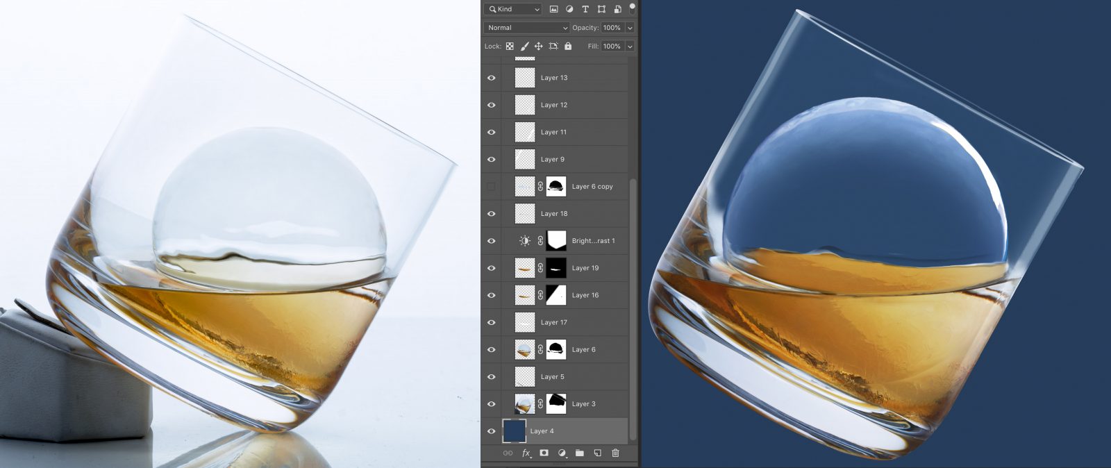
With ice being the hero, we wanted to make sure it looked its best on-pack. Enter our photo retouching process. After each cube or sphere was shot, the files were sent over to our studio where we spent hours meticulously retouching each photo to create perfect hero shots. In the end, the goal was realistic transparency when paired with the background color. Talk about a creative process where you find your zen.
A Cool Wrap Up
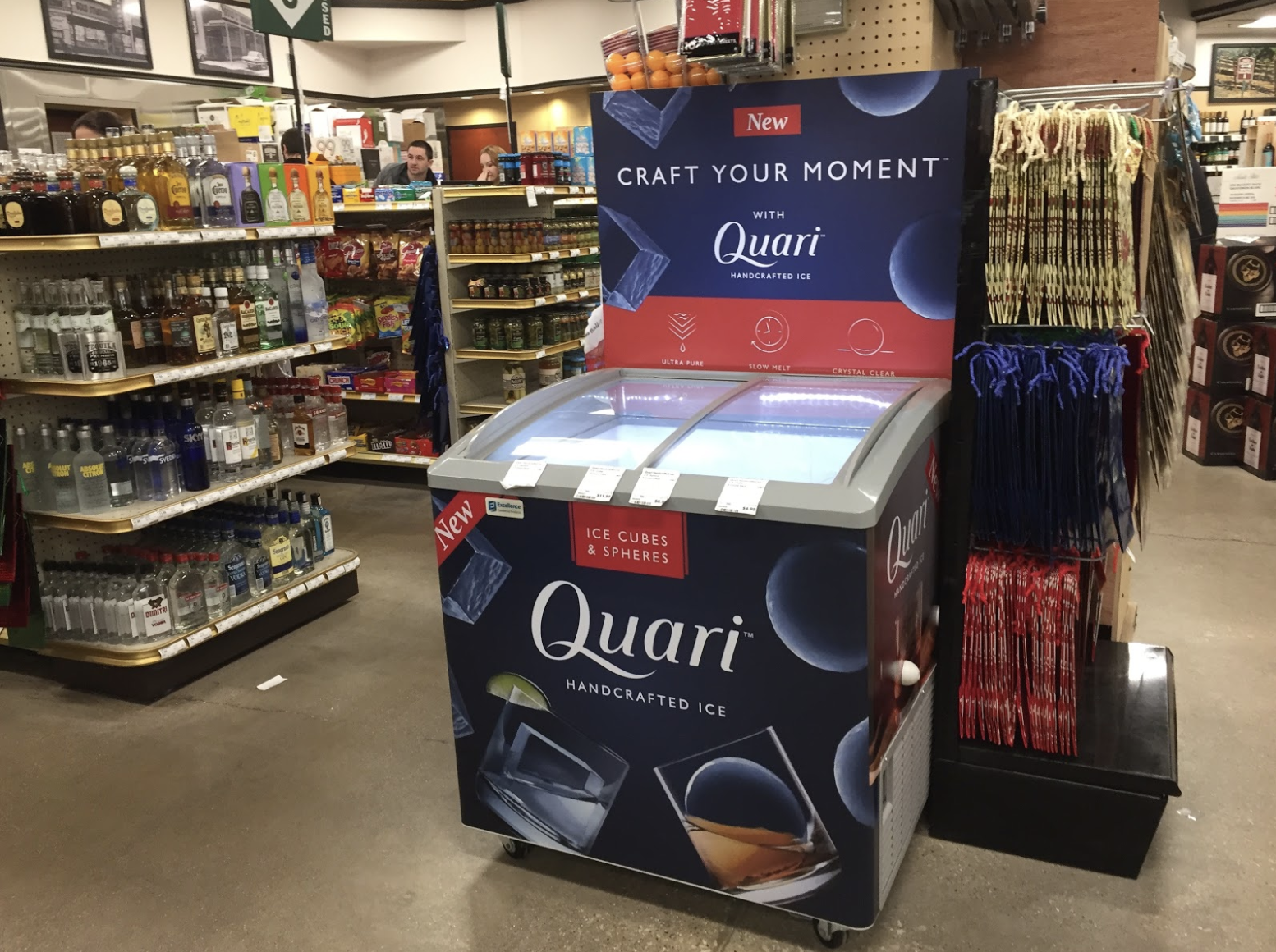
Once we had solidified Quari’s brand and packaging design, the next move was to design coolers for their products. Quari branded colors create great contrast and stopping power in busy stores. As a result, the impactful coolers successfully launched the brand in-store in Chicago Binny’s, and helped Quari showcase their product beyond standard cooler shelves.
“Thanks for helping us punch above our weight!”
-Neil Sullivan
Co-Founder, Quari Handcrafted Ice
Mini Case Studies
Enjoy reading about Quari Packaging Design? Check out our other Mini-Case Studies, where we highlight some of our favorite projects that aren’t currently in our showcase – like CNI, Pinnacle Performance Company, and Beechworth Windows.
—

