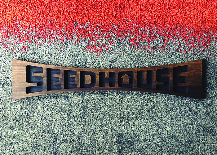
We’ve recently celebrated 10 years as a design studio, and the team wanted to make an object that commemorated Seedhouse and the journey as a gift for Bryan, our principal and founder. After running through a few ideas, we realized that we still didn’t have a sign: think old fashioned, brick & mortar business sign. But why would a simple sign be important for a design studio that exists heavily online?
We’ve written before about all the ways that a design can come to life. A logo does so much more work than just sitting on a screen or existing 2D on paper, and the ways it comes to life help shape the immediate impression of a brand. Defined by the American Heritage Dictionary of the English Language, “Signage is the design, or use of signs and symbols to communicate a message to a specific group, using for the purpose of marketing or a kind of advocacy.” Signage is also used, per the Harper Collins English Dictionary, “To sign collectively, or be considered as part of the group.”
The joyful duplicity of this, an object that at once communicates Seedhouse as a collective while also advocating our expertise through its design and craft was an opportunity too good to resist. Also, we didn’t have a sign.
The Design Process works just about anywhere.
It begins with sitting down and sketching out ideas and identifying problems we want to solve. Materials, execution, final environment, and timelines all had to be considered.
While metal is a neat option, natural wood felt more true to the character of Seedhouse, and though all of us are gifted drafts(wo)men, the level of finish and longevity of the piece felt more complete if it were fabricated instead of painted. Flexibility was also important: this sign had to be able to exist both as a standing object and as a piece hung on the wall.
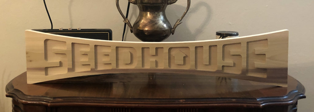
After carefully considering all of our options with the above, we decided on crafting a 3D carved piece that was sturdy enough to stand on its own, but light enough to be hung up if desired.
Design is iterative.
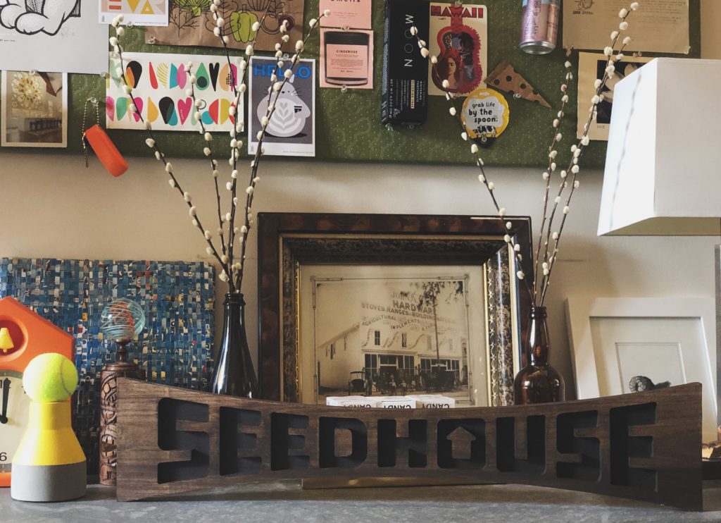
Initial digital concepting helped us realize that our trademark would throw off the balance of the sign, and while it looked nice carved into wood, we wanted something a little more dynamic for the exterior shape. After a couple iterations, we ended up going with an exaggerated and simplified outline of the brandmark, which felt right (and also brings to mind skate decks, snow boards, and other fun, possibly dangerous things). This shape has a sturdy balance when placed table top, but also looks great wallside.
Designers in the woodshop.
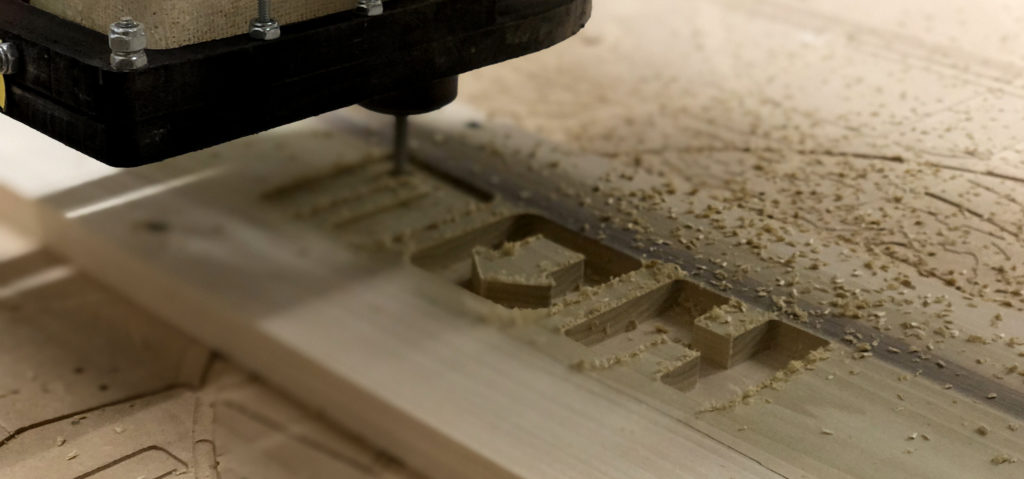
Once we established final artwork and confirmed final production files, it was time to head into the woodshop with a good friend who knew how to handle the CNC router.
As people who do most of our work in front of a computer, it’s always fun to be a little more involved physically in the process of making. After a few test runs, and messed up crossbars of letters, we finally crafted the perfect piece.
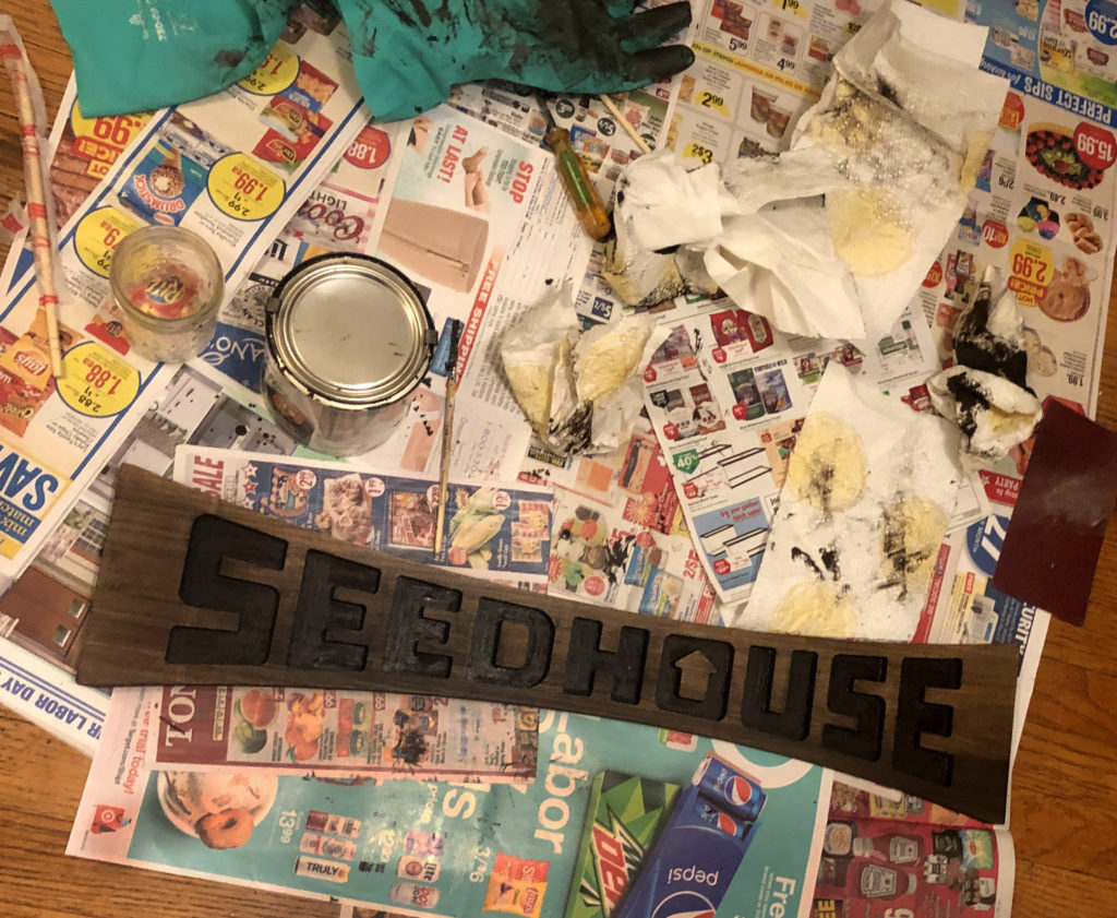
After, we took the piece to our staining studio (aka apartment kitchen floor) carefully stained it atop what we know best: newspaper ads featuring all sorts of conventional CPG.
A few days of drying later and VOILA—a 3D object meant to communicate the down-to-earth, weird, and fun nature of the Seedhouse collective as they deliver killer well-crafted design. Also known as a sign.


