Food Illustration
Tip 1: Make people eat with their eyes.
Our many years of consumer research have proven that consumers eat with their eyes and then buy. Consumer typically give 3 seconds to a package before moving on. In those three seconds, a consumer will first gravitate towards food illustration or photography, then move onto brand. Next they go to the secondary typographic details (or a neon call-out, if that’s included). Often, they might not even make it past that initial look if the totality of the artwork isn’t bold enough to catch their eye.
Food photography increases appetite appeal, communicates contents, and inspires usage. Why would you elect to go with anything else?
[images from client’s instagram accounts]
Tip 2: Food Illustration Stands Out
While food photography has its benefits, and usually succeeds, sometimes a package needs to go beyond category conventions to stand out. Enter: Food Illustration.
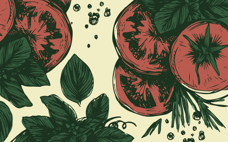
In a sea of photography, a bright and poppy illustration stands out. Illustrating your food product, or its ingredients can be a way to reenforce your brands story or voice.
Food illustrations on packaging instantly communicate an offering that is more crafted and natural. They act as a fishing lure even more than photography. The opportunities are endless—an illustration can push the boundaries beyond standard photography physics, bolstering your message and your offering without adding clutter to your package.
Tip 3: Consider Style and Substance
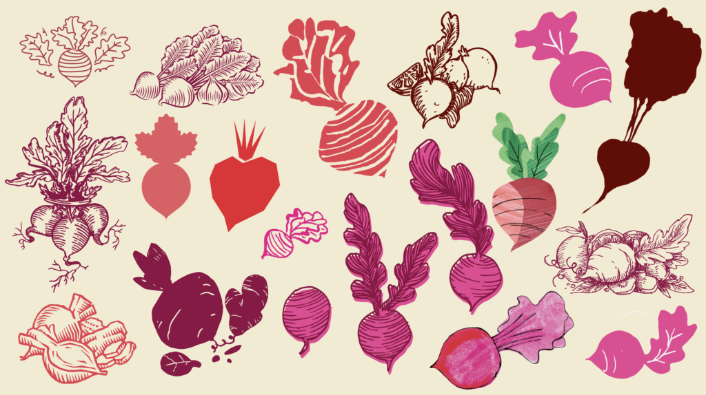
Beets are one of our more commonly illustrated vegetables here in the office. In juices, baby food, breads, wraps, sauerkraut, soup, beets are having a moment and adding their color and flavor to products across multiple categories. Different illustration styles lend themselves to varying brand narratives. By looking at the collection above, you can see that there are a multitude of ways to craft or draw a beet, each with its own look and feel. Choosing the right style highlights the brand dimension that you want to convey on your CPG packaging.
How do you choose which food illustration style is right for your packaging?
Stuck choosing between photography or illustration for your consumer packaged good? Try returning to your brand strategy. What impression do you want to give to which consumers? Your choice should reflect that. Look also to the category conventions applicable to you and what “rules” you can comfortably break, as well as to your competitors. The key here is meaningful differentiation.
—
Need packaging that requires food illustrations? Get in touch with Bryan.We can help. Illustration system execution and production is one of our packaging design specialties, especially when it comes to crafting a new style just for your brand.
See Also: Our blog on cut paper illustrations here.


