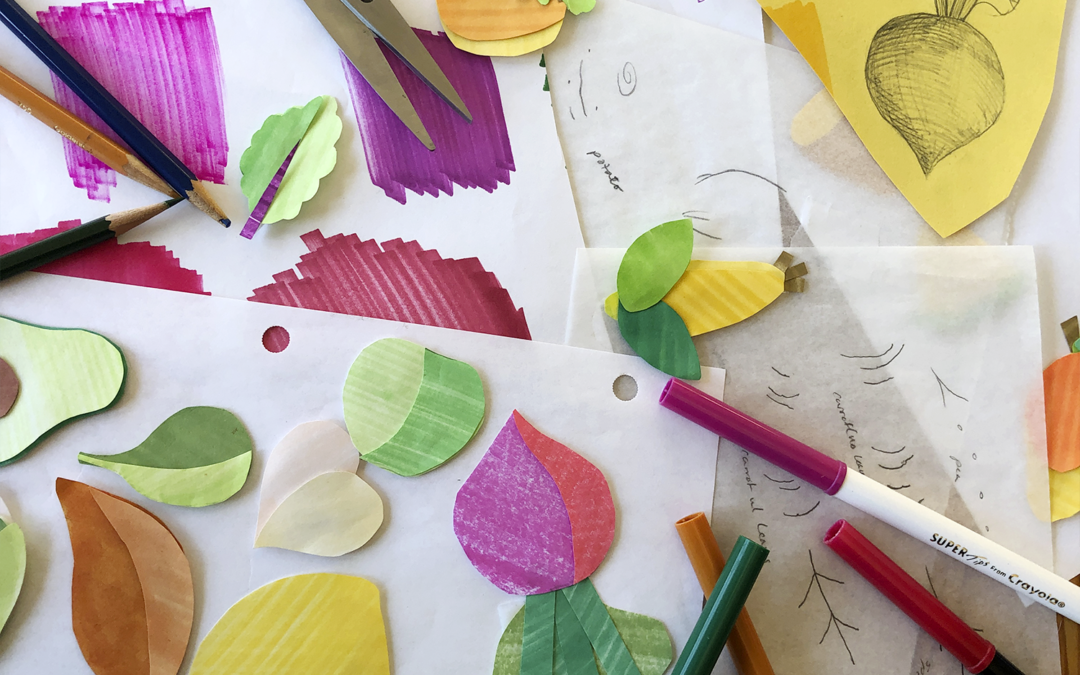
A big chunk of our work revolves around food: food brands, logos, packaging, eating food. We illustrated more sweet potatoes than the average person. Certainly more sweet potatoes than WE ever expected to illustrate. (And don’t get us started on horseradish!) We constantly ask ourselves, “ok, what art style helps to push the whole concept closer to the brand essence?” Thankfully, cut paper illustration is the answer in multiple instances.
The basic elements
Two basic elements, paper + dimension, hold incredible potential. So many factors come into play: Will the paper be textured, transparent, thick, or thin? Is it best to have lots of space and shadow between layers or not? Will there be 20, 30, 60 layers, or just two? How should it be lit? Backlit? Cleanly cut paper or torn? Take a quick glance at Pinterest and you will see the many ways people created joyful, mesmerizing or hauntingly beautiful art using these simple components.
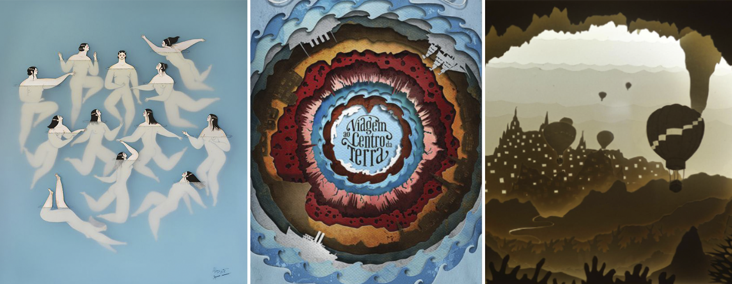
[Images by Sonia Alins, Garlo Giovani, Aline Marie ]
The impression cut paper gives
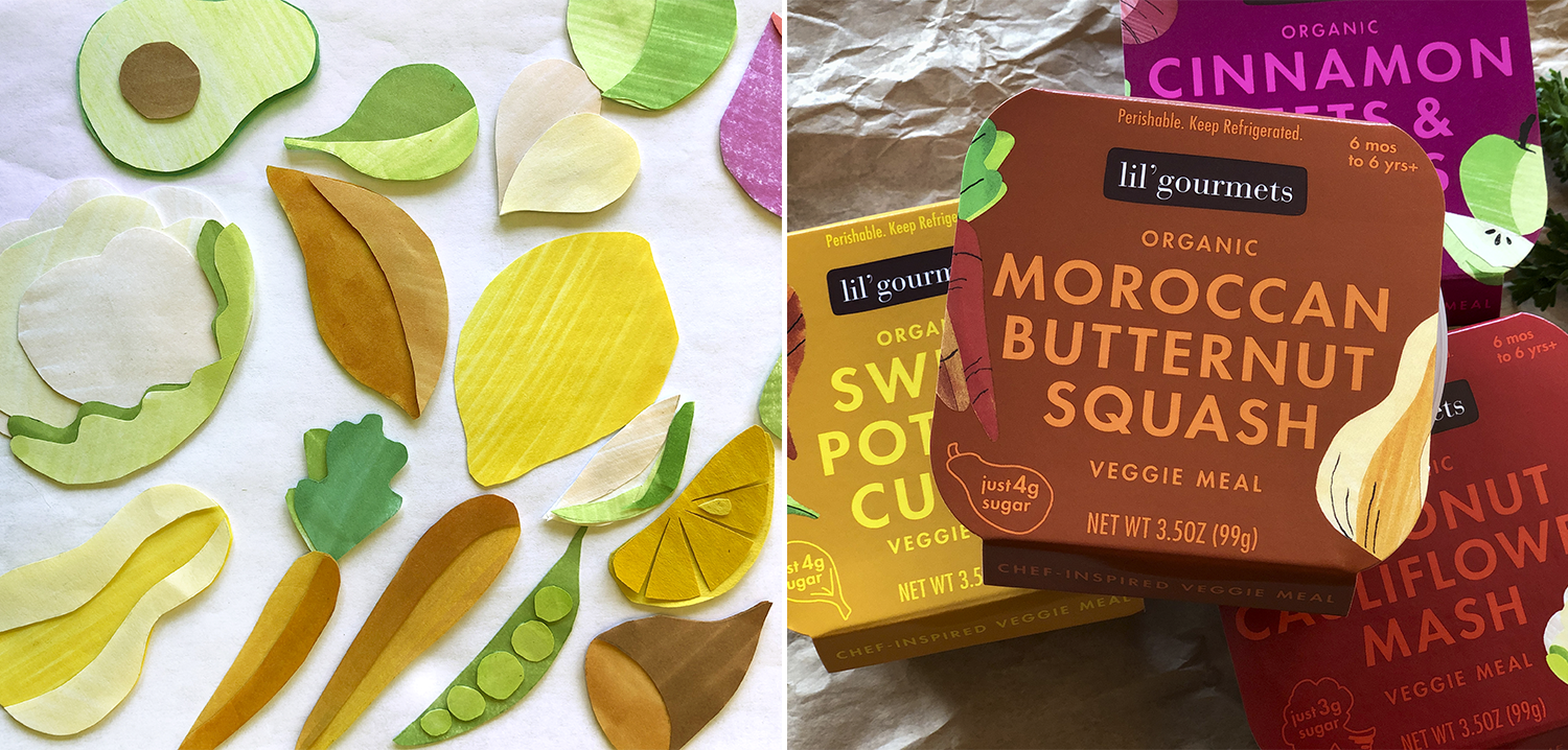
On first blush, you think of cut paper as a child’s art project, and, in essence, it is. And we love that because we can use this connotation to help strengthen the brand’s message without saying a word. For instance, the funky cut-paper illustrations featured on Lil’Gourmet’s kid meal packaging help cue that this is kid-related before you even read the copy.
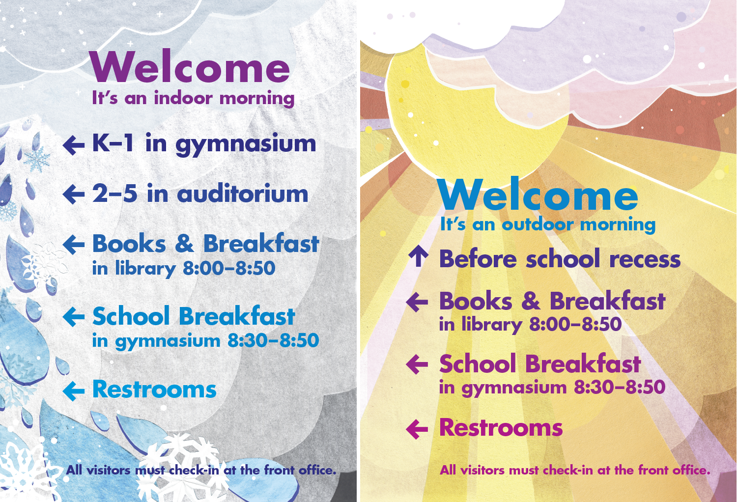
Evoking place or establishing mood
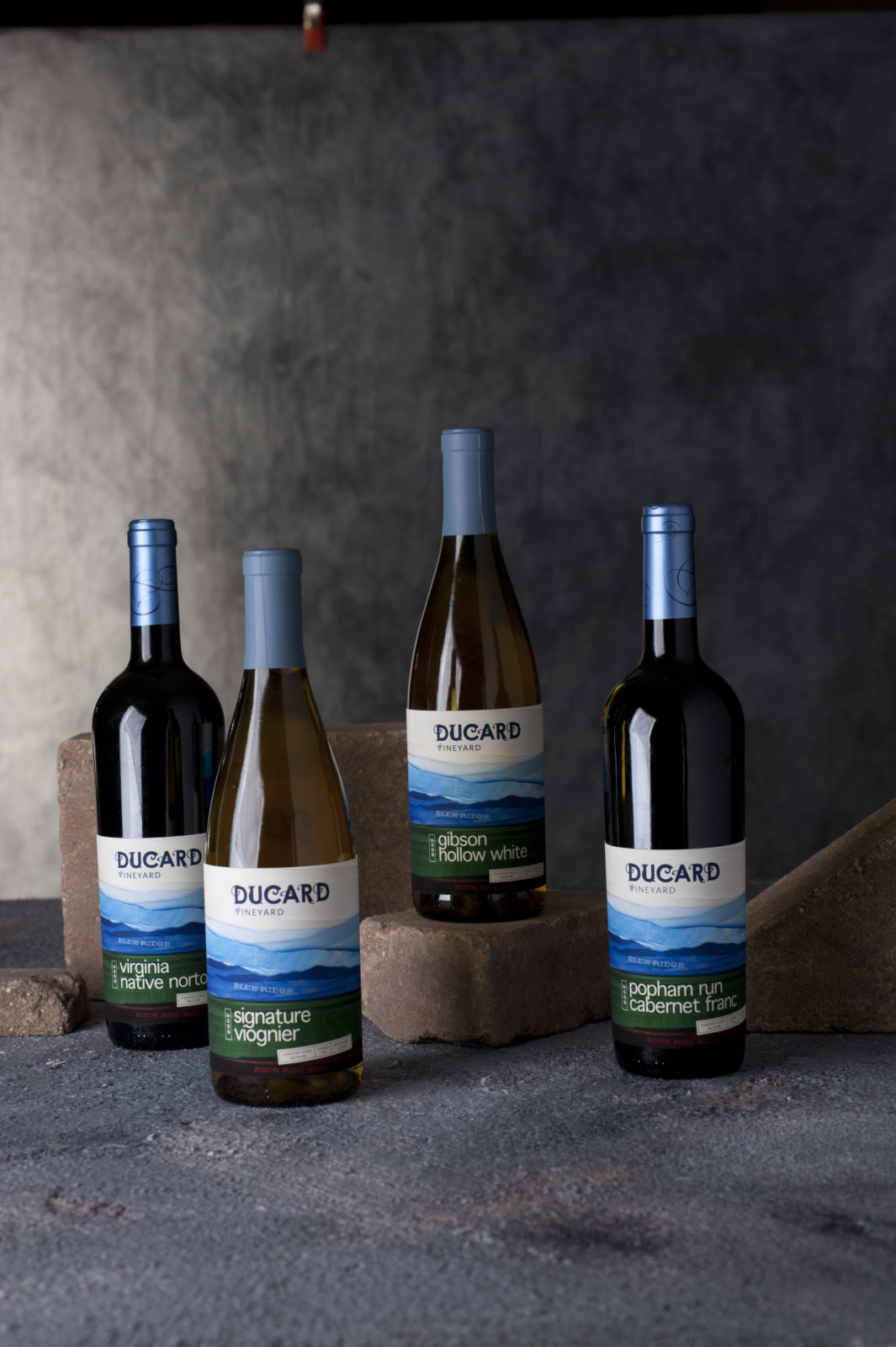
The depth and texture also establishes a mood or sense of place as shown in our DuCard Vineyards label (above) and the two school posters we designed (below). Using delicate torn paper, we create an evocative Blue Ridge Mountain vista for the wine label refresh that simply and quickly alludes to the misty mood of the mountains. Our rain day/sunny day posters need to quickly communicate to parents where to take the kids during school drop off, while engaging the kids.