Overview
Client: Design Integrity
Delivered: Brand Strategy, Logo Design, Brand Extension Items
Design Integrity is a group of thinkers and tinkerers. They delve deep into complex product development problems to find the best way forward. They stand apart by being experts across both engineering and industrial design. Therefore, our goal was to reestablish Design Integrity’s identity with greater focus on its strength: complex engineering merged with industrial design. Continue reading to discover how we engineered the Design Integrity Logo Design.
Orientation—Mighty, Fast and Multi-Faceted
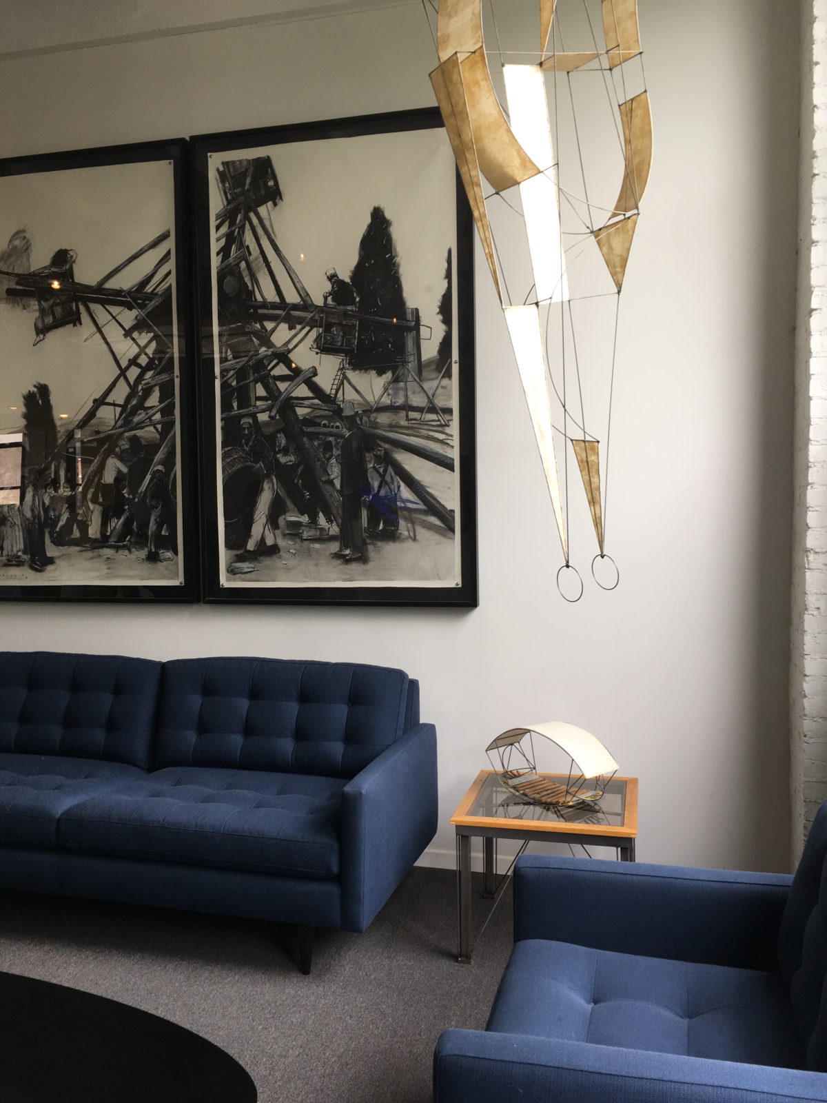
To start defining our strategy, we deep dived into the world of Design Integrity—visiting their office, getting familiar with their methods, their history and investigating their place in the market. Our goal in immersing ourselves was to assimilate info so that we could define the brand appropriately and create a brand story that better conveys the firm’s proficiencies, personality, and strengths.
Strategy before Logo Design
Our audit and immersion led to the understanding that clients with higher levels of technical complexity, innovation requirements, and deadlines go to Design Integrity (DI) to take care of the job. They do this in part because DI employs a rare combination of engineering prowess and design creativity. One audit observation was that many competitors employed similar, staid brand presentations, and there in was an opportunity for DI to standout & showcase what it is fundamentally good at – uniquely solving complex problems.
Great Brands Have Soul—Design Integrity Logo Design
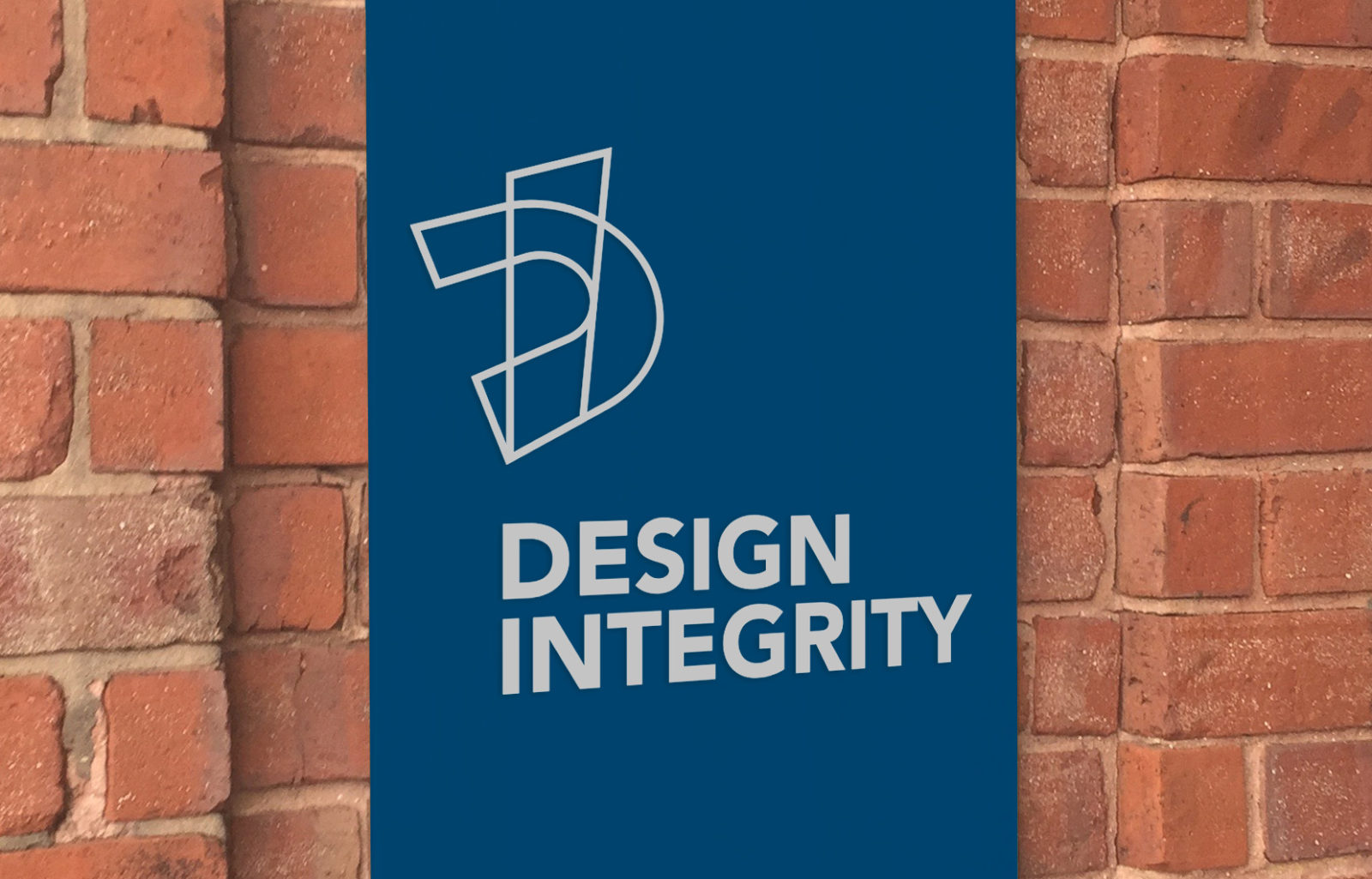
With a well defined brand we were then able to craft Design Integrity’s new logo to give voice to their brand essence and help create more meaningful differentiation. A carefully engineered monogram acts as a symbol for the brand. The two letterforms connect much like how DI connects engineering and design. The offset monogram pairs with an uppercase wordmark. The professional, trusted blue brand color helps push DI away from competition and gives a nod to their credibility within the space.
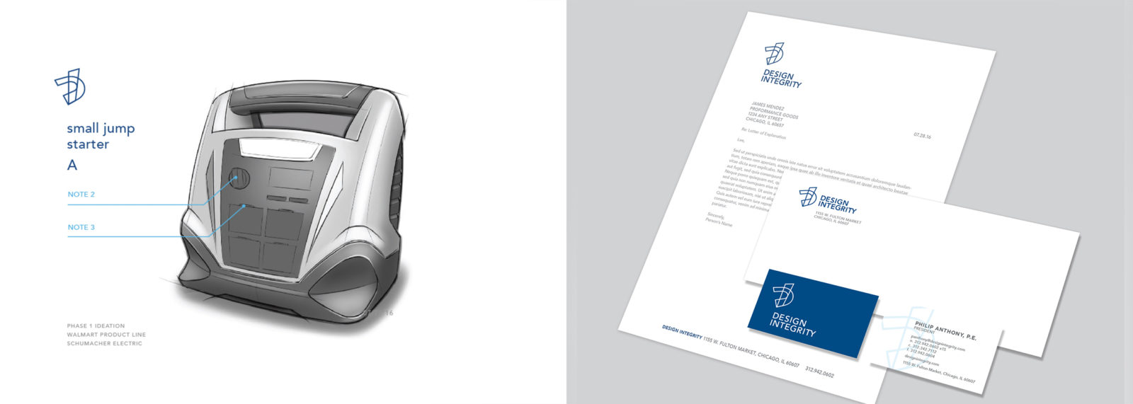

Great brands also have some flexibility. Seedhouse also created a secondary, alternate brand lock-up for those instances when the brand needs to be positioned horizontally (e.g. web application, business envelopes; see above right). This compliments the primary, traditional vertical lock-up (symbol atop wordmark) to give the brand more options while also maintaining a consistent look & feel. That’s smart.
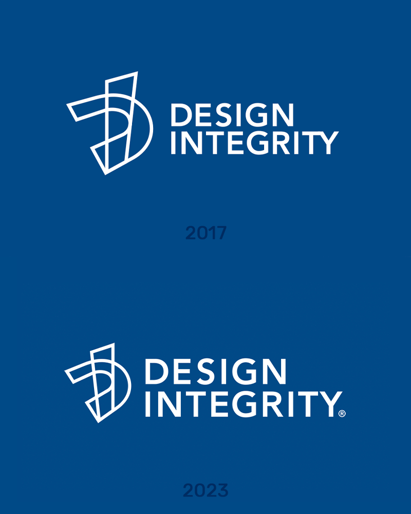
2023 Logo Update
Case Studies
Did you enjoy reading about our process to create the Design Integrity Logo Design? Next, see other case studies and head over to other project highlights like Quari, Pinnacle Performance Company or Beechworth Windows.
—

