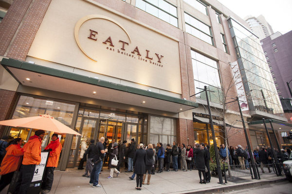
Bryan and I had a chance to stop by Eataly Chicago – essentially a department store for Italian food – the other day. As we’ve noted in past posts, we are a pain to shop with, easily distracted by the new packaging design of this brand or a new structure in that category.
You should have seen us at Eataly. Full A.D.D. in effect. Wandering this way & that and picking up everything that had an interesting texture, typography or design, we came upon the extensive pasta aisle. Not only do they sell freshly made pasta, they sell something like a hundred different SKUs of packaged pasta. A bunch of the design in the category is to be expected.
But we can across the packaging for Lidia’s Pasta and it made us stop.


The first thing you notice is the bright red color – different from the other more cream or yellow packages, yet appropriate. It made us think of tomato sauce which is a great association for pasta! The next element that we really appreciated was the graphic element that broke the window – creating a fake fold, seemingly sealed with the photo of Lidia Bastianich, the popular chef and namesake of the line. The fold creates a great rhythm on the shelf.
This design is a great example of strong differentiating brand color and graphic blocking at shelf. Bravo!
-Krissy