How the Maison Restaurant Branding Started
Bryan and Krissy, the dynamic sibling duo at Seedhouse, have worked together in packaging and branding since 2004. We joke that we couldn’t work with our other brothers. However, we had to challenge that assumption when our brother, Vandy, came to us about the Maison restaurant branding – his first restaurant in Charleston, South Carolina. Of course, we said ‘yes’ and jumped into action.
Vandy and his business partner, Will Love, were aiming to reinvent the French Bistro for the foodie-focused Charleston restaurant scene. Vandy is classically trained (at the French Culinary Institute) and loves classic French dishes. On his off-days, he would crave a good country paté or steak frites. But, that kind of food just didn’t exist in Charleston. He saw an opportunity to cook the food he loves and introduce it in a contemporary way.
The Process
The Seedhouse team started at th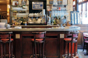 e source – French bistros. We learned that bistros evolved out of the communal basement kitchens for Parisian apartment buildings. The kitchens provided 3 meals a day for the buildings’ residents as a part of their room and board. Looking at the visual language of the bistro, nickle bar tops, black and white tiling, gold leaf lettering, chalkboard menus combine to create that Parisian sensibility. Because the Maison interior design team was going in that direction, we knew that the branding had to bring the more modern flair to that traditional vibe.
Initial Creative Exploration
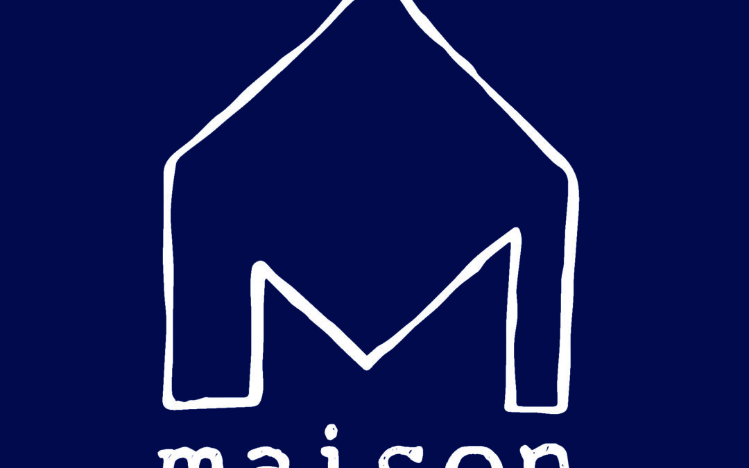
After we understood the visual language, we moved on to the creative exploration. In playing, we discovered the ‘M’ shape and the idea of ‘house’ (which is what ‘maison’ means in French) shared some great elements. Therefore, combining those shapes turned into a fun exploration – from more ‘naïve’ illustration to modernist abstraction. We hit on the current shape in this exploration when our designer Andrew was attempting a modernist take on a table. Through refinements, we were able to get a symbol that held a trio of meanings – a table, a house, and the letter ‘m’.
Next in the typographic exploration, we were looking to balance the sleekness of the symbol with a friendly approachability and sense of craft. The hand-drawn typerwriter-like font gave us just what we were looking for.
The Rollout of the Branding to the Whole Restaurant
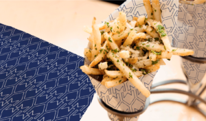
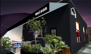
Rolling the logo out to the other brand expression elements like the menu, neon signage, aprons, outdoor paint color, social icons offers a great opportunity. We were able to use the symbol or the wordmark on their own or together. In addition, we even repeated the wordmark to become its own branded pattern. As a result, Vandy, Will and the Maison team are thrilled – as are we! Maison was also listed as one of the Best New Restaurants of 2019 in Thrillist.
We love working with chefs to bring to life their restaurant branding, or even package design. Reach out to us if you are in need of a restaurant identity or chef packaging design.


