Overview
Client: Eagle Manufacturing
Delivered: Logo Redesign, Brand Identity, Brand Strategy, Brand Guidelines
For over 125 years, Eagle Manufacturing Company has provided the largest line of industrial safety products to customers around the world, built on a legacy of employee’s hard work, innovation and high-quality American-made products.
After acquisition by Justrite Safety Group in 2018, Eagle needed to better harness the power of its equity and positioning as it relates to the Justrite Safety parent brand. To deliver a more compelling message for those looking for traditional, ‘built to last’ products, Seedhouse defined the Eagle brand positioning and updated the visual identity. This resulted in the new Eagle logo redesign & extended brand identity.
Immersion & Brand Definition
No brand lives in a vacuum. To start, we did a market audit of the competition, the Justrite Safety Group brand portfolio, and other brands that were using an eagle symbol. The audit defined cross-category visual trends and revealed areas of opportunity. We also dove into other ancillary American legacy brands to help narrow down what visual cues speak to heritage.
Extracting meaning through interviews & surveys
We also dove into Eagle’s legacy, interviewed current employees and surveyed customers to explore the brand, glean insights and define what the brand meant to them. Our research showed that people have a strong positive association with Eagle and that the brand has a nostalgic familiarity and high quality perception. Though, Eagle needed stronger differentiation from others in the market. We discovered opportunity for differentiation in highlighting the pride of employees and loyalists, and to play on the natural strength of the eagle as a symbol.
Modernizing a heritage Eagle logo through redesign
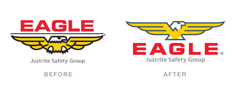
With brand definition in place, we set off to craft strategic iterative changes to the Eagle symbol and wordmark. We began with a visual audit of the brandmark, breaking down what areas could be refined to help better support our strategy and brand application flexibility. We then explored small changes to each element. What we landed on was an optimized version of the logo that everyone knew and loved that balanced the updated brand strategy with brand equity.
 Above: Some of the exploration done to the original brandmark
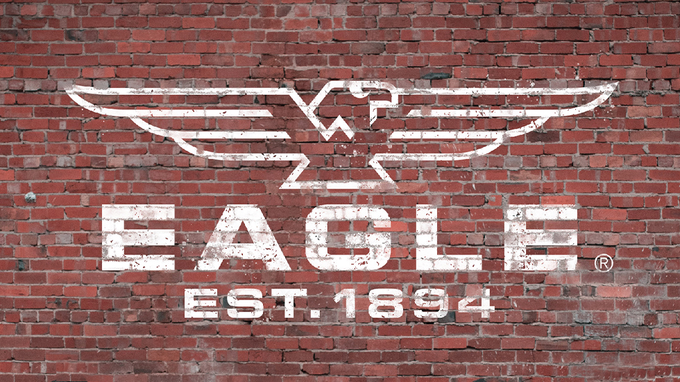
The new logo still features the original eagle—mechanically streamlined and bolder, leaning into the innovation of the brand. A slight color update allows for placement flexibility and a strong triangular body connotes strength, symbolically tying to manufacturing and safety.
The lock-up with the word mark was adjusted and the typography refined for better legibility. The overall brandmark holds the original the visual equity of the brand, but now has more freedom across application and a more evocative presentation.
Landing on American-Made pride
A brand is more than just a logo. Seedhouse rolled out the design refinements to craft an entire identity centered around harnessing that American Pride, and captured it in an official Brand Guidelines document. We designed:
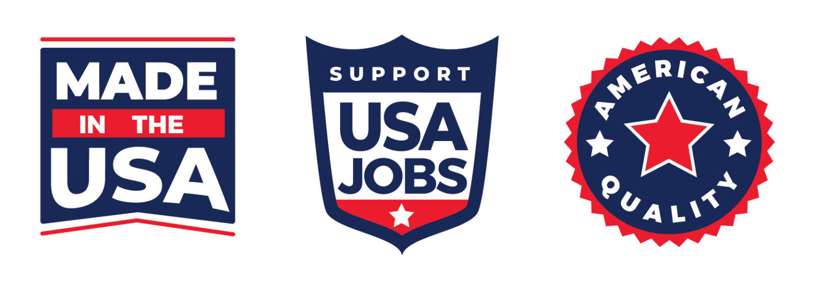
– Icon Family to communicate values
– Advertising Concepts
– Catalog Covers
– Digital Application
– New Brand Colors
– Redesigned Approach to Old Photography
– Font Family
Each part of the brand identity was refined to reinforce that feeling of pride when supporting a heritage American brand that keeps America safe.

Above: Eagle Brand Guidelines Cover

Above: Approved Alternate Logo Colorways
Below: Additional Brand Icons
 Above: Brand Pattern
Below: Various Brand Applications
 The redesigned Eagle logo & brand honors Eagle Manufacturing’s past while giving it versatility for the future. This project reminded us of our past work on brands such as Grainger, Ace Hardware, GE, DuPont and Owens Corning. While we treat every project as their own unique process, we pull from past learnings from our history with some of the most iconic brands.
Want to see more of our work? Check out our showcase or our other mini case studies, or contact us to get a custom brand or package design suited to your needs.

