Design reflects its culture. Whether we’re talking about tomato sauce labels or computer packaging, the best design work is an echo of its particular moment in time. Apart from its original commercial and persuasive goals, every piece we create at Seedhouse is destined to become an artifact rooted in its own era. There is no such thing as timeless design, and that’s not a bad thing. The history of design is brimming with inspiration and well-seasoned insights, a potential breath of fresh air and antidote to the omnipresent design trends of the moment.
The history of design and great work of the past has deeply informed my own professional practice and is always a consideration in the work we do at Seedhouse. While unearthing the design history of my childhood era, I had the privilege to preserve some of it myself.
Like many 80s kids, I grew up at the dawn of the video game era, surrounded by the first generation of consoles and personal computers that infiltrated homes and pop culture. The biggest mover in this electronic invasion was Atari, a Silicon Valley company that established records and created an industry. In 1980, Atari was the fastest growing company in U.S. history. But they weren’t just an electronics giant. With an approach that would be built upon by Apple decades later, Atari marshaled great design as a way to communicate to its burgeoning audiences and to orient them within the emerging home electronics revolution. 
The company set the industry bar in branding, illustration and design, clearly articulating and differentiating its position (and dominance) in the market. Co-founder Nolan Bushnell made Atari the leader in the industry by focusing on creativity and design. But while Atari’s celebrity game programmers received ample attention, the art, design and marketing teams within the company have been completely overlooked. 
Their contributions shaped Atari and ensuing decades of the nascent industry, and so I took it upon myself to uncover and tell the stories of these unsung creators from my childhood. But it wasn’t simple. Like other companies in the 80s, Atari’s archives had been scattered to the wind, original art destroyed or sold, memories hazy with the passage of time. I was eventually able to track down many of the original employees, document their stories, while also scouring museum archives, private collections and eBay to flesh out the historical record. This work culminated in the first book focused on Atari’s art and design. 
My early research centered around creative director George Opperman, the man chiefly responsible for the art and design culture at Atari. He built and shaped the company’s first creative teams, designed the iconic Atari logo and defined Atari’s visual approach. The company made use of the best practices of identity design, art, and packaging to market new products that still had an approachable, inviting aura.
Atari deployed both graphic and industrial design in ways that provided familiar touchpoints for wary consumers. They used their understanding of broader culture to create objects and communications that seemed familiar, carving out a space for themselves in ’70s and ’80s living rooms. At a time when computers were still cold, intimidating machines for many, Atari designers borrowed industrial design cues from high-end stereos and recording equipment. The design brief for Atari’s first home console, the VCS (Video Computer System) called for the hardware to be “designed for living room or den aesthetics analogous to stereo designs for permanent setting.”
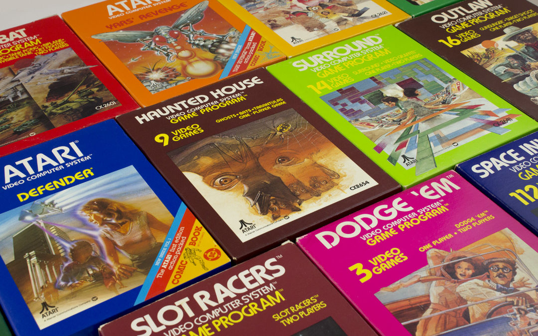
Along with the home consoles, Atari still had to sell a brand-new product—the video game cartridge—on store shelves. Their designers drew inspiration from paperback book covers and record sleeve designs to create energetic and powerful packaging illustrations, utilizing editorial-style illustration and bold design to communicate the energy and fun of Atari’s video games. While the graphics of those games were incredibly simple (and crude by today’s standards), Atari illustrators used design and artwork to create evocative narratives that helped inform the overall gameplay experience.
In its coin-operated games, Atari cabinet design and artwork transformed the look of arcades for years to come. In graphic design, Atari’s bold use of color and stark, evocative typography also helped set the pace for consumer electronics. Atari was ahead of the curve at every point, as it evolved from bright colors to metallic inks, mathematical grid lines and black backgrounds. Looking at it through the lens of nearly 40 years, the work certainly seems tied to its era, but the craft, energy and power of the designs rely on more than nostalgia. The Atari name and brand have outlasted competitors and contemporaries, still holding cultural cache and awareness. This is a testament to the unheralded designers of Atari and their legacy of design that is worth preserving.