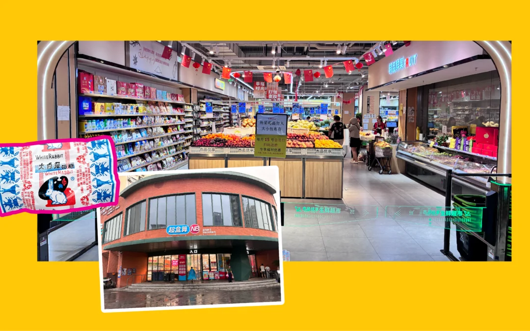
At Seedhouse, we can’t walk into a grocery store without turning into anthropologists. So when a recent trip took us through four Chinese cities—Beijing, Xi’an, Guilin, and Shanghai—we did what we always do: we found the nearest supermarkets and started wandering the aisles, cameras out, curiosity on.
What we found was a masterclass in design working overtime. Here’s what stood out in Chinese packaging design.
The Store Experience Feels Familiar, Until It Doesn’t
The bones of a Chinese grocery store aren’t so different from what we’re used to; produce up front, meat and dairy along the perimeter, self-checkout everywhere, and shelves lit to make everything glow. But nearly every transaction happens through a phone app, and the shelves themselves are loud: bright, layered, and constantly competing for attention. In an environment like that, packaging doesn’t just need to look good; it needs to physically cut through the noise.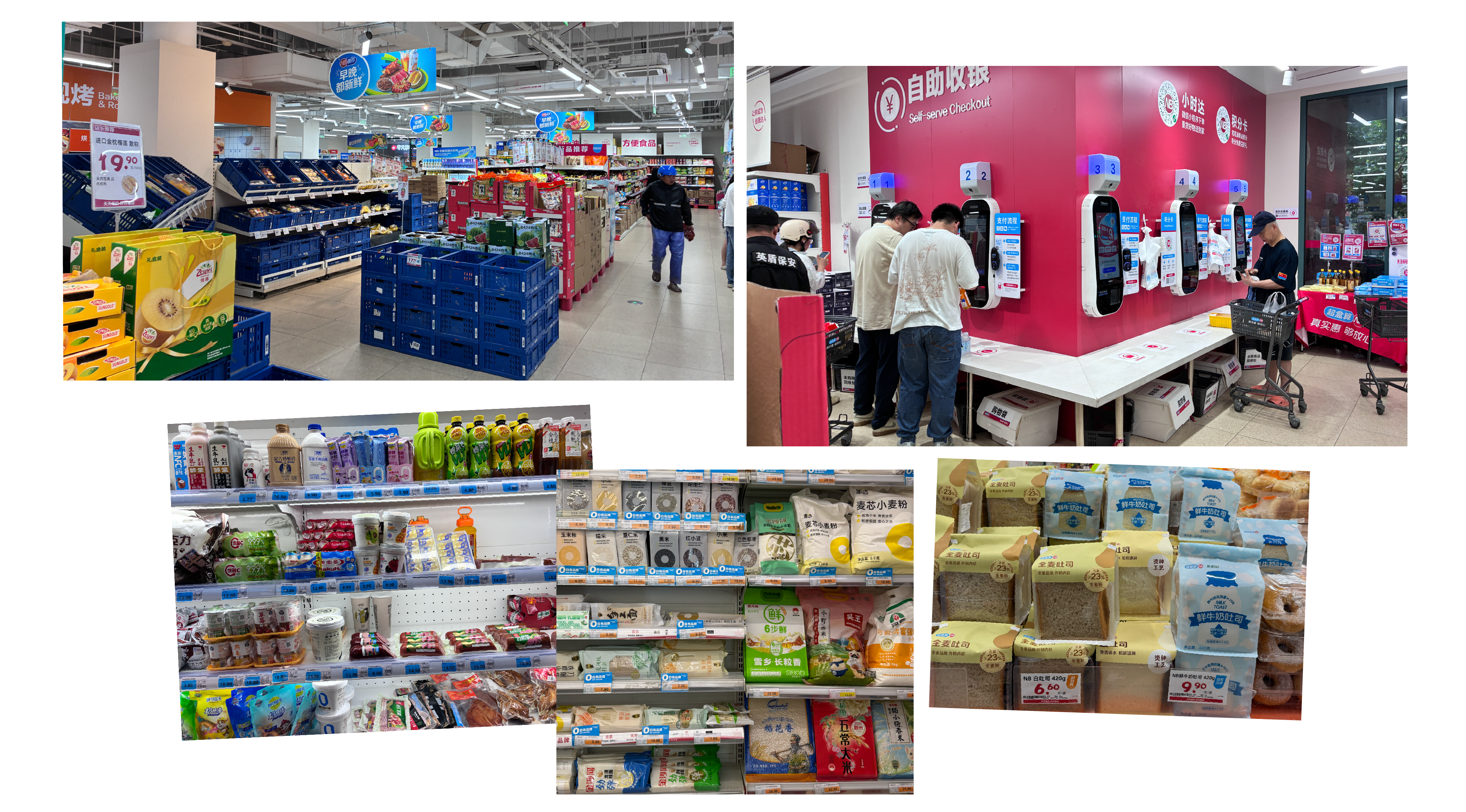
Reading Packaging Without Reading the Language
None of us read Mandarin fluently, which turned out to be a gift. It forced us to shop the way a huge number of consumers already do: by instinct. We found ourselves hunting for flavor cues, callouts like %ABV, and other functional information not through text, but through color, imagery, and iconography. It’s a good reminder that packaging is often doing its job long before anyone reads a word of copy.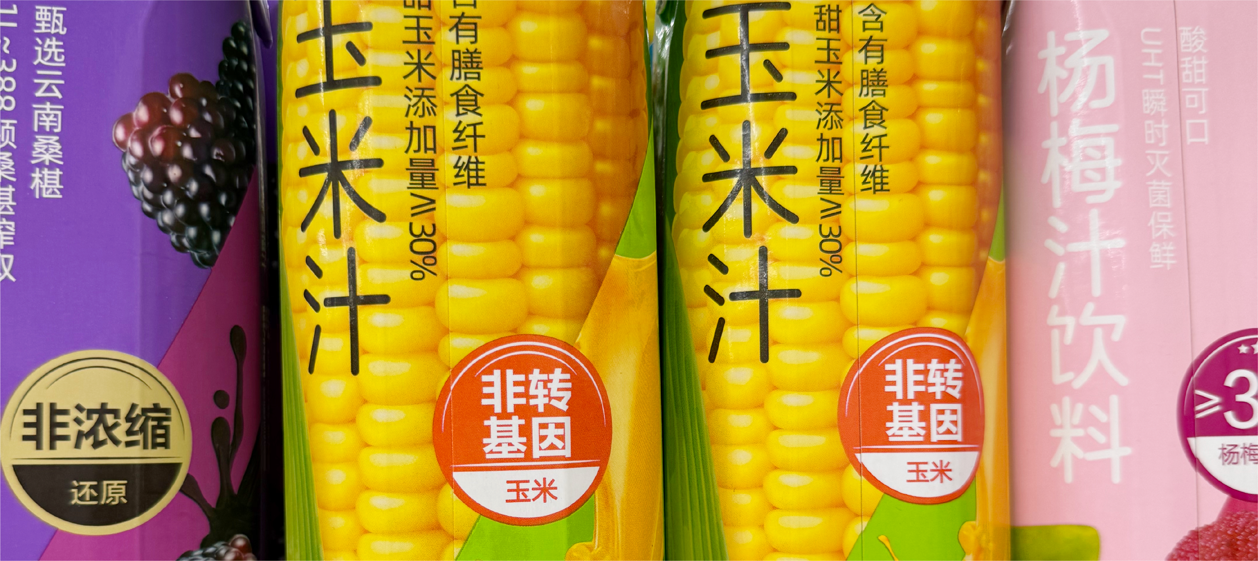
A few tricks we saw doing this heavy lifting:
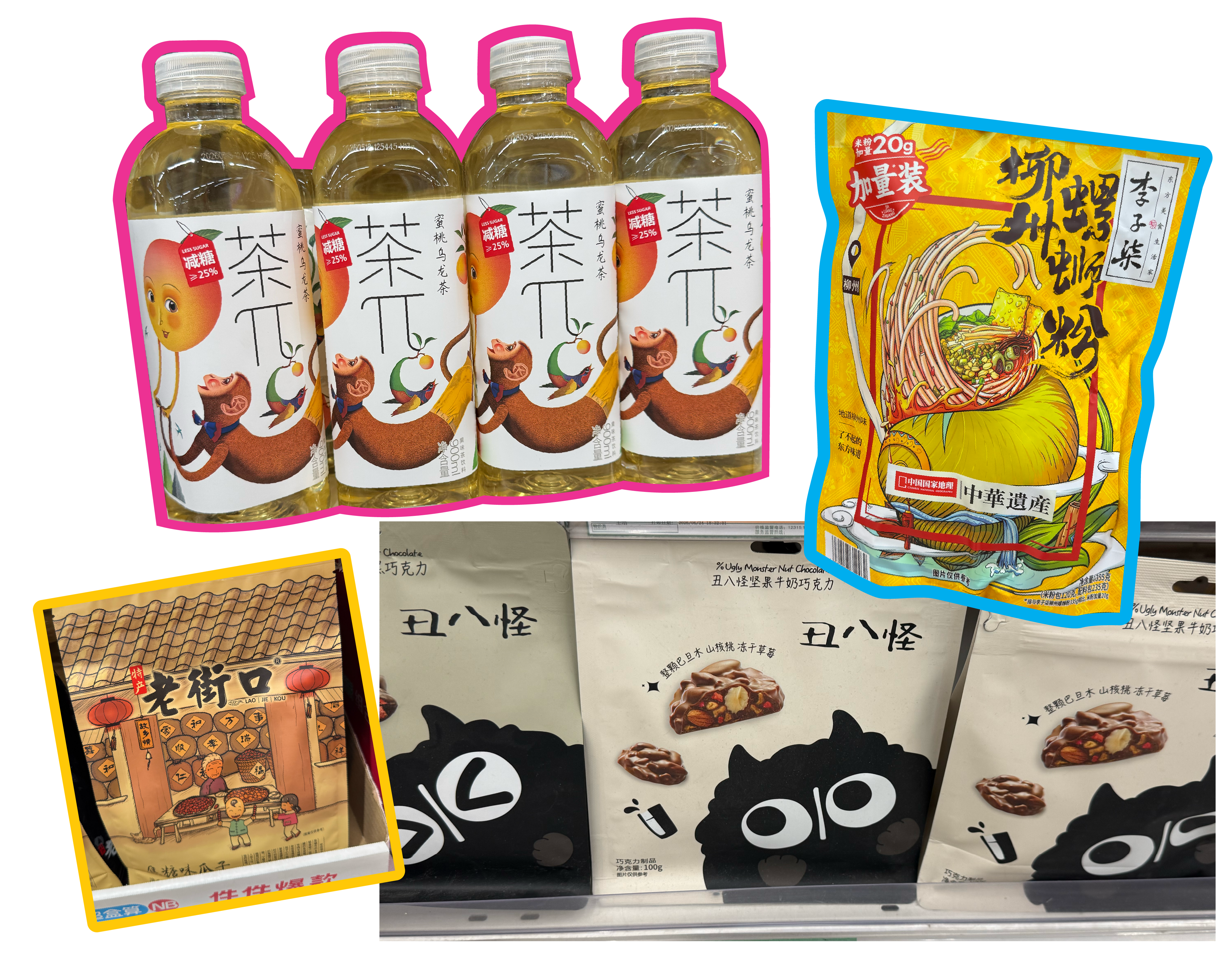
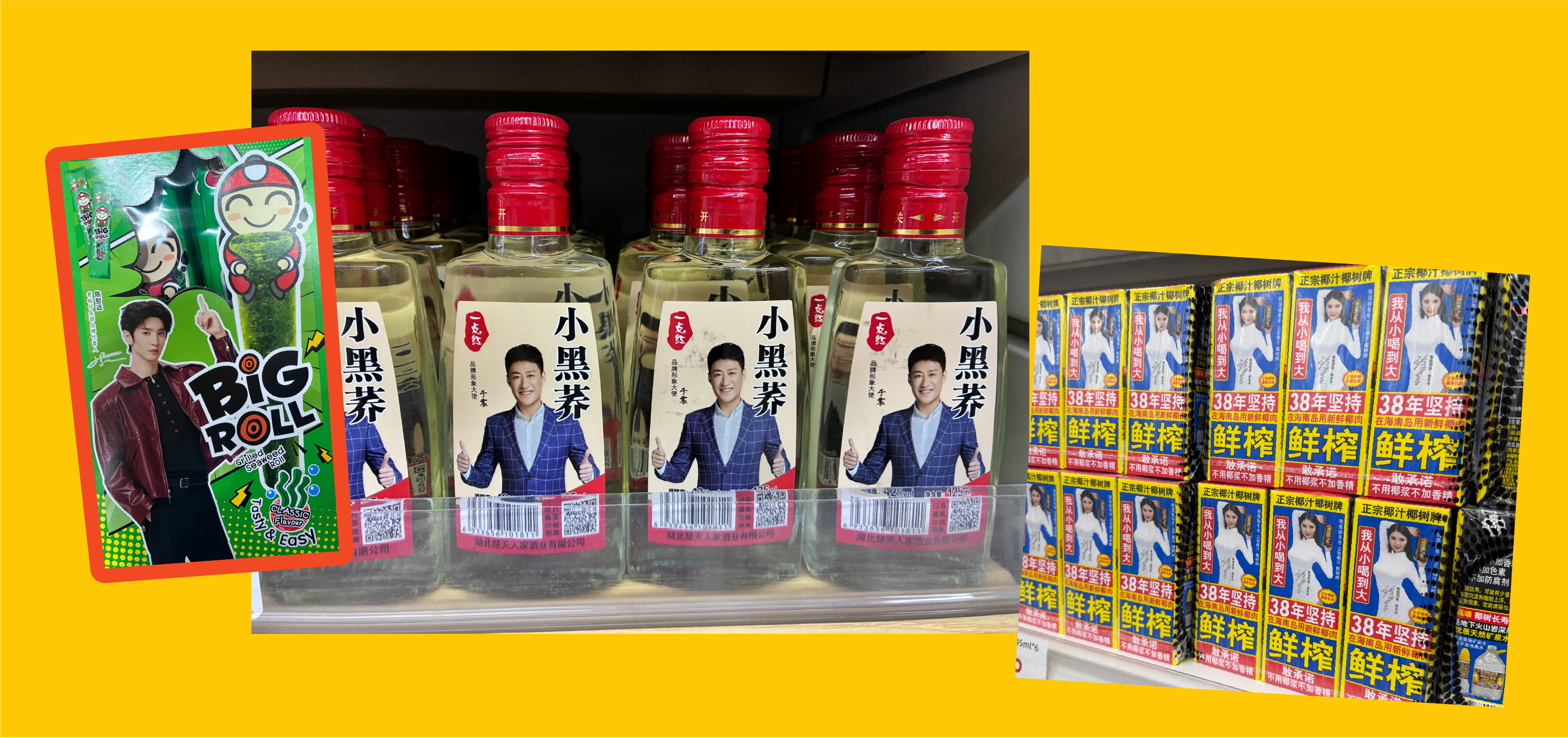
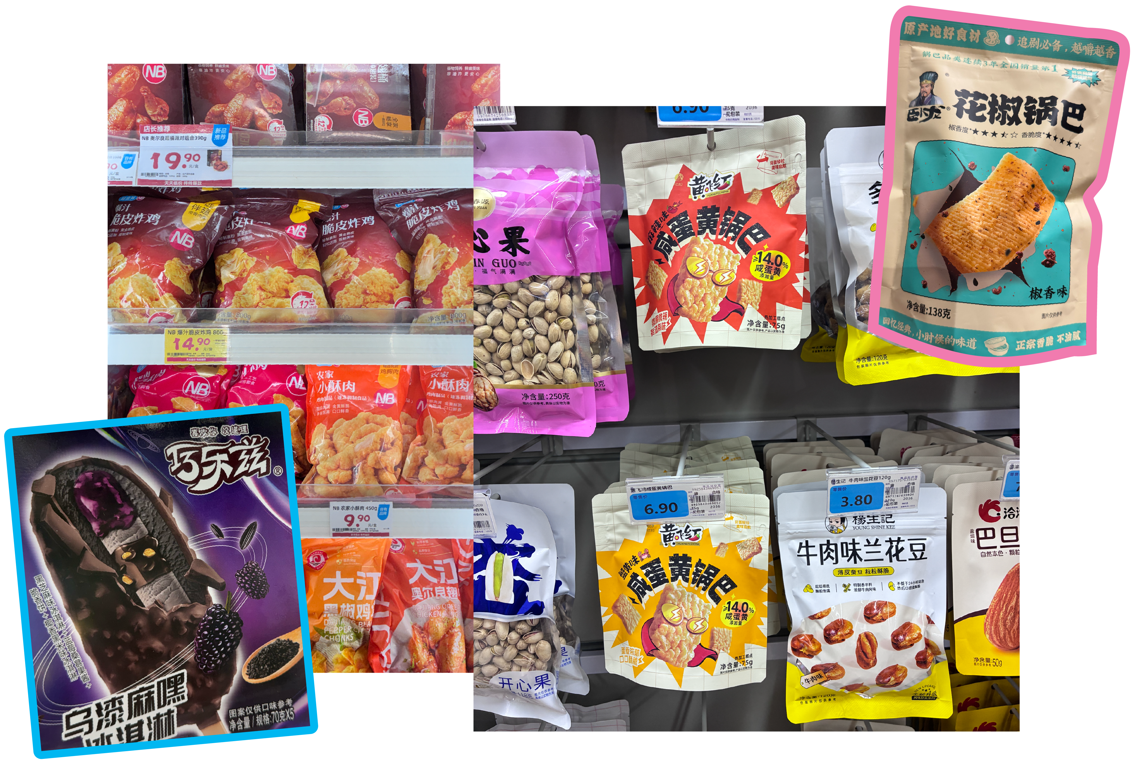
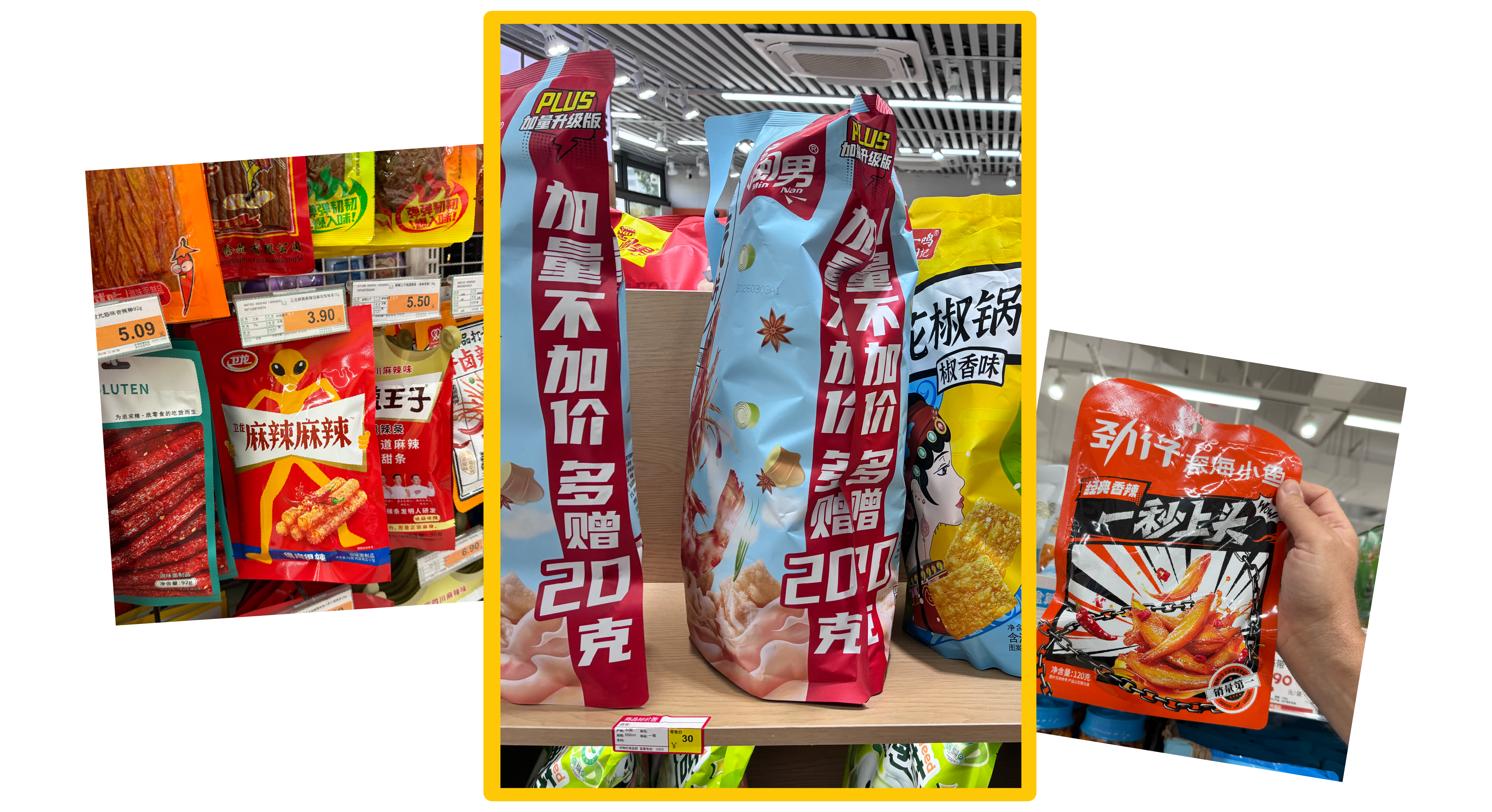
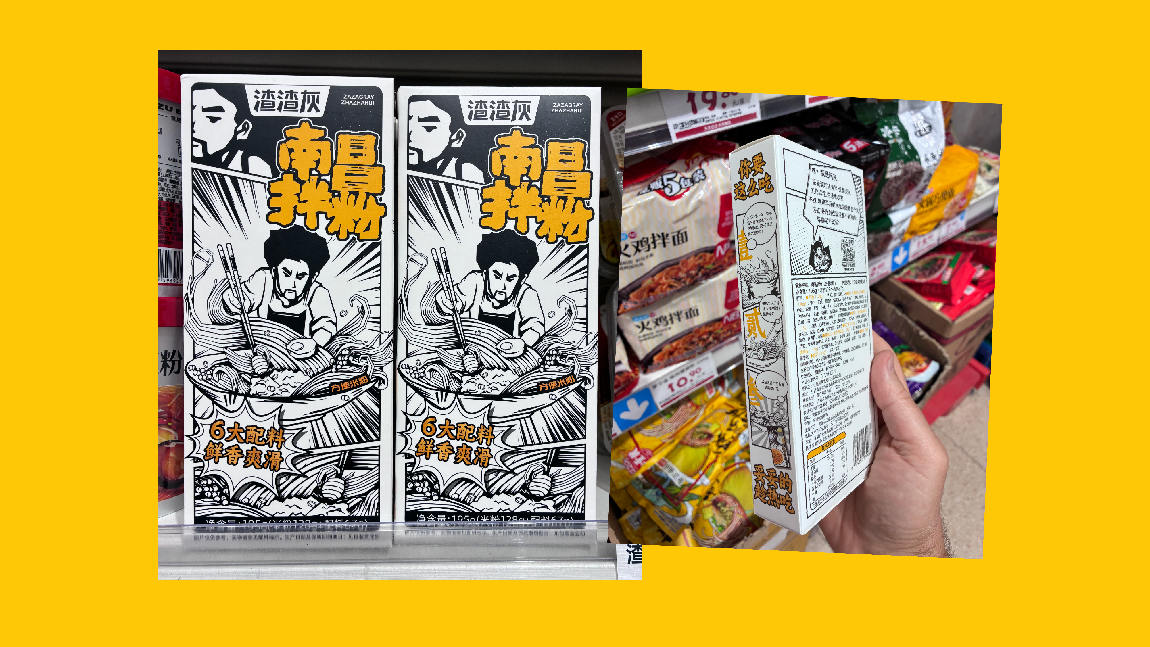
- Illustrations & Illustrated Characters used frequently—sometimes dead-center, sometimes pushed to a tertiary, almost decorative role, but all bringing a fun energy and personality to the pack

- Photography of real people, often celebrities, frequently giving a thumbs up
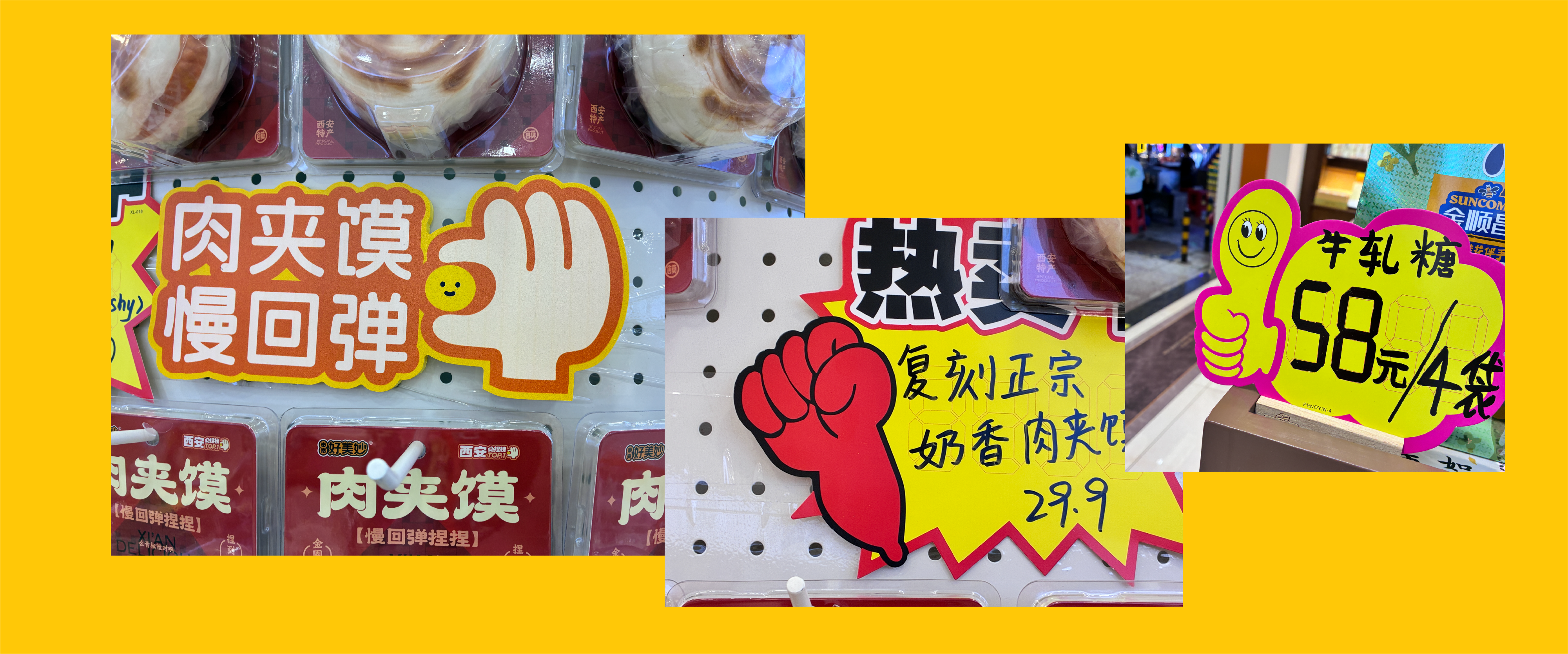
- Hand gesture icons standing in for tone, approval, or flavor intensity
- Warm colors in the freezer aisle—proof that some principles of appetite appeal are universal, no matter the market
- Dynamic Product photography – gave the products a sense of movement and excitement
Global Brands, Localized Language
Recognizable global players were everywhere, but rarely untouched. Budweiser was a great example—unmistakably Bud in its structure and color, but now “The World Renowned”. 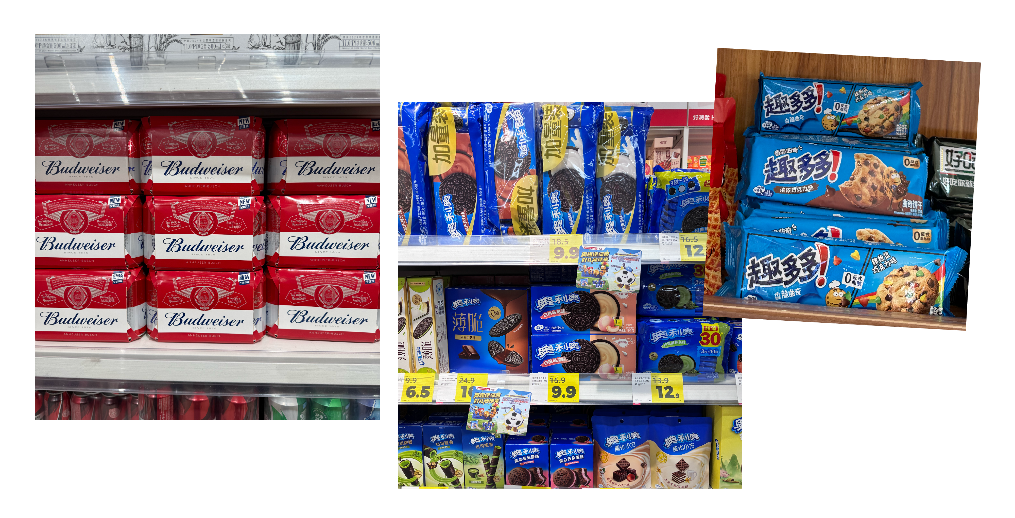
Brands like Chips Ahoy and Oreo were instantly recognizable through color and packaging architecture even though the logos were translated into Mandarin.
Even US staples like Lays, Coca Cola were very present – but had both Mandarin and English brands on their packaging. The flavors were definitely tailored to the Chinese market though.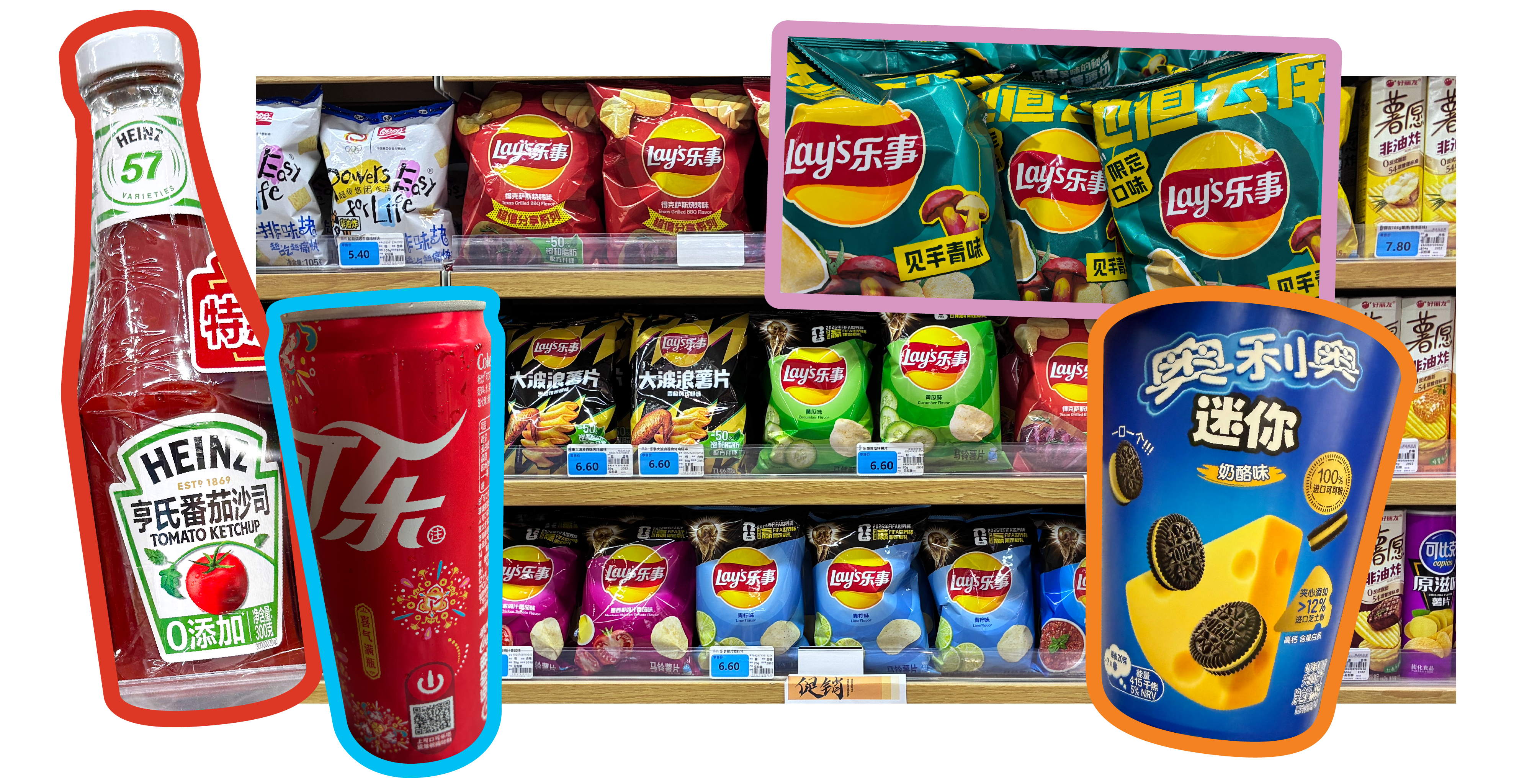
We also spotted plenty of look-alike packaging and logos clearly inspired by Western icons—echoes of Jack Daniel’s, KFC, and 7-Eleven showed up, a reminder of just how far brand equity can travel, for better or worse.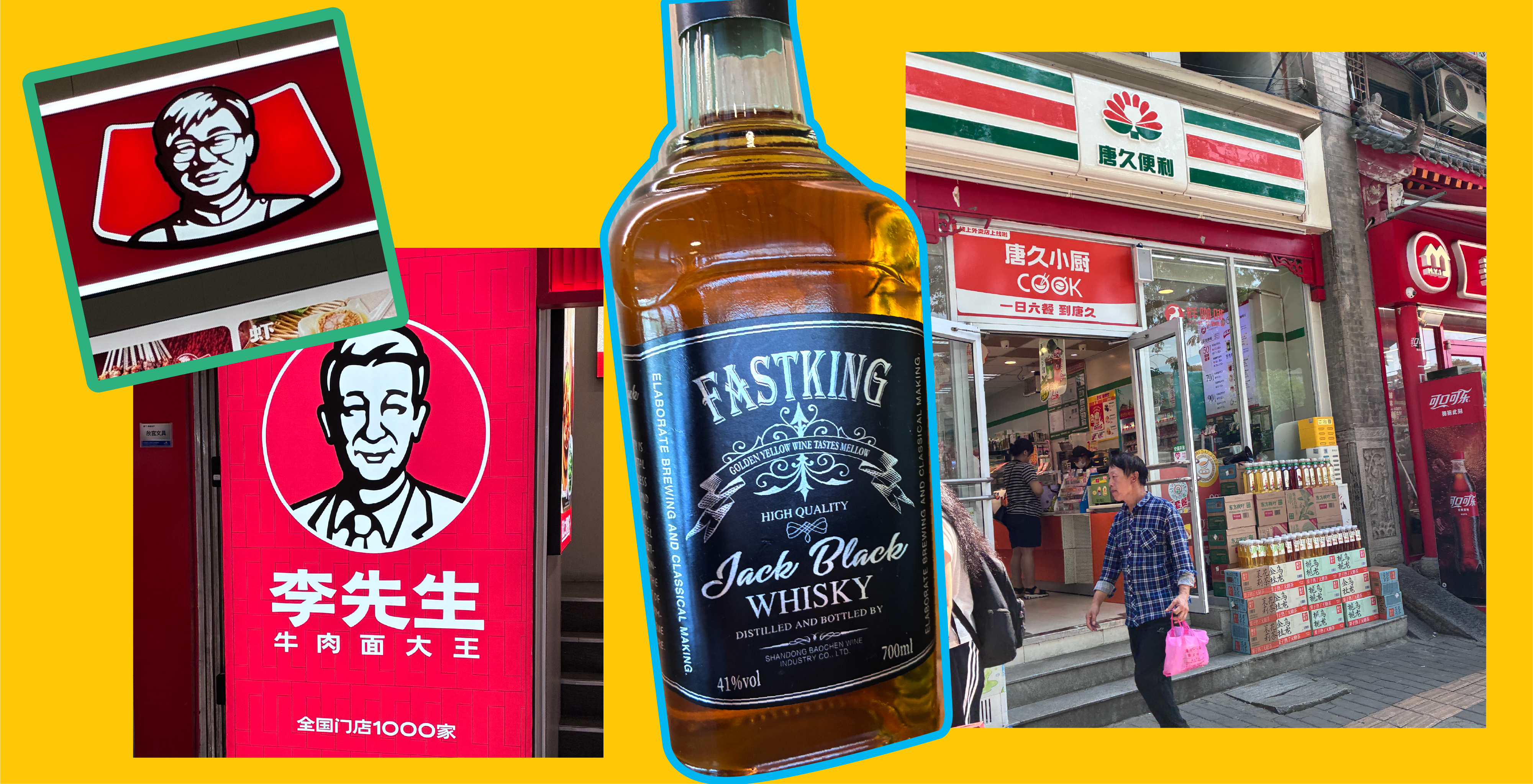
We also eyed a few translations that had us scratching our heads. But we’re sure Mandarin speakers can say the same thing of US packaging translations!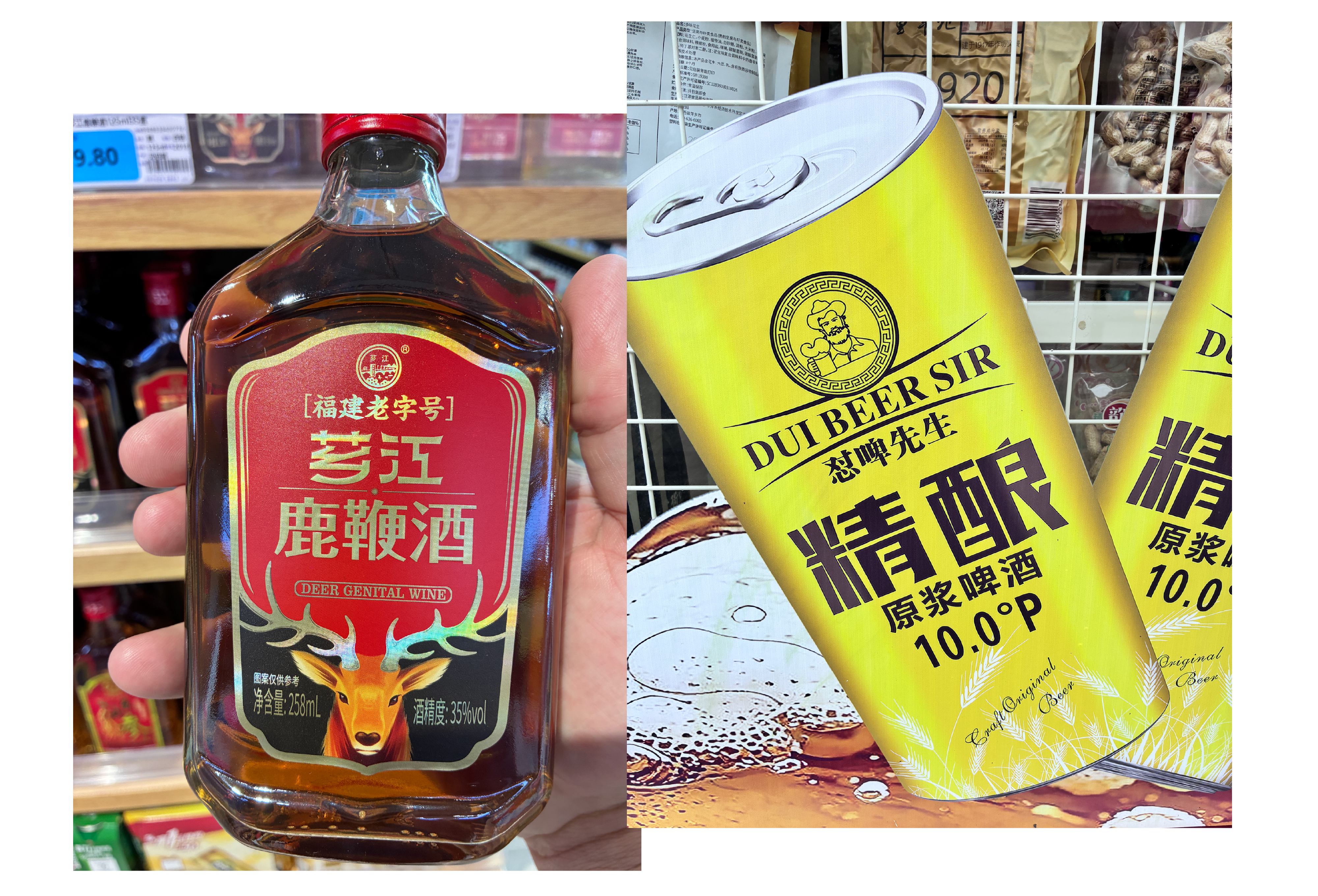
Craft, Materials, and a Few Genuinely Clever Tricks
Substrate and print quality felt like a point of pride. We saw a much greater willingness to lean into premium materials—foil pouches, gloss hits, and rich, multi-color printing—even on everyday products. Cobalt blue showed up again and again as a high-contrast anchor color. Innovative die-cuts were common, breaking the edge of a pouch or creating new shapes that arrested our attention. And the layering was intentional: text, illustration, food photography, character art, and color all stacked together into something visually dense but not chaotic.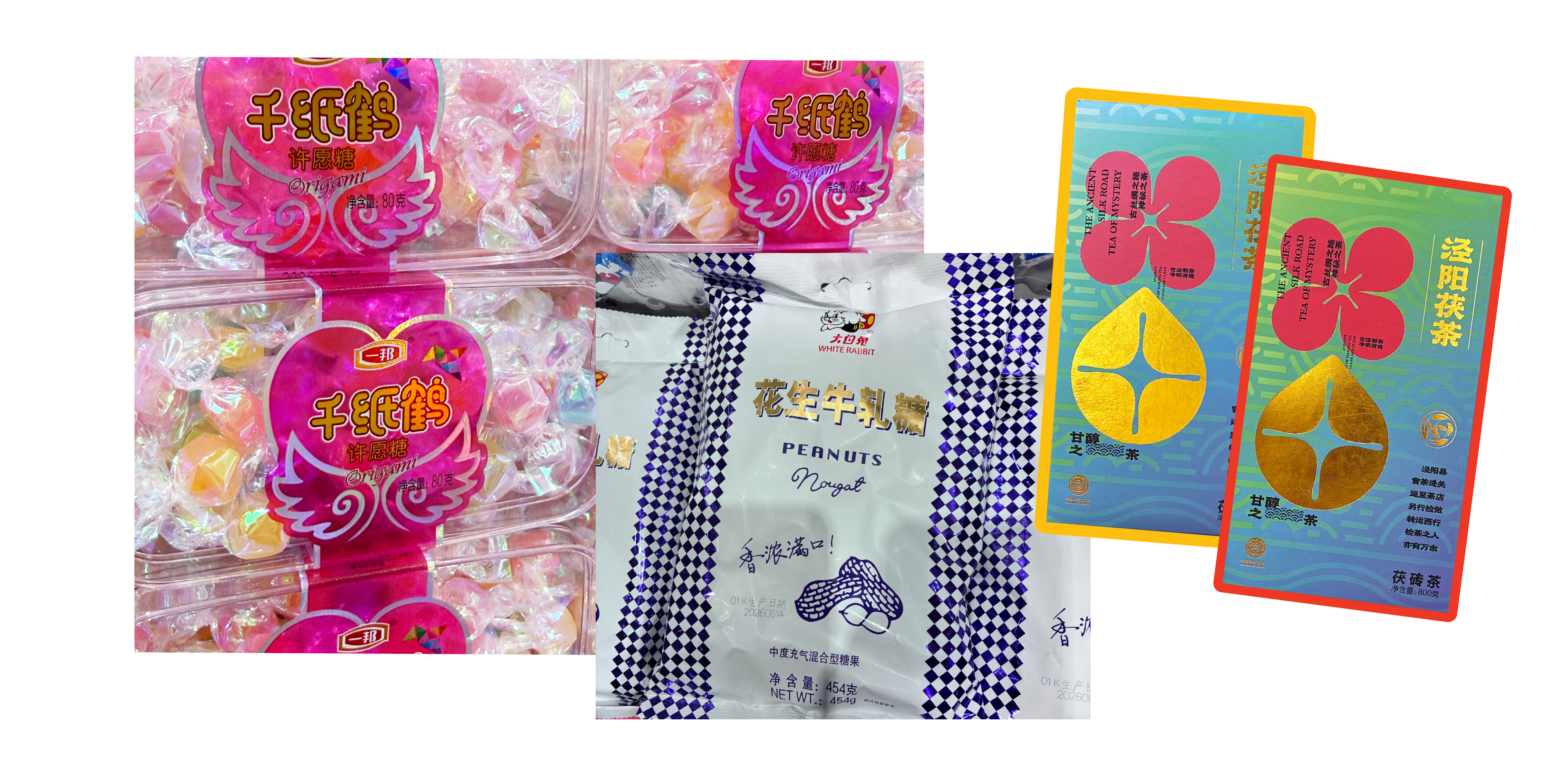
One detail we loved: printing red on the side panels of a pouch, front and back, to create the illusion of depth on an otherwise flat package. Simple, cheap, and effective.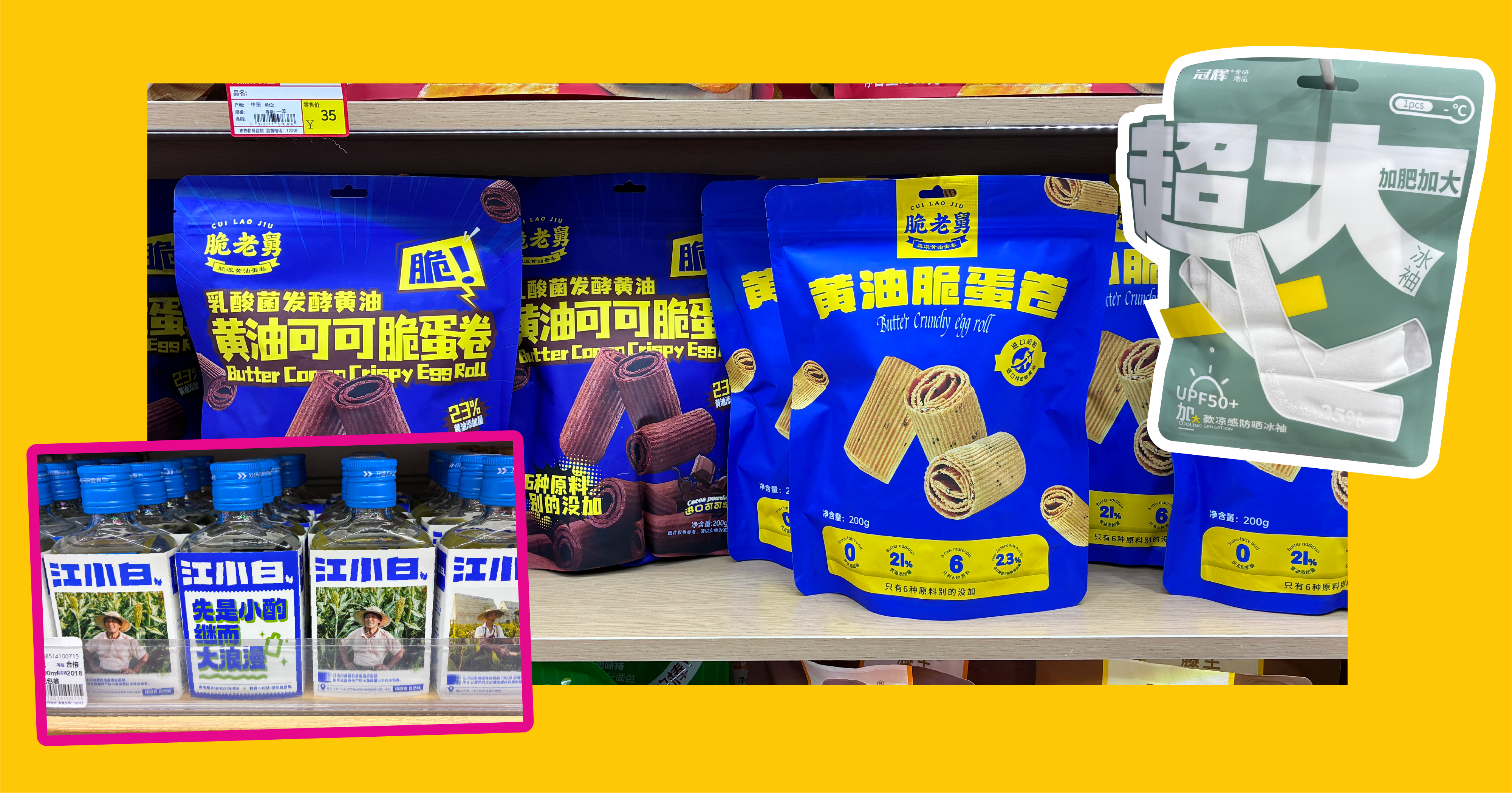
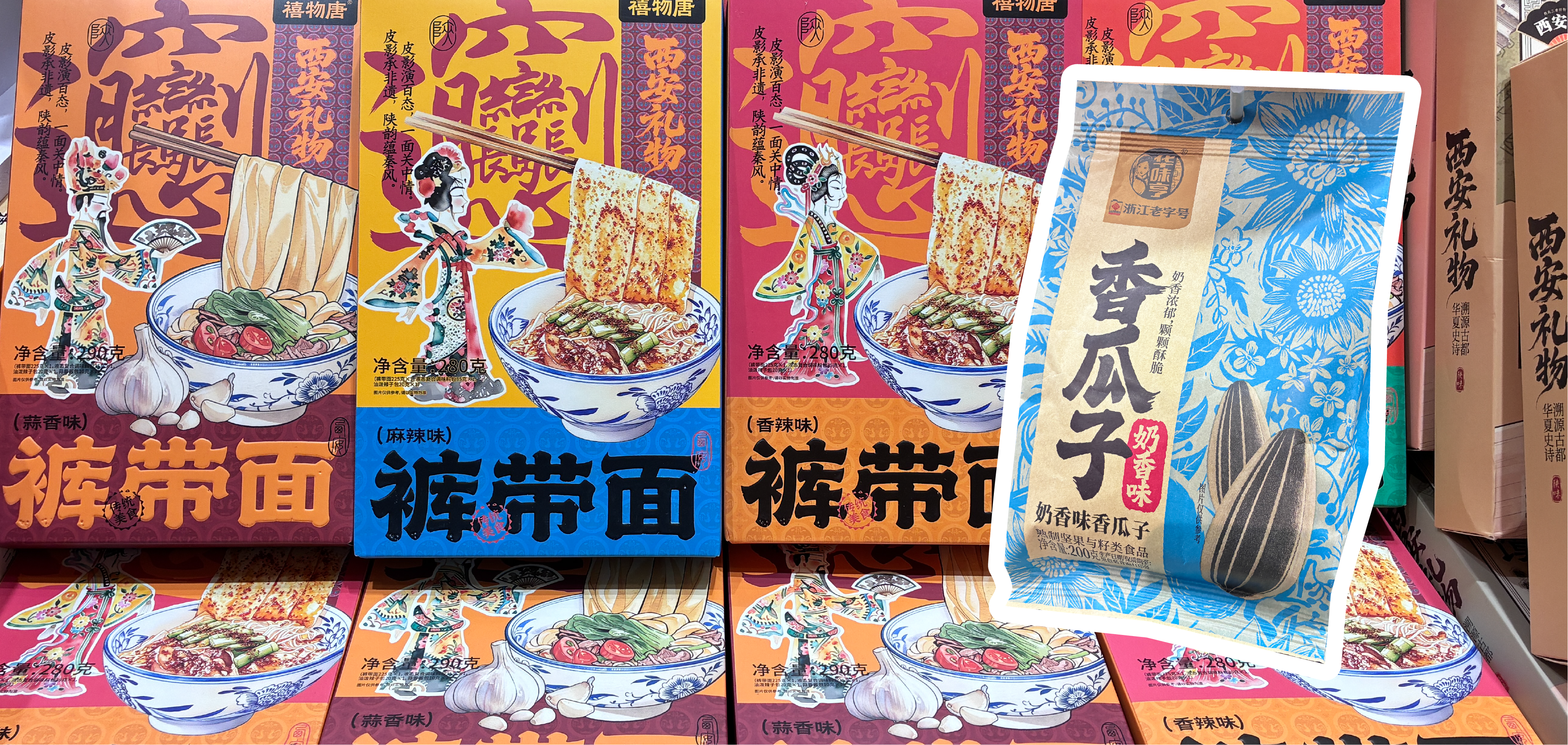
We also noticed premium-ness expressed through restraint just as often as through richness—some of the most upscale-feeling products on shelf won by being quiet and understated rather than loud.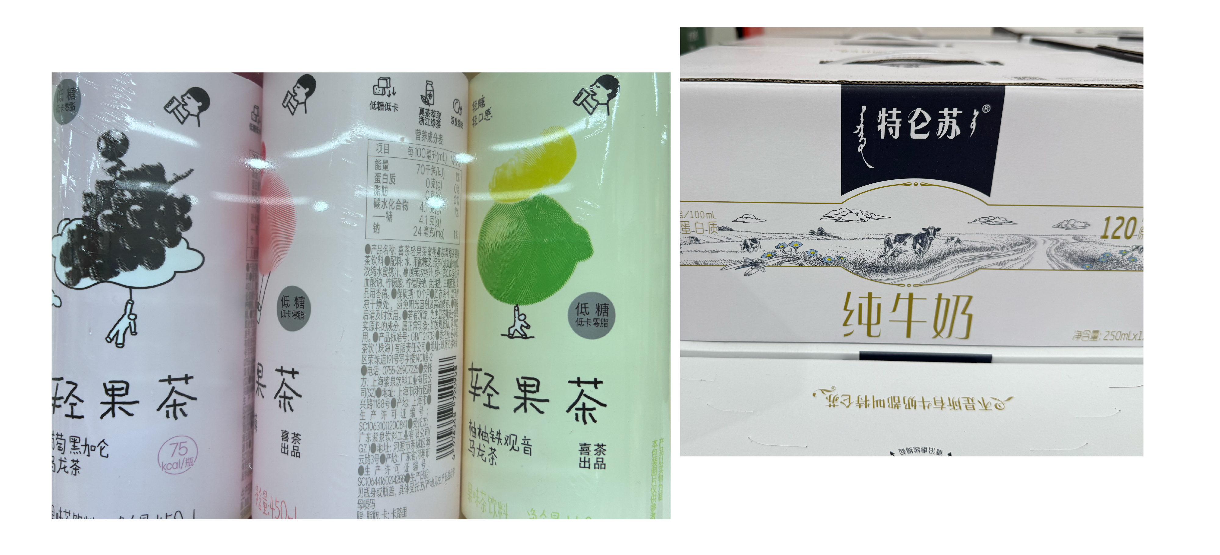
Structure as Signature
Some of the most memorable packaging wasn’t about graphics at all—it was about shape. Milk sold in bags. IV-style pouch drinks. Bottles with built-in handles or wrapped in printed sleeves. Uniquely shaped bags, like the ones used for Chocday. Candy wrapped in iridescent film that shifted color in the light. Beer cans and bottles borrowing an almost industrial silhouette. Water bottles with unique bottle structures. Each of these turned structure itself into a brand asset—ownable in a way no label alone could achieve.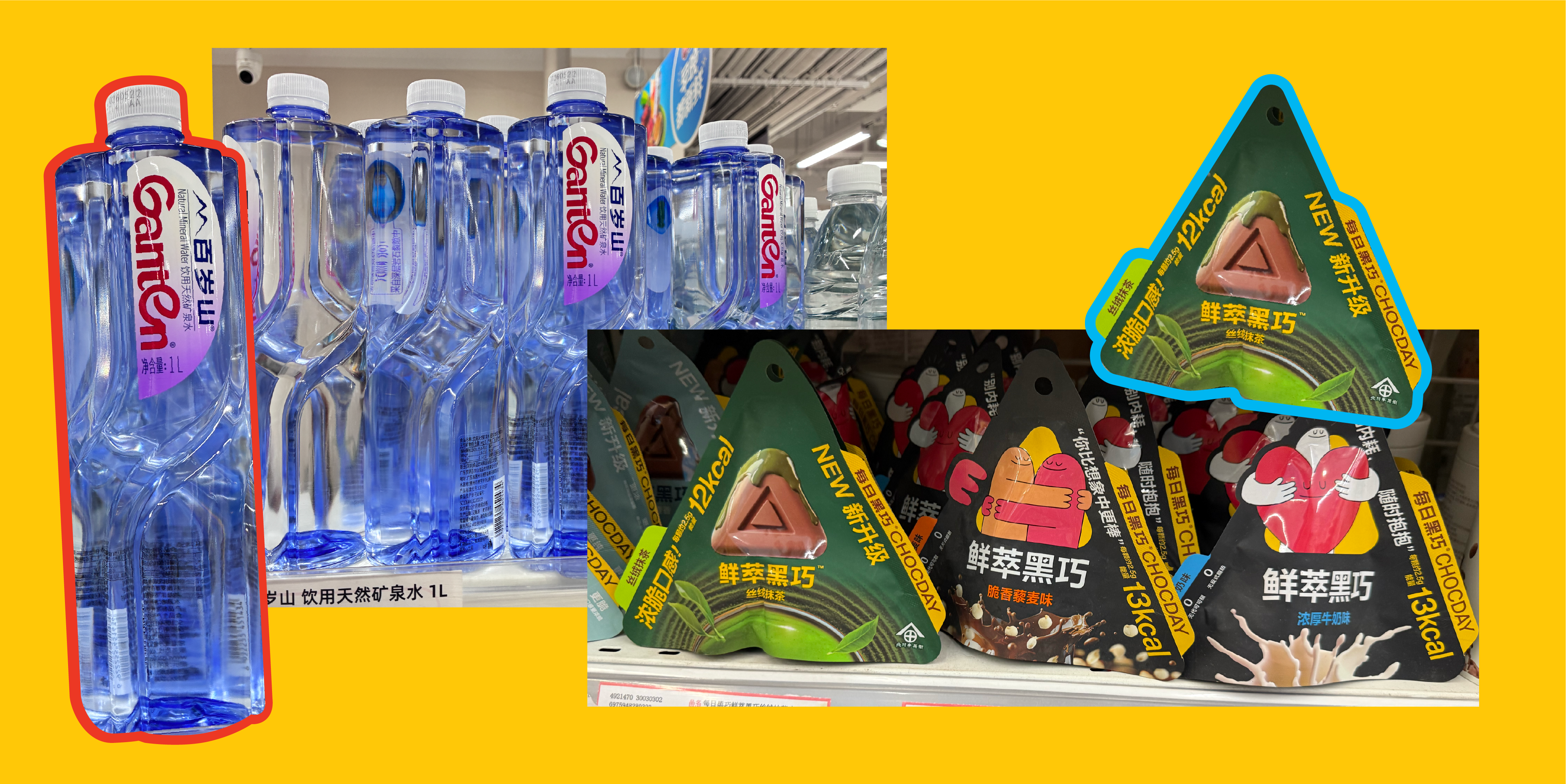
A Few More Things Worth Noting in Chinese Packaging Design and Signage
- Flavor profiles pushed further than we expected—citrus and herbal notes showing up in oral care, for instance
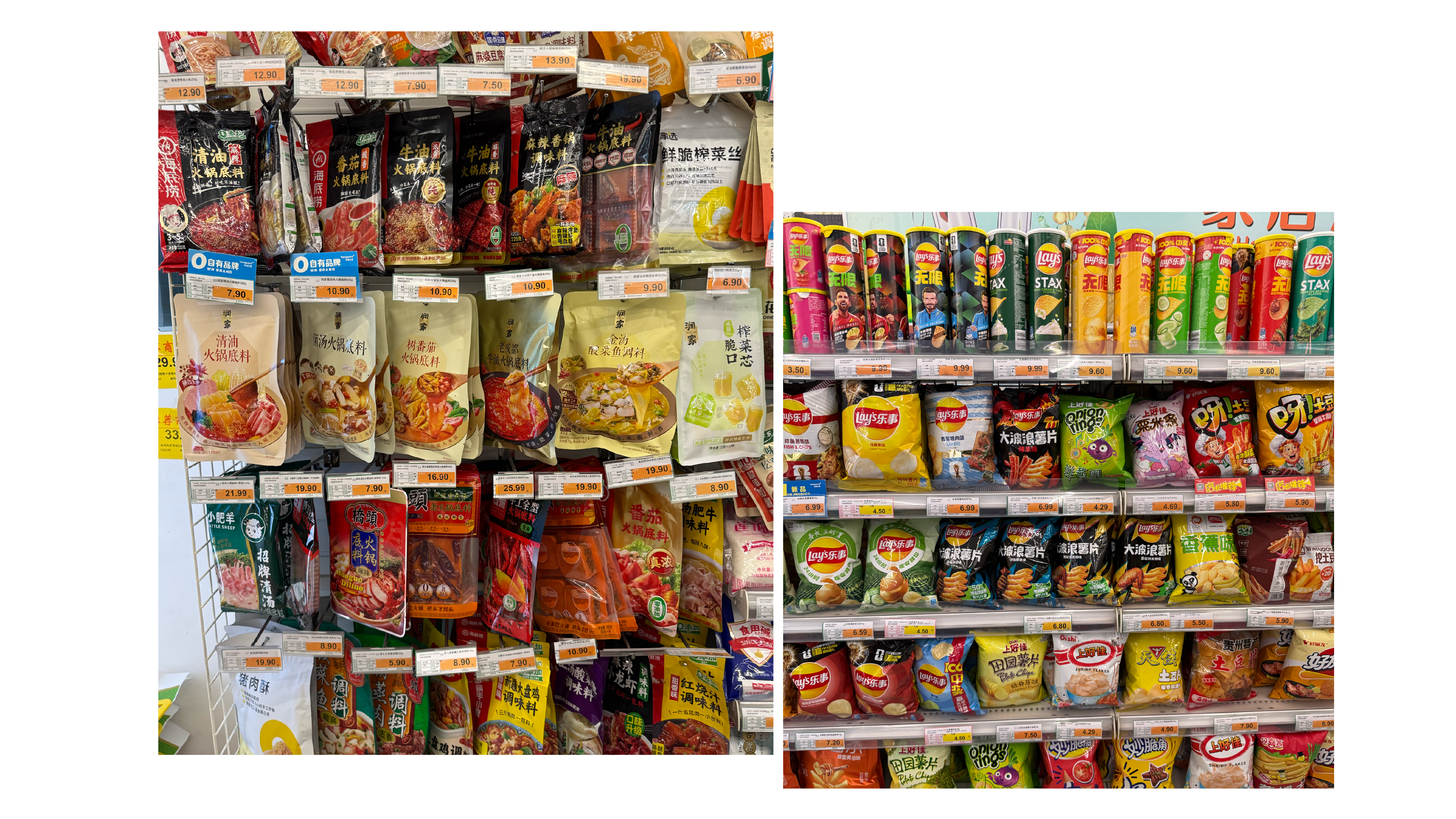
- Slanted peg-bag merchandising used to maximize shelf presence in tight spaces
- Snack packaging leaned more dynamic overall, driven by photography and sweeping, energetic graphics
- Robots — genuinely, robots 🤖 —making coffee and helping sell products in more than one store or kiosk
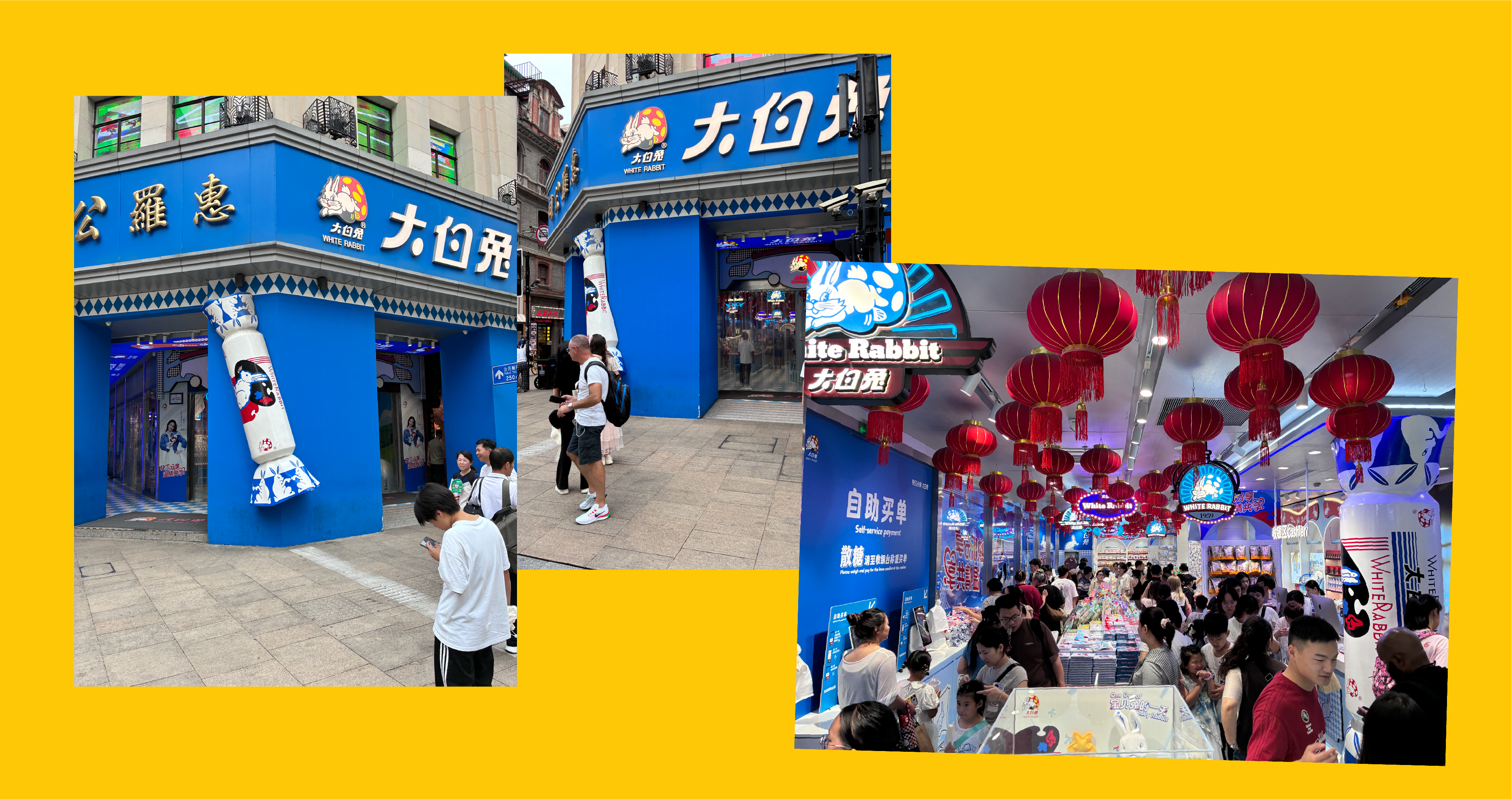
- The White Rabbit store, where the packaging itself became the signage, blurring the line between product and storefront
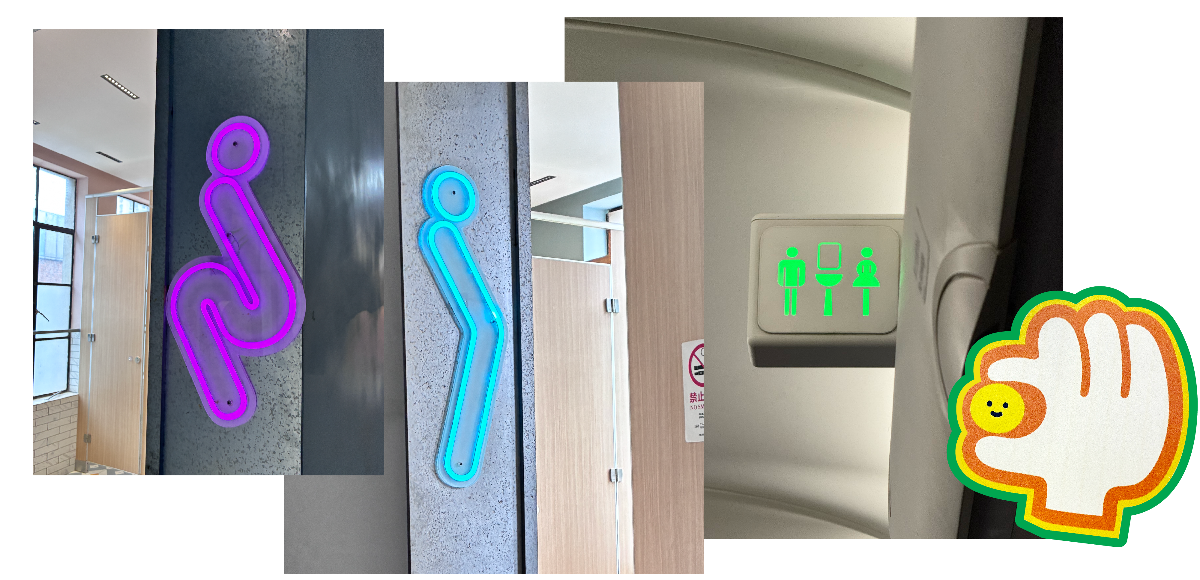
- Signage in general was excellent—confident, colorful, and clearly considered
The Takeaway
China’s packaging landscape is rich, referential, and unafraid of visual density—but it’s also disciplined about when to turn the volume down. It’s a market where color, structure, and imagery routinely do the job that text does elsewhere, and where premium materials aren’t reserved only for the top of the category.
For us, it was a reminder that great packaging design is a universal language—even when the words on the Chinese packaging designs aren’t.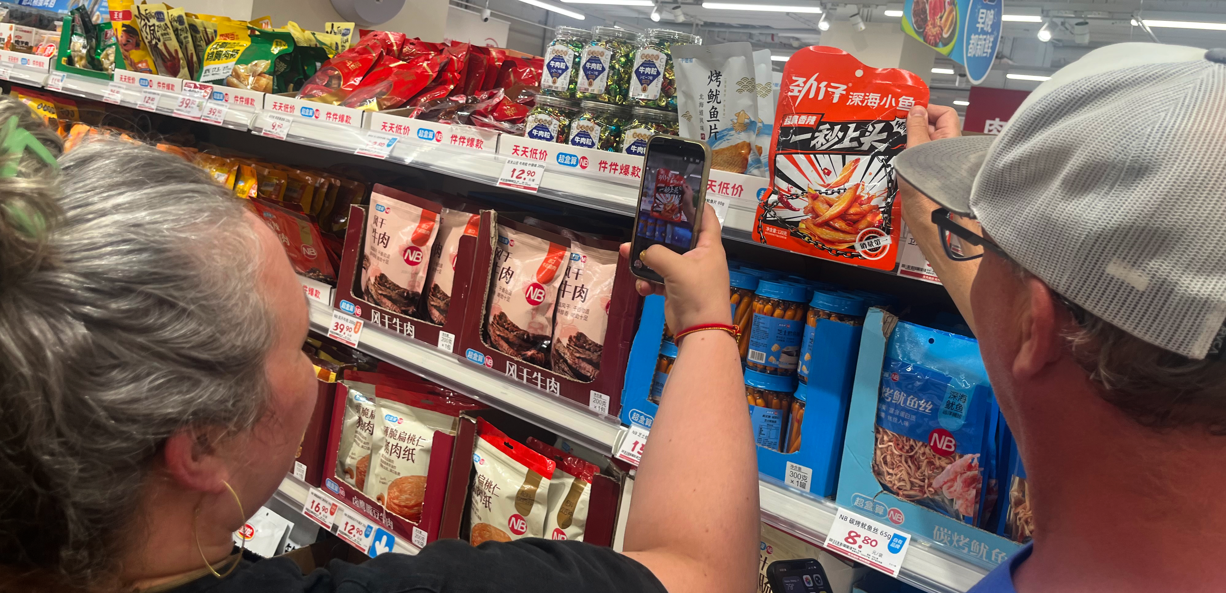
To continue exploring, check out this cool video about visiting Chinese supermarkets from Tina Lee or this one from More.Monaee. Read more from the Seedhouse team on our blog.