Eventually it was going to happen. Another big agency was going to rebrand themselves, using Helvetica. We’re calling them Helvetica Brands. Global branding agency Interbrand did it. And just like that, creativity dies another small death.
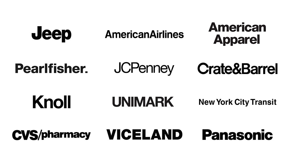
More Helvetica? Is that what creativity looks like in 2016? Because there seems to be a lot of this going around. Interbrand joins a long line of agencies and brands, present and past, who’ve used this classic typeface to communicate their brand’s personality to the world. Crate & Barrel. American Apparel. Viceland. JC Penney. Pearlfisher. Knoll. Jeep. CVS. Panasonic. American Airlines. Unimark. Cards Against Humanity. The New York City Transit Authority. Target. When does it stop?! Helvetica is a classic typeface, but decades of ubiquity and overuse have robbed it of the ability to make an emotional connection.
What is Interbrand, the firm known for building “breakthrough brands,” communicating with this logo change? That they are afraid, and would rather blend into the background of safe and familiar. That it’s too risky to say something different and take a stand. Hardly the behavior you want from your creative agency.
Sure, we’ve all heard the rationalization of firms — “But it’s not about us, it’s about the work! We’re just the white gallery walls for our clients!” Sorry, but we call BS on that. It’s just lazy, unimaginative design, dipped in the fear of true distinctiveness. Enlisting a tired typeface like Helvetica gives away one of the most powerful weapons a brand has — meaningful differentiation. For most organizations, it is the silver bullet. The secret sauce. The money play. Paired with a great product or service, powerful design helps change hearts and minds, while allowing a brand to truly stand out from the noise and connect with the right audiences.
So, let’s just say it. Creating a brand identity using Helvetica is irresponsible.
There are so many proper ways to tell a story visually. Our clients come to us because they believe it’s important to have a point of view in the world, a distinctiveness that will set them apart from competitors and capture mindshare in their markets. We are excited (and obligated!) to do that for them. And that means saying no to Helvetica.
Update: VelvetShark did a recent post that further catalogued the trend. Check it out and let us know what you think.