Designing to leap across the pond.
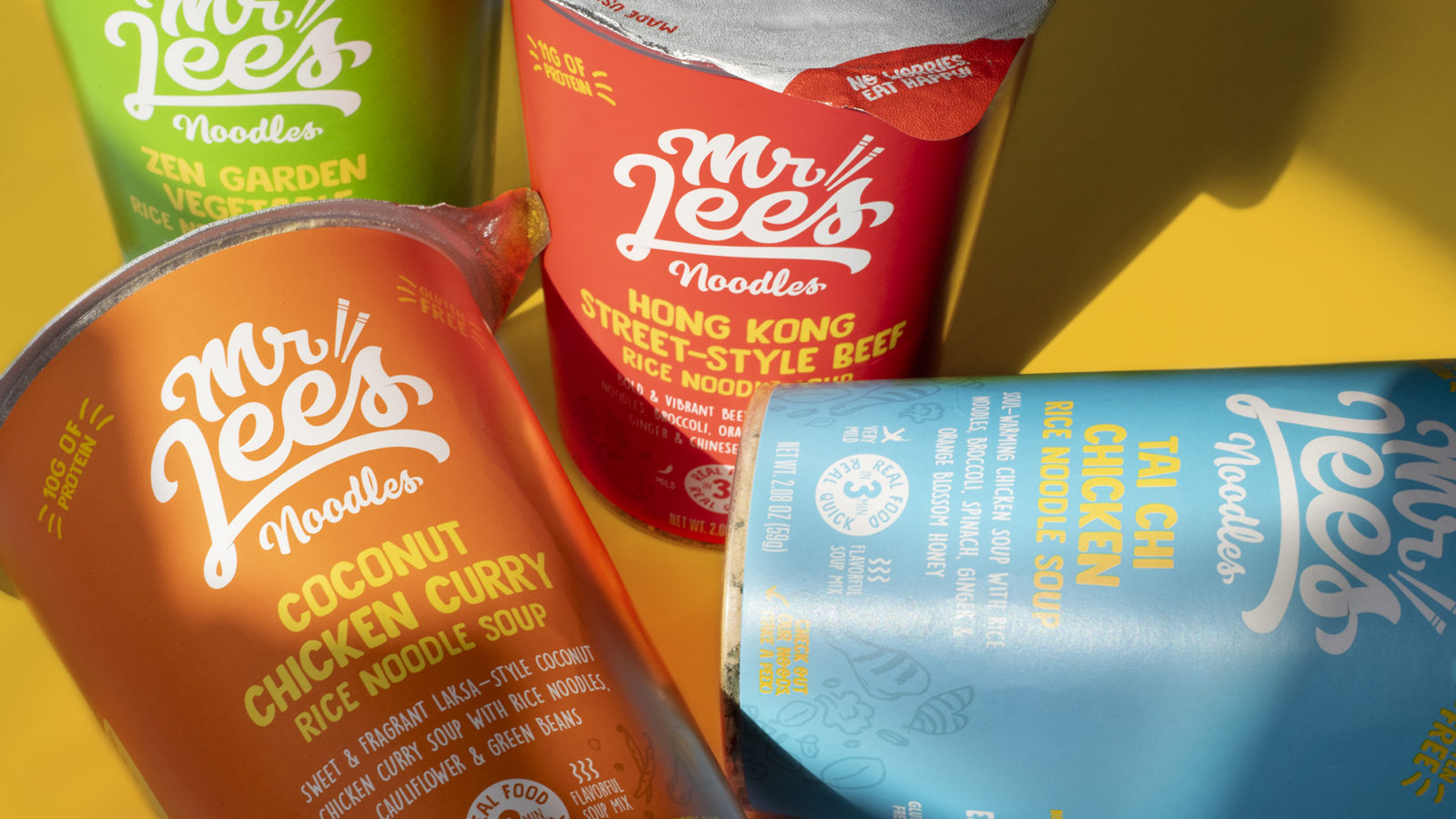
Mr.Lee’s is an instant foods brand based in the U.K. that passionately believes that everyone has the right to quick, honest, and tasty food. Featuring low sodium and real, freeze-dried protein, Mr. Lee’s is a brand of instant real foods that has gained popularity in Europe and Australia. Looking to break into the U.S. market via Whole Foods, Mr. Lee’s Noodles needed help optimizing their packaging to catch the eye of U.S. consumers.
Overview
Client: Mr. Lee’s Pure Foods
Delivered: CPG Redesign Update, Package Design System, Line Extension, Icon Design, Custom Illustration
Careful market audits and consumer research yields high impact, effective designs.
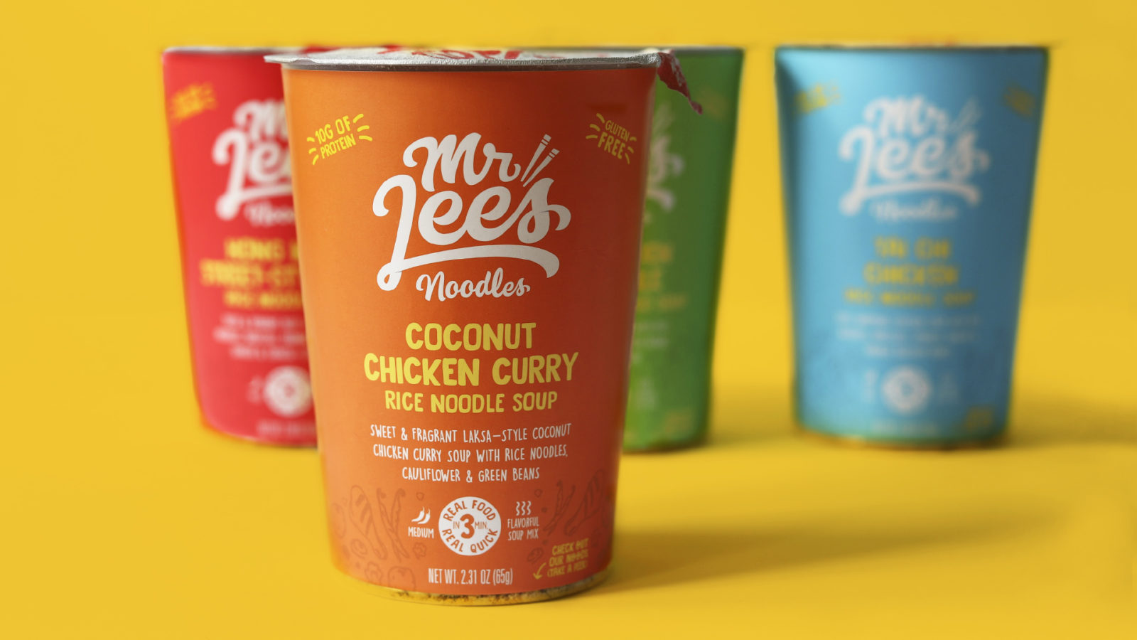
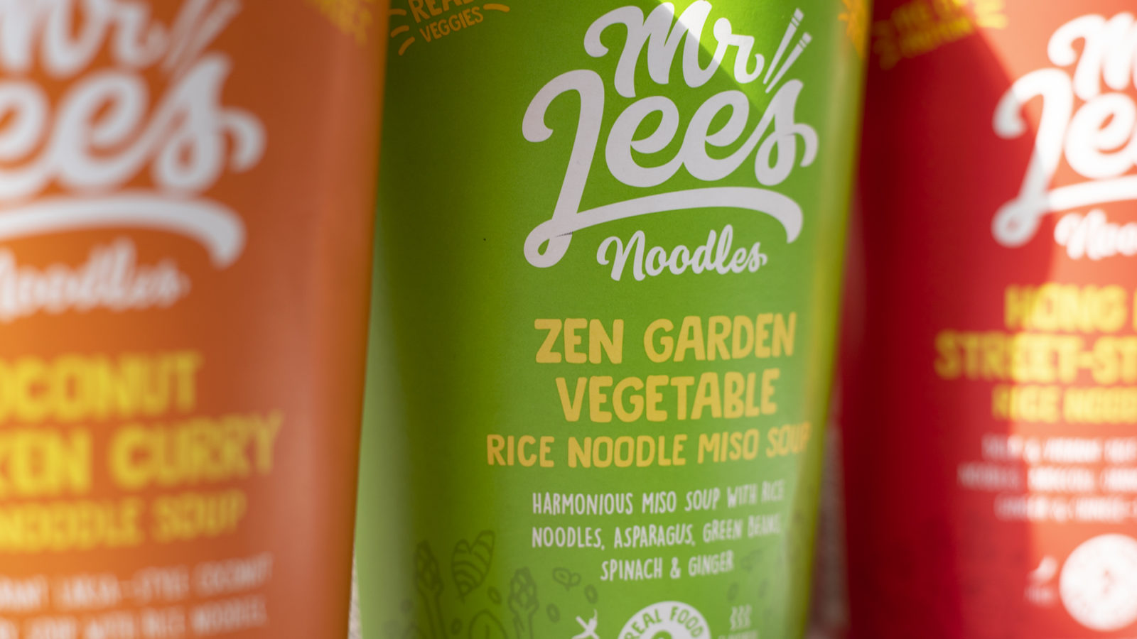
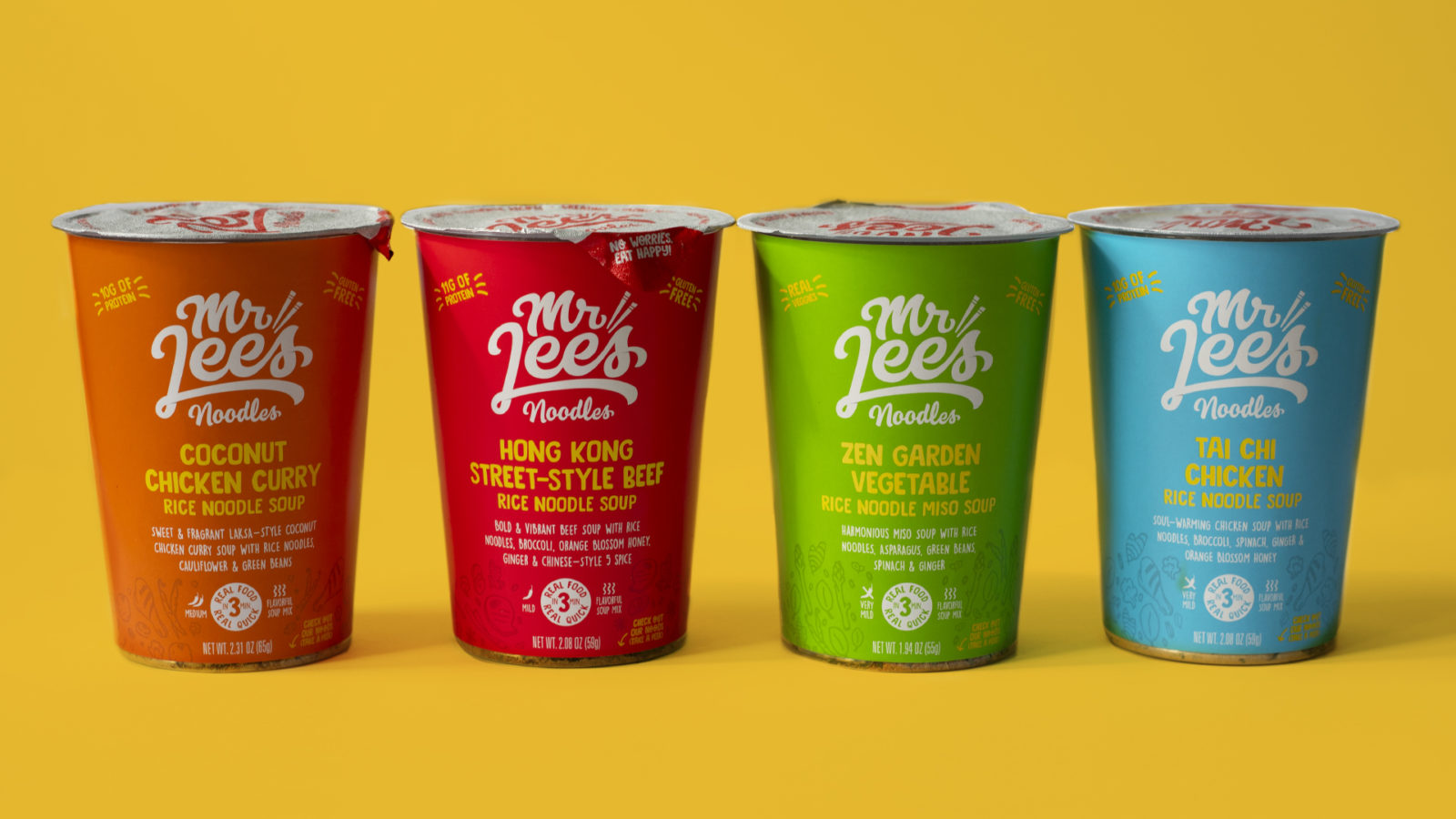
Relying on our market audit and observations, we optimized the already-great packaging to enable a quicker read on-shelf in U.S. markets and upped appetite appeal to get in the carts of shoppers. After running designs through consumer testing to validate messaging and communication hierarchy, our end result is a package that features hand drawn illustrations to cue flavor, an improved nomenclature system for key messaging, and adjusted marketing copy—all working together to stand out against competition and help communicate a fun, authentic, delicious and healthier alternative to other dried instant noodles on shelf.
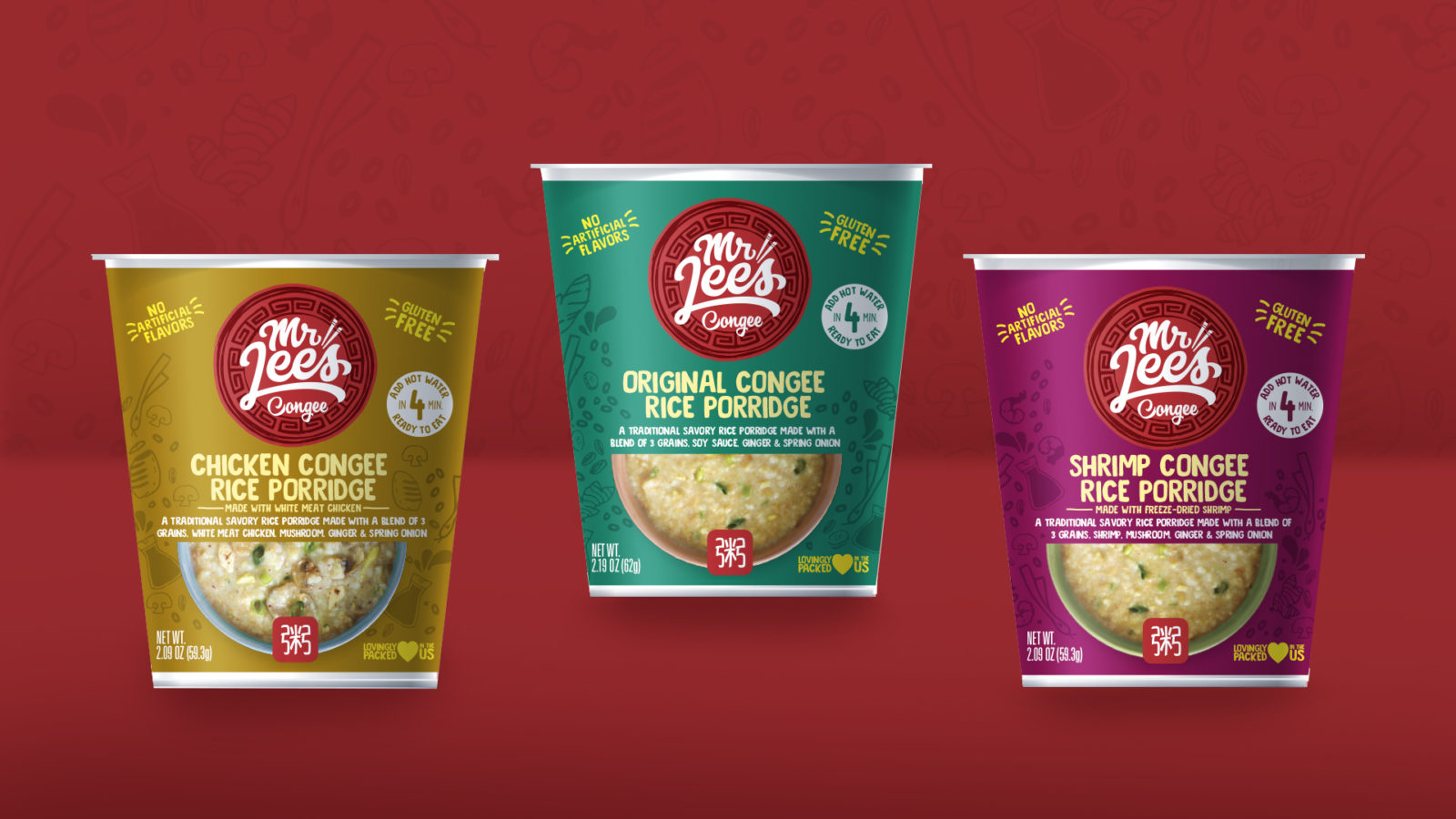
A Line Extension dependent on clear communication
After the launch of their noodles line, Mr. Lee’s looked to introduce Congee, a traditional Chinese savory rice porridge, into to the American market—the first of its kind available in standard U.S. grocery stores. Because the product is so new to the American consumer, we re-worked the design system to be able to more clearly communicate the offering, while separating it from the noodles line.
Food photography works with a differentiated brandmark inspired by Chinese longevity plates to highlight congee’s origins, while photography of the congee in colorful bowls paired with familiar tone on tone flavor illustrations helps to communicate flavor and up appetite appeal.