Redesigning Military Grade Gum for consumers
MEG, or Military Energy Gum, was established in 1998 by the former gum chemist behind Big League Chew, Hubba Bubba, Bubble Tape, and many more iconic gum products. Military Energy Gum and the U.S Military have worked together since 1998 to help stop fatigue-related injuries and deaths. Military Energy Gum is the portable, fast-acting energy source that military, law enforcement, and all frontline responders can depend on.
Overview
Client: Ford Gum
Delivered: Logo Refinement and Packaging Design Refresh, Point of Sales Displays, Packaging Guidelines

Refining the familiar with meaning
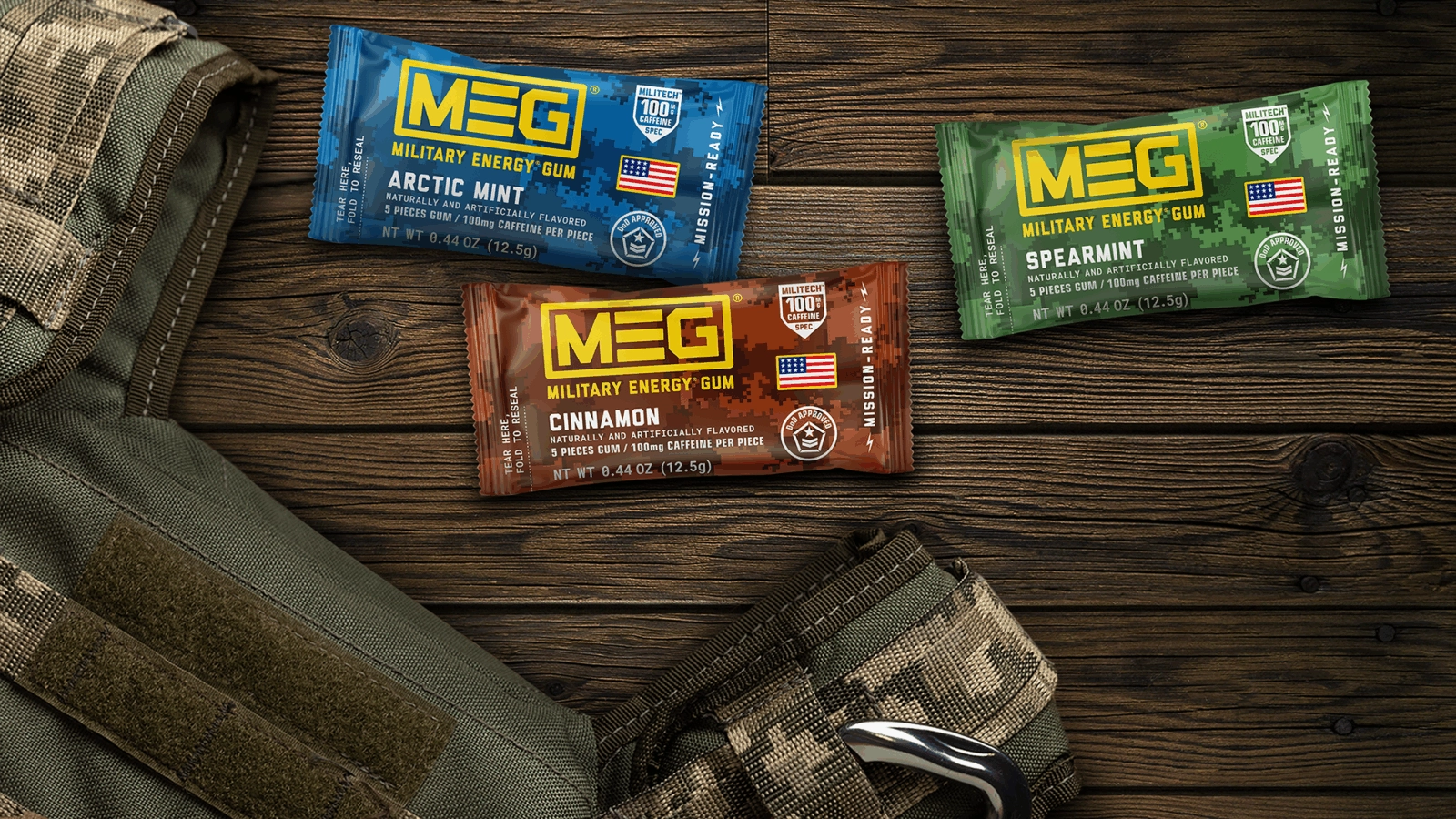
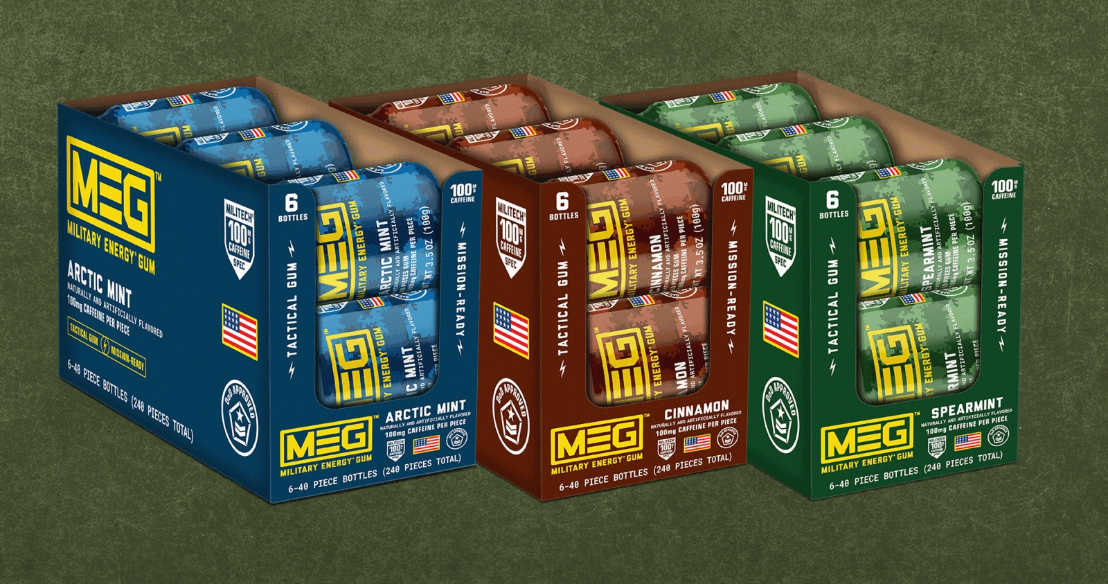
To update the brand and packaging, Seedhouse worked to retain the brand assets that meant something to the target audience – the background camo pattern, the Department of Defense rating, the MEG acronym – but spun them to have a more contemporary presentation. We updated the camo pattern to the more current digital camo pattern.


Military Design Influence
The brand logo was designed to have a bold, proud, badge-like presence, evoking the stripes of military rank in the “E” letterform. The packaging typography evokes military documents. The iconography includes the American flag for US pride, and shields and badges reminiscent of squadron patches.


Upping experience & Flavor
The flavor colors are bold to indicate the boldness of the experience, but retain the previous flavor color ways so as not to turn off or confuse existing fans of the gum. The overall effect is a packaging design system that looks equally at home in a go bag, a gym bag, kit bag or assault pack.


