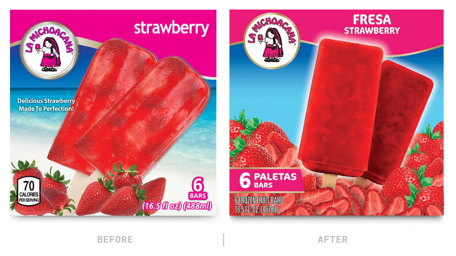
Subtle changes lead to a big brand difference.
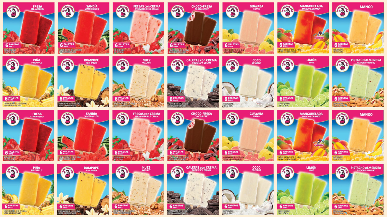
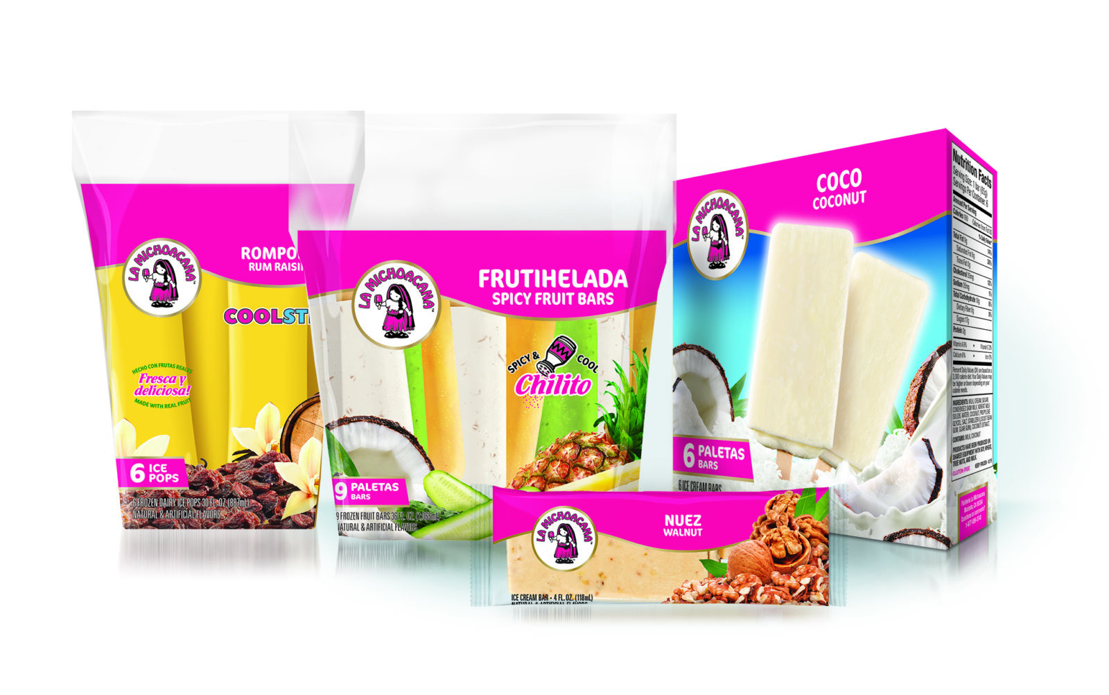
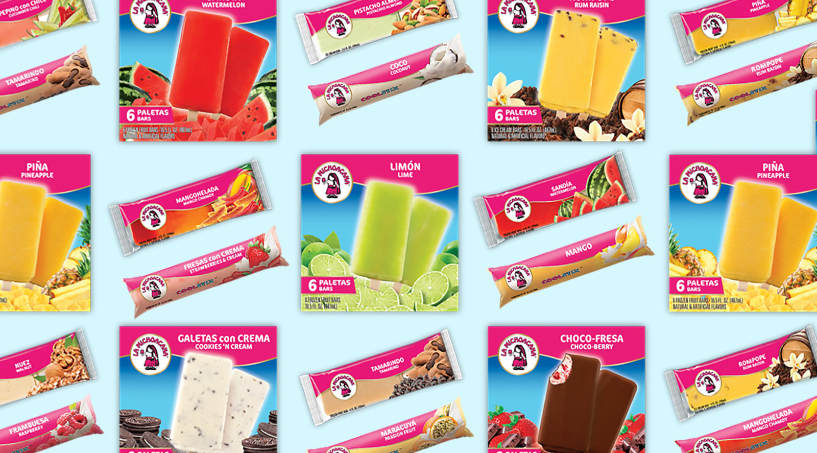
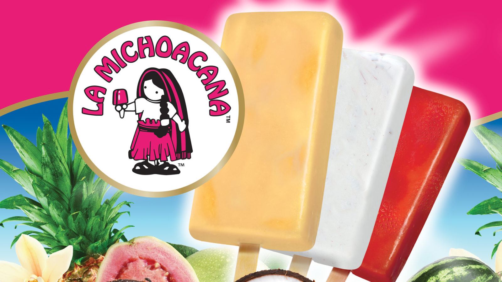
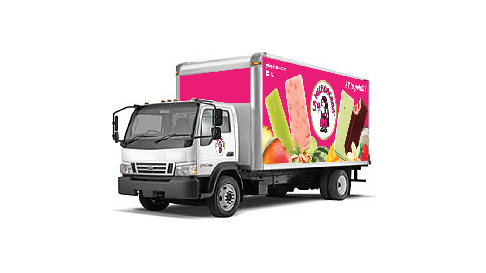
La Michoacana is an authentic heritage brand with a robust and loyal following that supplies paletas (ice cream & fruit bars) and other ice cream form factors, including cups and bolis. The brand is such a recognizable staple with its core market that it soon became apparent that we had to preserve the brand’s most foundational assets: its logo and the visual wave of hot pink color.
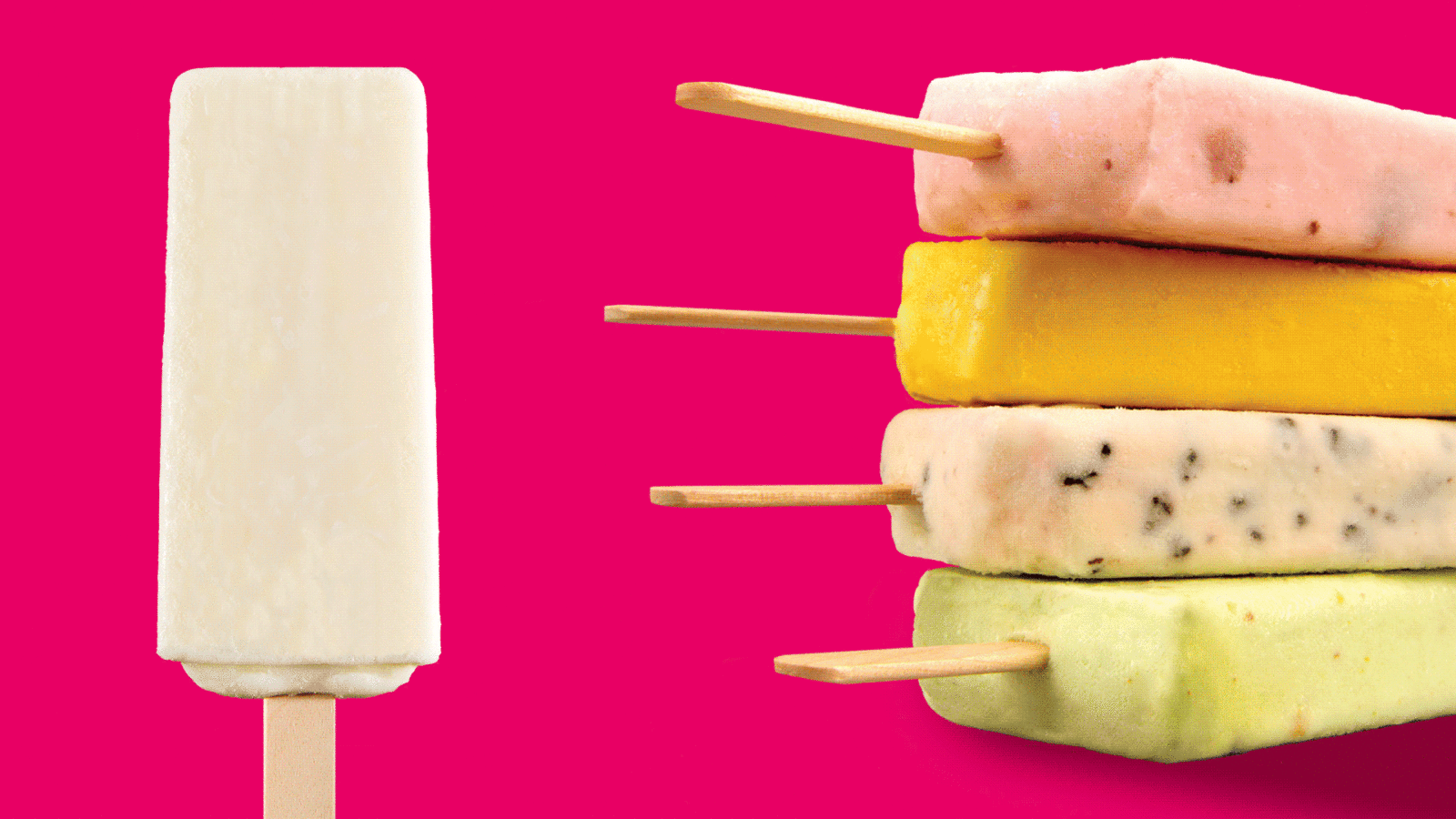
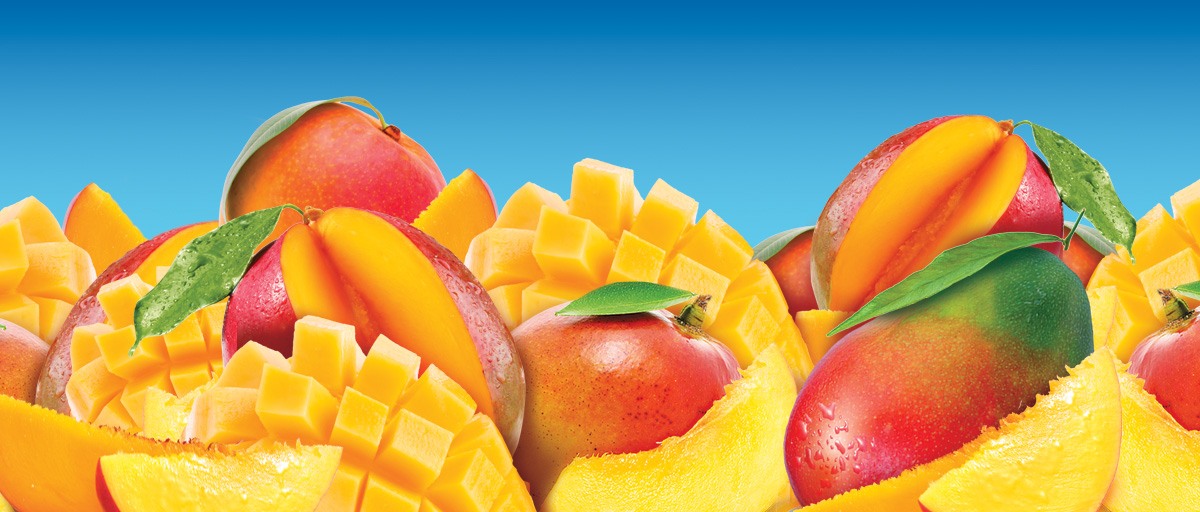
Our job was to carefully update the La Michoacana packaging design while maintaining the brand’s authenticity and nostalgic appeal. We polished the logo, re-shot product & ingredient photography (to better cue fresh fruit flavor, quality), and created brand guidelines to help make for a stronger brand & package design system. The result is a bold & energetic presentation that keeps growing!
Overview
Client: La Michoacana
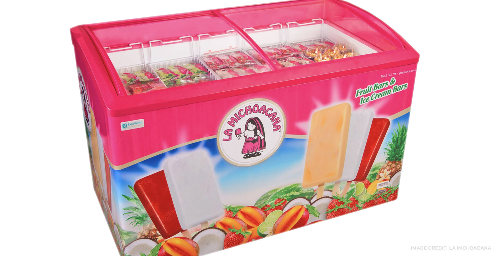
Delivered: Brand update, CPG Redesign, Package Design System, Product Renderings, Icon Illustration, Line Extension, Photo Art Direction & Retouching, Box Truck Wrap design, Retail Freezer case Design.

")