
The Challenge—The Bakery Aisle had a Joy Problem.
For gluten-free shoppers, the bakery section of a grocery store has historically been a place of quiet resignation. Packaging that communicates “safe” rather than “special.” Visual design borrowed from to-go containers—muted, functional, meant for disposal. The implicit message: you can have a cookie, but don’t expect it to taste good.
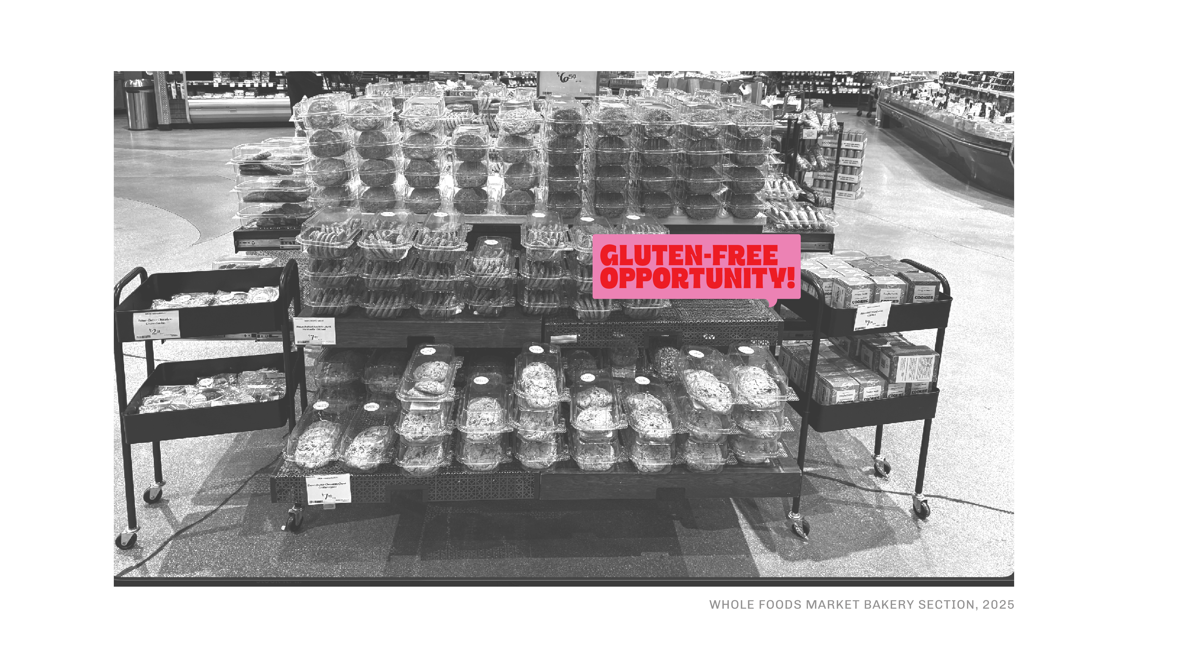
Butter + Sugar was founded on the radical premise that this is completely backwards.
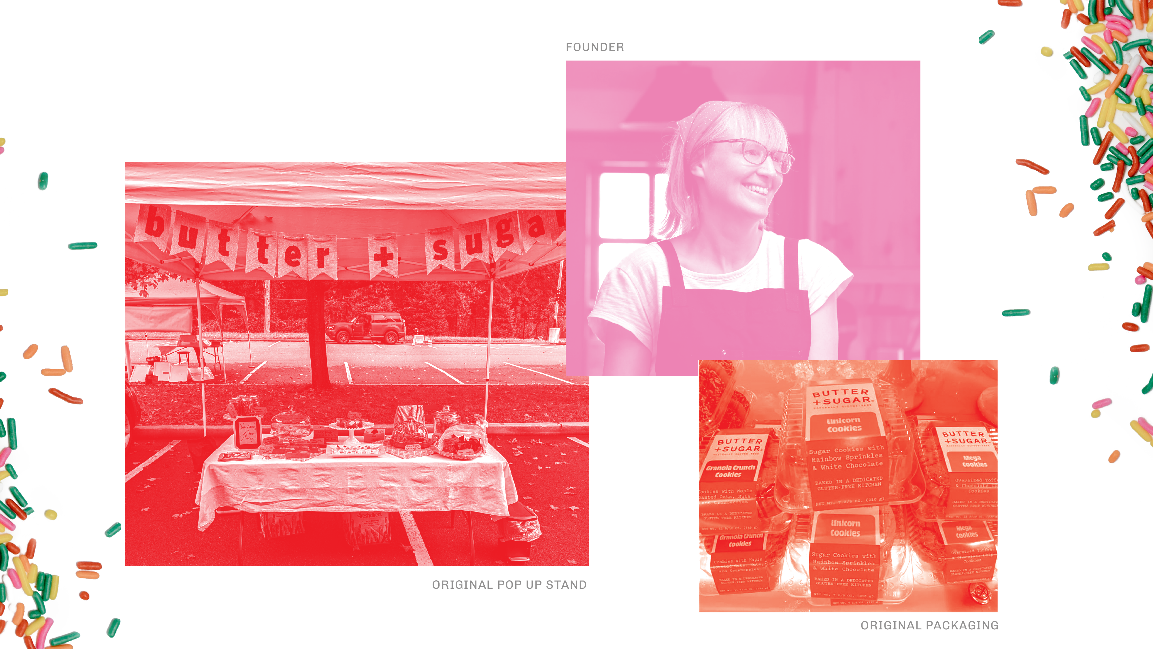
Maya, a mom whose son has Celiac disease, set out to develop certified gluten-free cookies with the flavor and texture of the real thing—cookies with crispy edges and chewy centers, bold mix-ins, maximalist flavors, and the kind of personality and taste that makes you reach for a second one. She proved the concept at farmers markets in Stamford, CT, building a loyal following one bite at a time.
The challenge Seedhouse was brought in to solve: how do you take that farmers market energy—warm, personal, genuinely delicious—and build it into a brand and packaging system that can command space in a competitive grocery bakery environment, speak to gluten-free treat seekers with authority and joy, and scale into a true CPG brand? The bakery section needed shaking up, and Butter + Sugar was exactly the brand to do it.
Overview
Client: Butter + Sugar
Delivered: Brand Strategy, Concepting, Structure Design, CPG Packaging Design, Package Design System, Brand Identity Redesign, Print Management, Trade Show Booth, Brand Extension Design, Brand Guidelines
Brand Positioning
The target audience—gluten-free treat seekers searching for comfort, joy, and a special treat for themselves, their guests, and their families—isn’t just looking for something they can eat; they’re looking for something that makes them feel like everyone else at the party. “Normal”. Happy. Reassured. Celebrated. That’s the emotional job this brand has to do every single time someone picks it up off the shelf.
Brand Definition
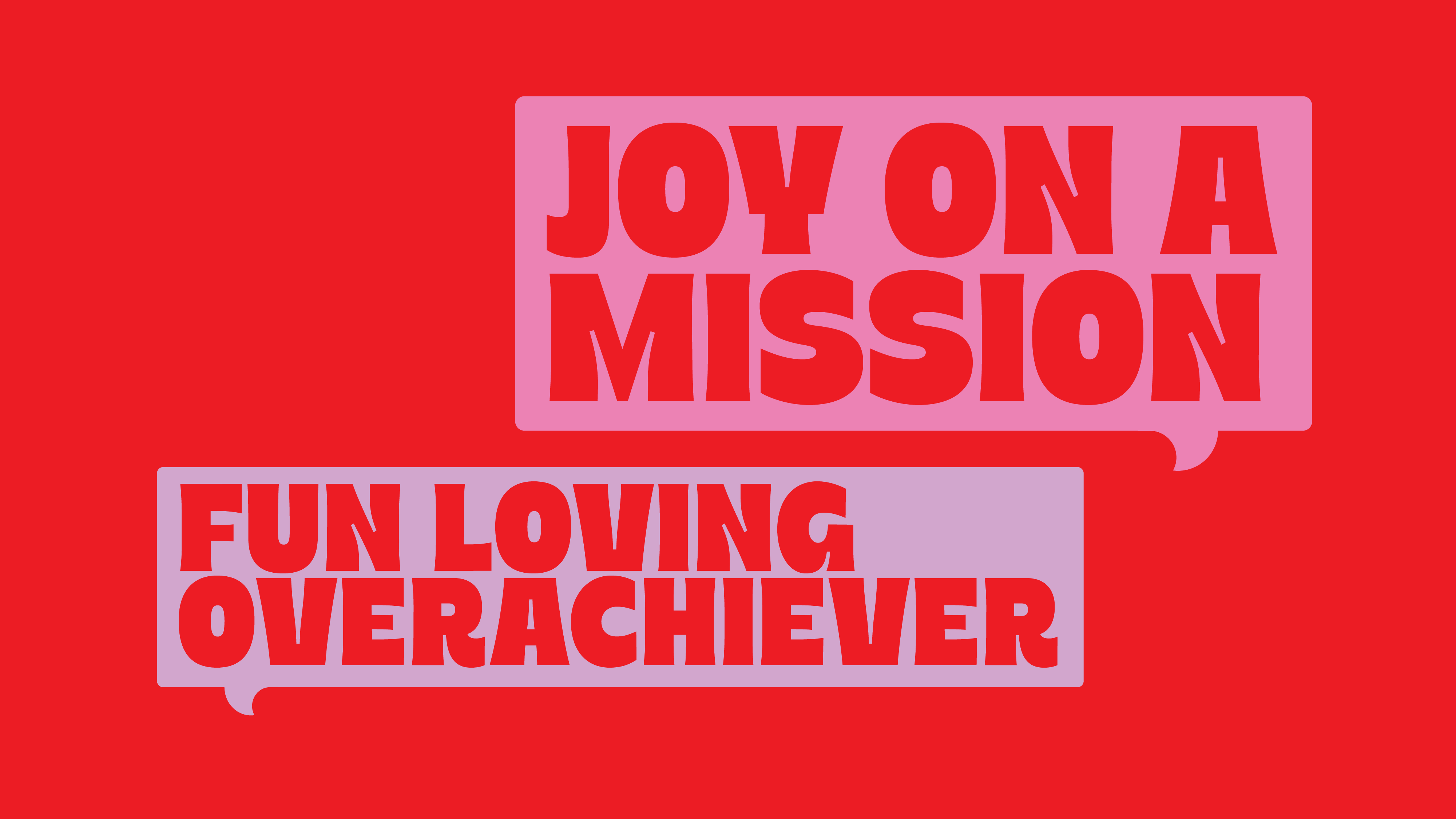
Before a single design direction was explored, Seedhouse did the strategic groundwork to make sure the brand had a real point of view. The brand Big Idea, Joy on a Mission, captures exactly what makes Butter + Sugar different: this isn’t a “free-from” brand that settles for okay. It’s a brand that overachieves on every axis, driven by genuine purpose and real parent experience.
The brand personality—Fun-loving Overachiever—gave the design team a precise brief. Not just playful. Not just premium. Both, at full volume, without apology. Think: the friend who shows up to the potluck with something homemade, gorgeous, and delicious, and also remembers the dietary restrictions of everyone in the room. That’s the energy Butter + Sugar needed to project from twelve feet away in a busy grocery store.
A Full-System Build, From Strategy to Shelf
This was end-to-end brand development—a complete design system built to take a beloved local brand to a national retail stage. The deliverables spanned every touchpoint a growing CPG brand needs to compete and scale.
The strategy phase defined the brand’s competitive territory, its audience’s emotional needs, and the visual codes we’d need to make Butter + Sugar feel completely different from anything else in the gluten-free set. The decision was clear: don’t compete with other GF brands. Be the most exciting thing in the entire bakery section. Set the bar there. And fortunately for the brand, the bakery section usually is a sea of plastic clam shells.
That strategic choice cascaded into every design decision that followed — from the energy of the identity to the structure of the packaging to the boldness of the color system.
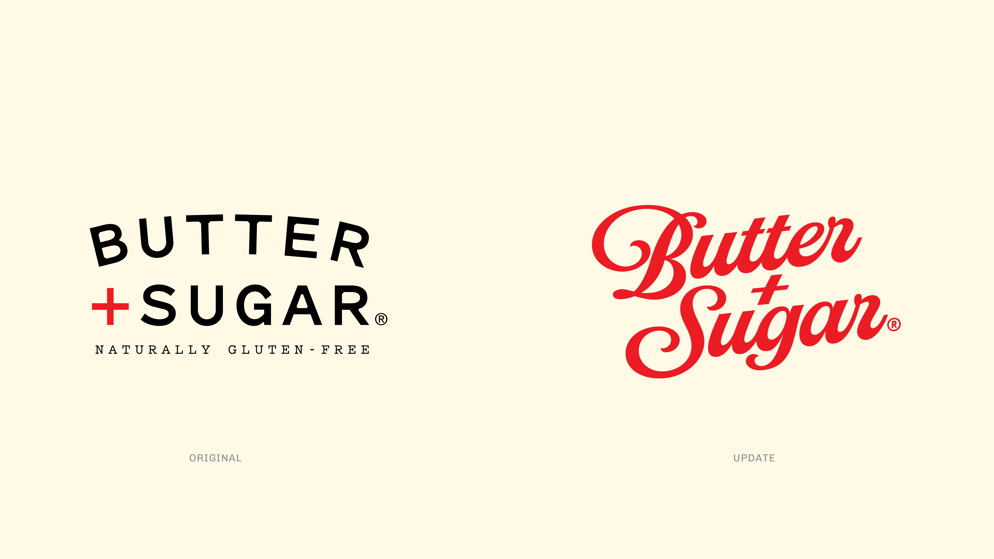
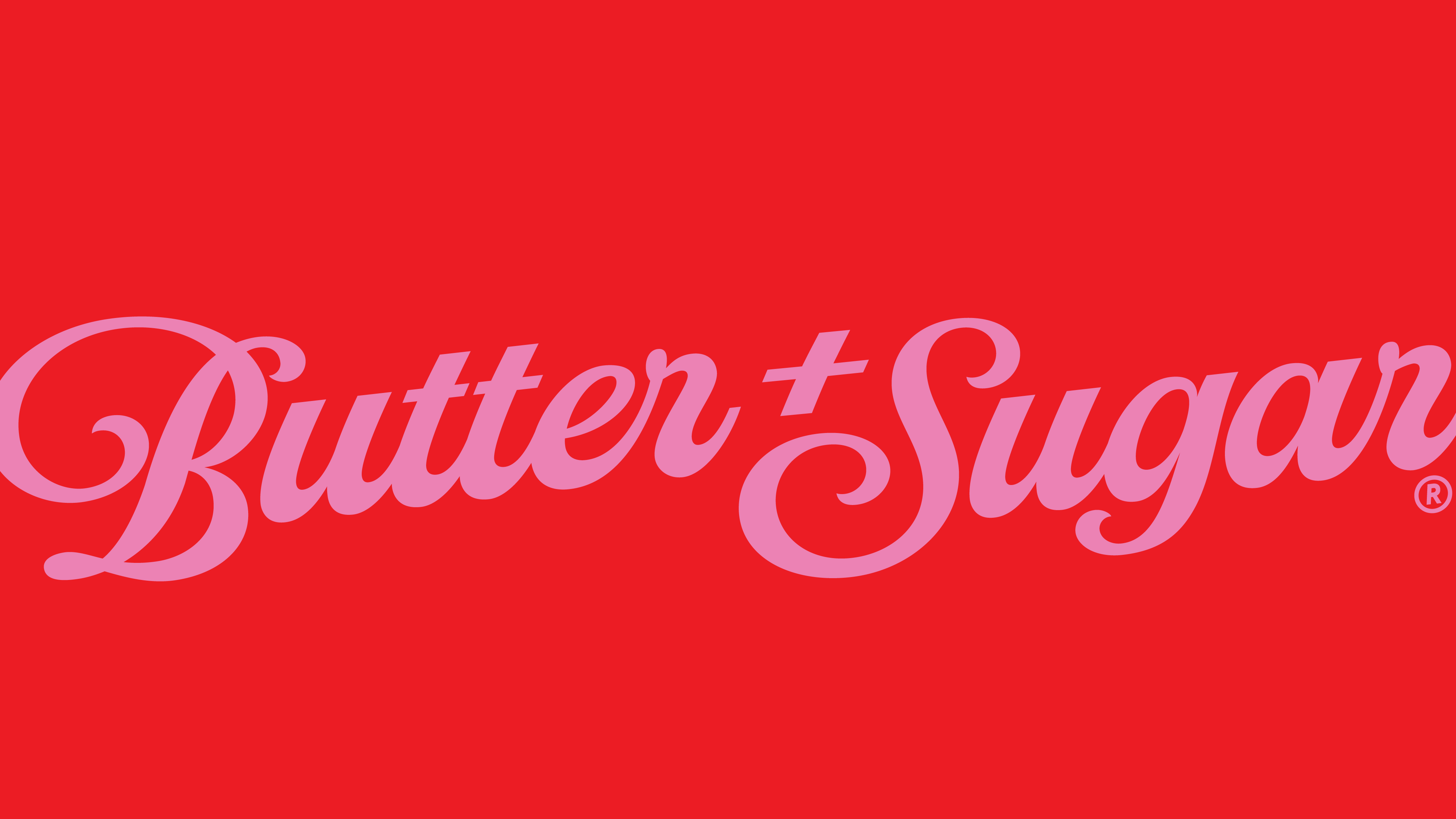
An Identity Built for the Party
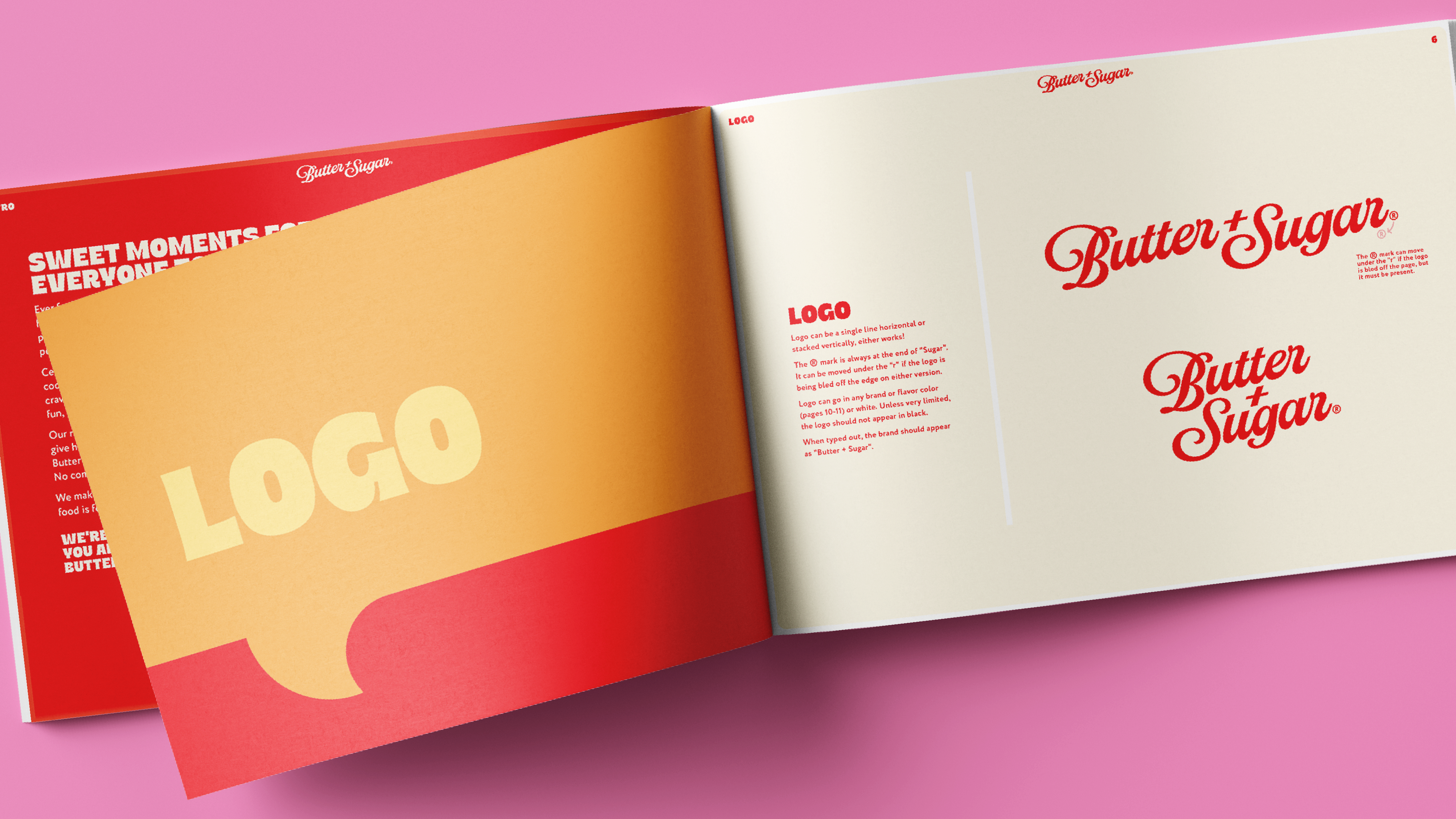
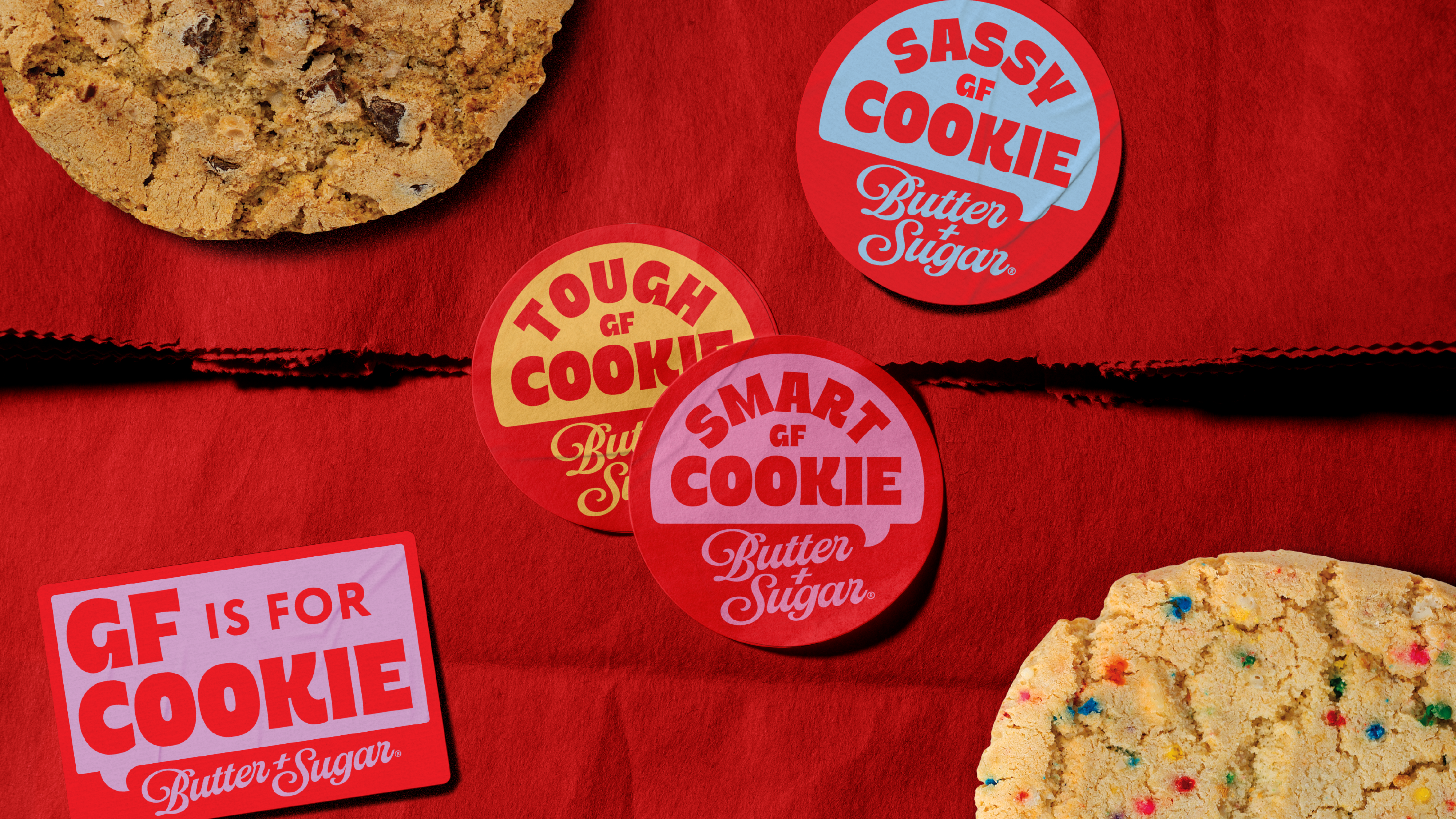
The brand identity redesign had one job: make Butter + Sugar feel like an invitation. The visual language needed to be festive and premium without being too corporate, and recognizable from across a busy retail floor. We built a mark that carries genuine warmth and energy; the kind of brand you’d be proud to hand across a table at a dinner party and just as happy to pull out of your grocery bag.
Packaging That Earns Attention—and Loyalty.
The bakery section is a visual fight of plastic clam shells selling goods tailored for the latest holiday or season. All competing for the same two-second window of shopper attention. Gluten-free products have historically opted out of that competition, leaning on a niche audience to find them in the center of the store or on a dedicated shelf. Butter + Sugar was designed to win the fight outright — to be the most exciting thing in bakery, not just the most exciting thing in the GF corner.
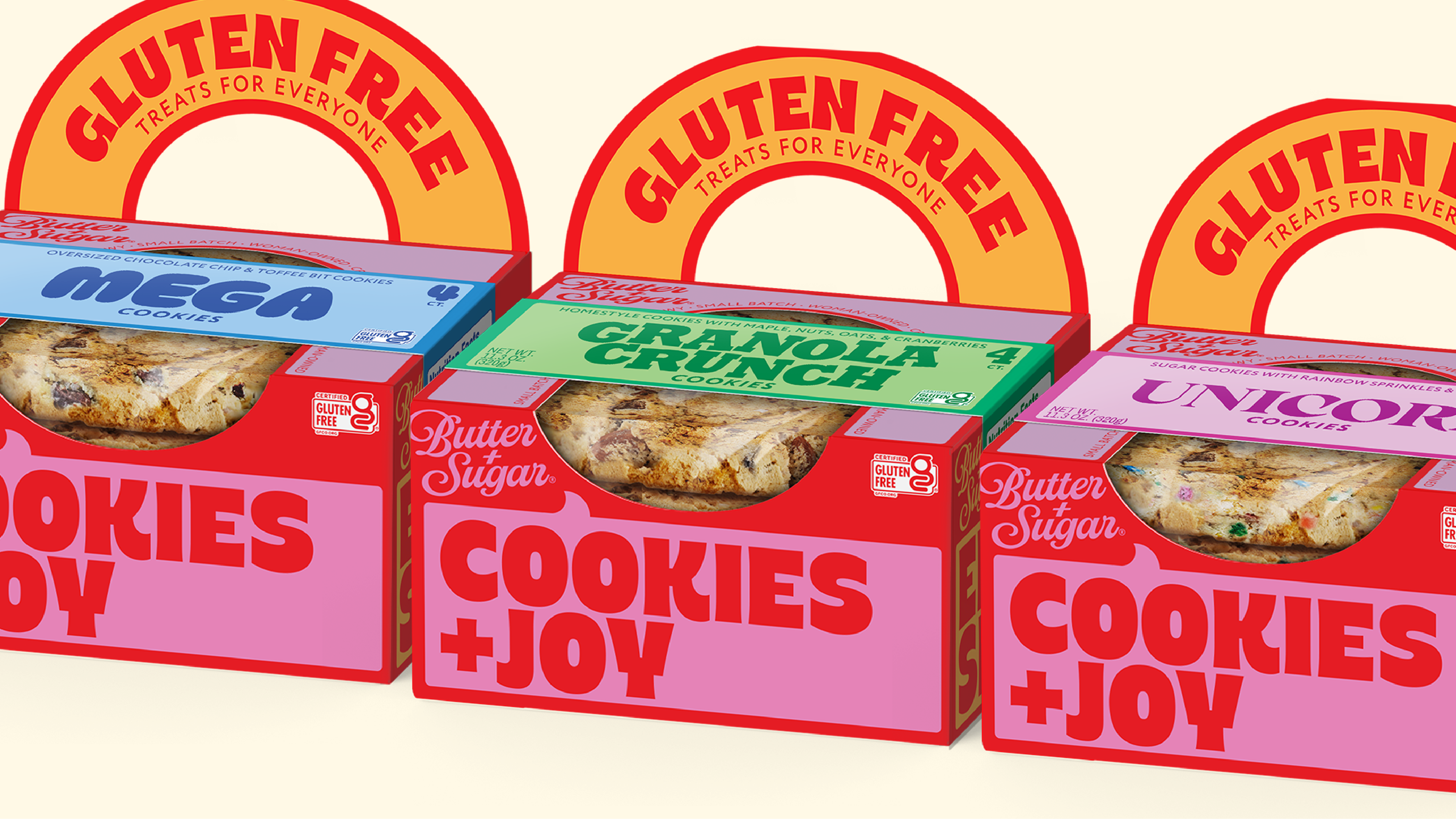
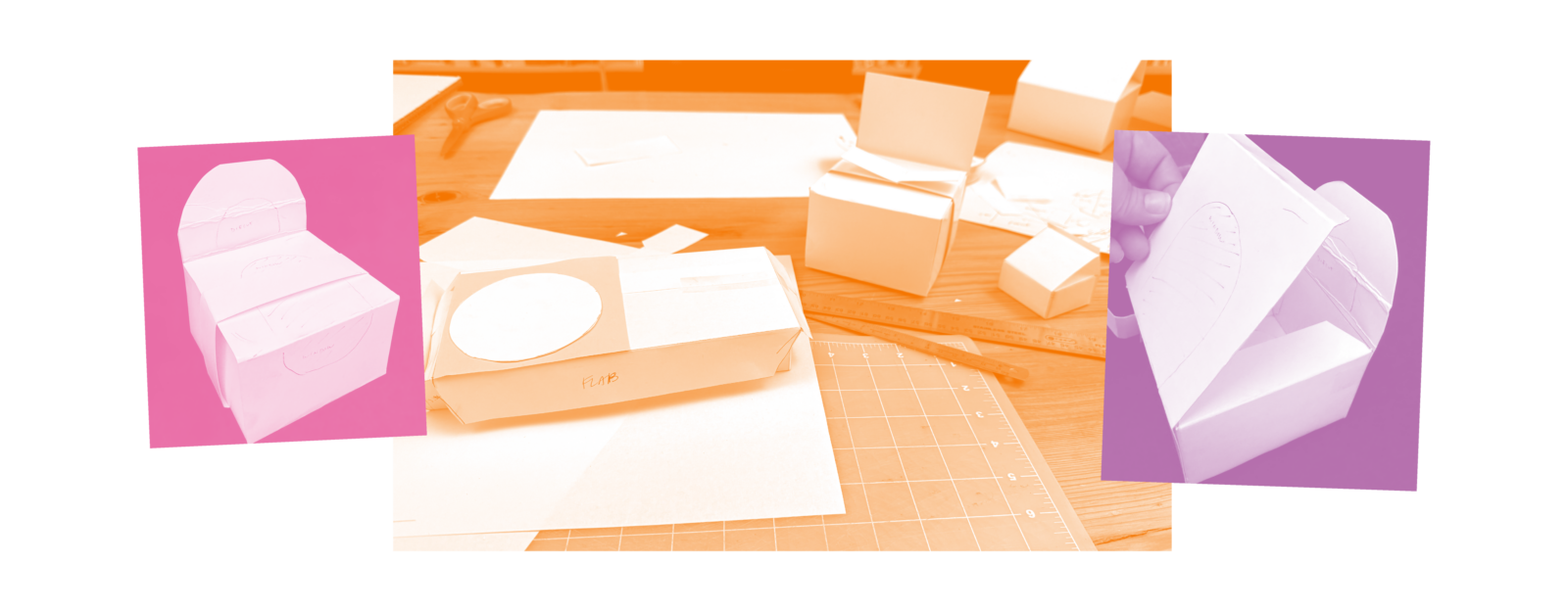
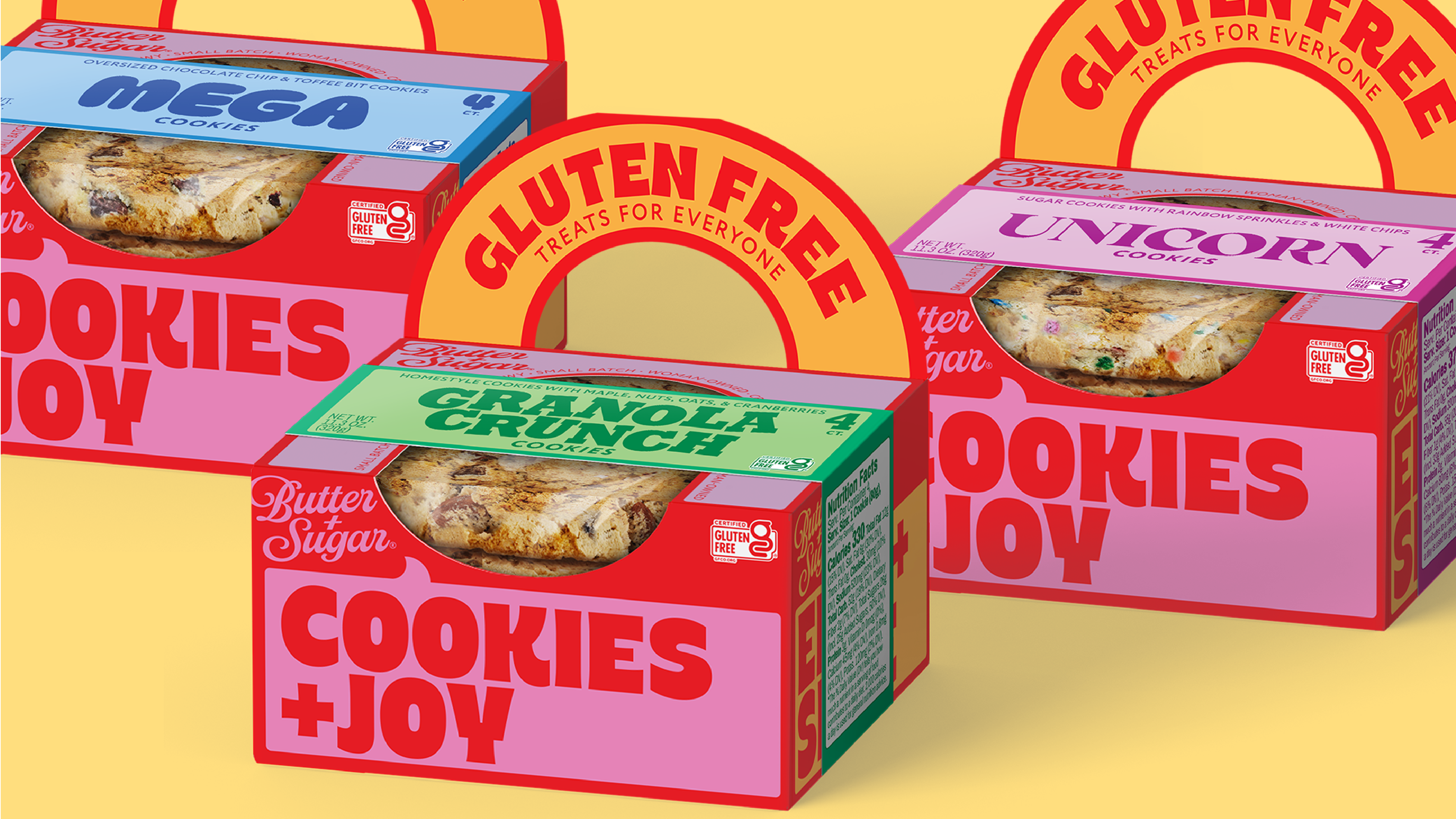
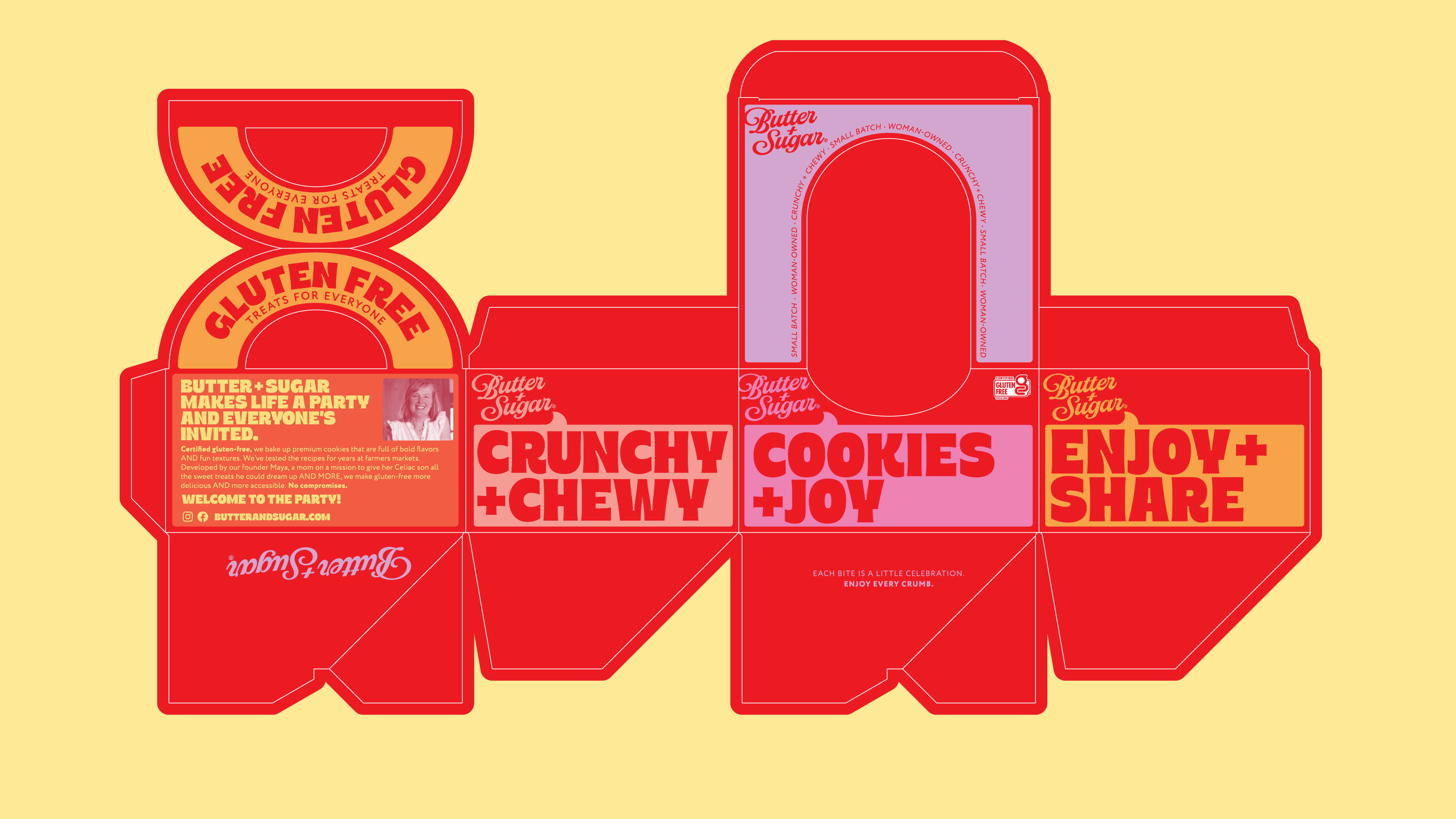
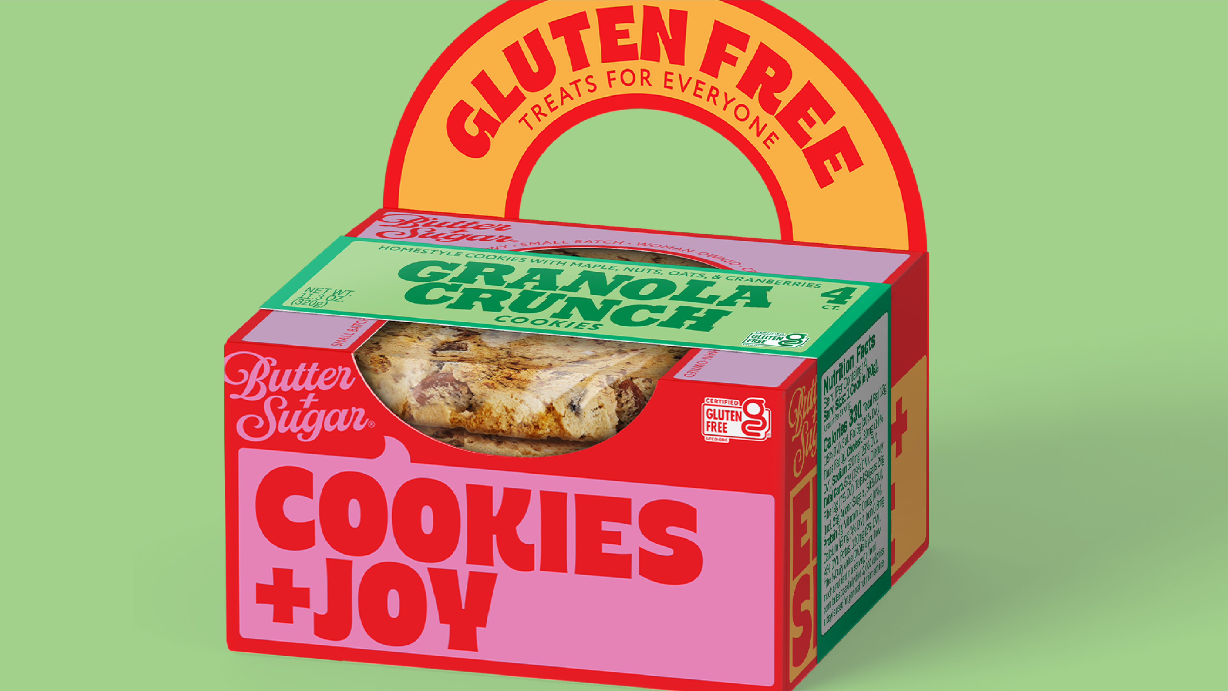
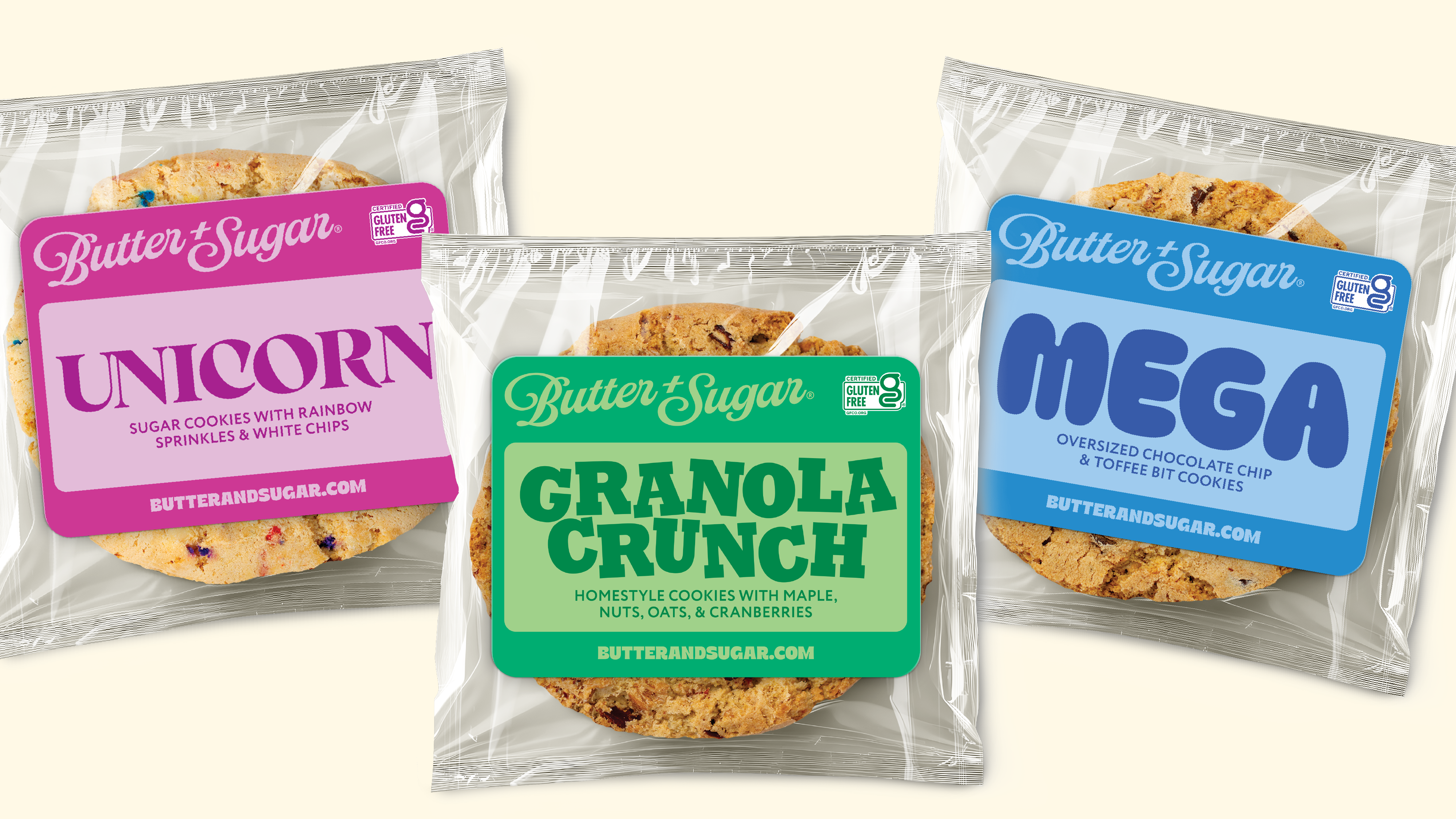
The structure design solved a real CPG tension: how do you protect a fresh-baked cookie, signal premium quality, and project joy and celebration, all in one package? The answer is a system where physical architecture and graphic design work in concert. The structure communicates freshness and care by using bakery cues – paper bakery box with cellophane window. The added handle acts as a mini pop-up billboard with the message “Gluten-free Treats for All” writ large.
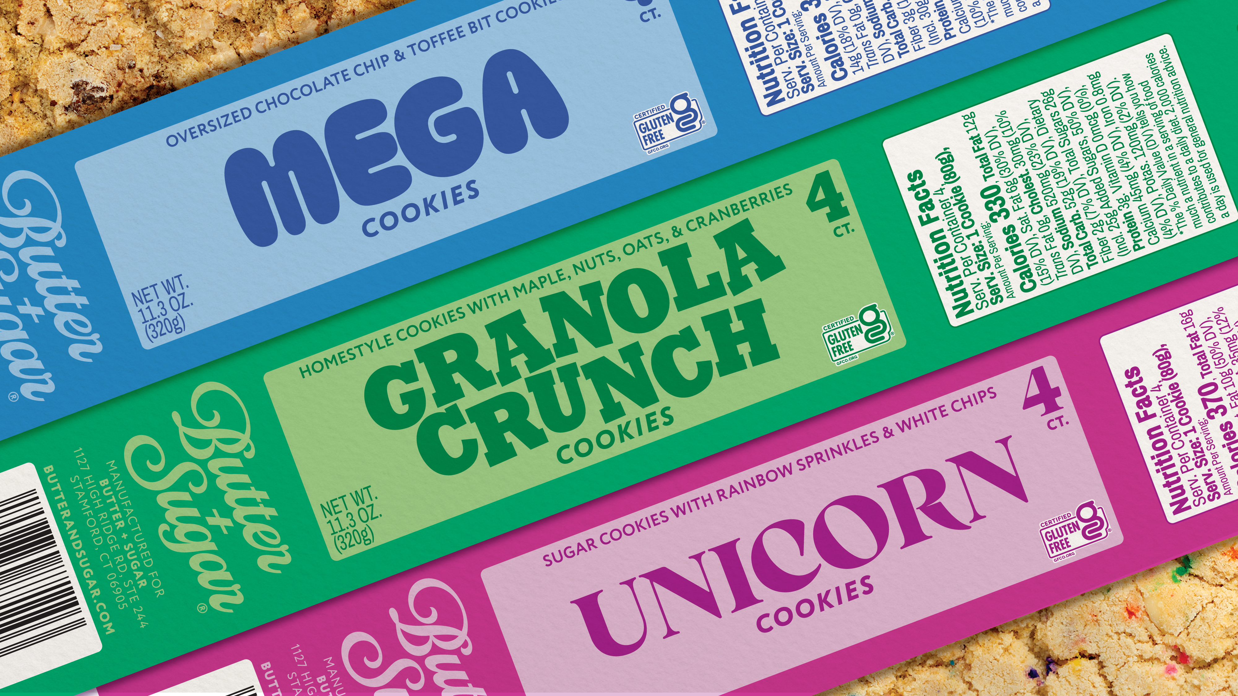
To save costs, we realized a universal box would allow us to create brand shelf blocking. The flavor-specific bands that slip over the universal box create clear differentiation across the three-cookie lineup — the Unicorn Cookie, the Mega Cookie, and the Granola Crunch Cookie. Each variety has its own flavor personality in the typography, making the shelf set easy to navigate and each individual SKU memorable on its own.
A System That Grows Without Losing Itself
The most important thing a brand system delivers is the ability to grow. The Butter + Sugar package design system, codified in the brand guidelines, was built to support line extensions, seasonal editions, and new format entries without starting from scratch. The brand extension design work explored exactly where and how the brand can flex while the identity stays unmistakably Butter + Sugar.
Trade Show Ready
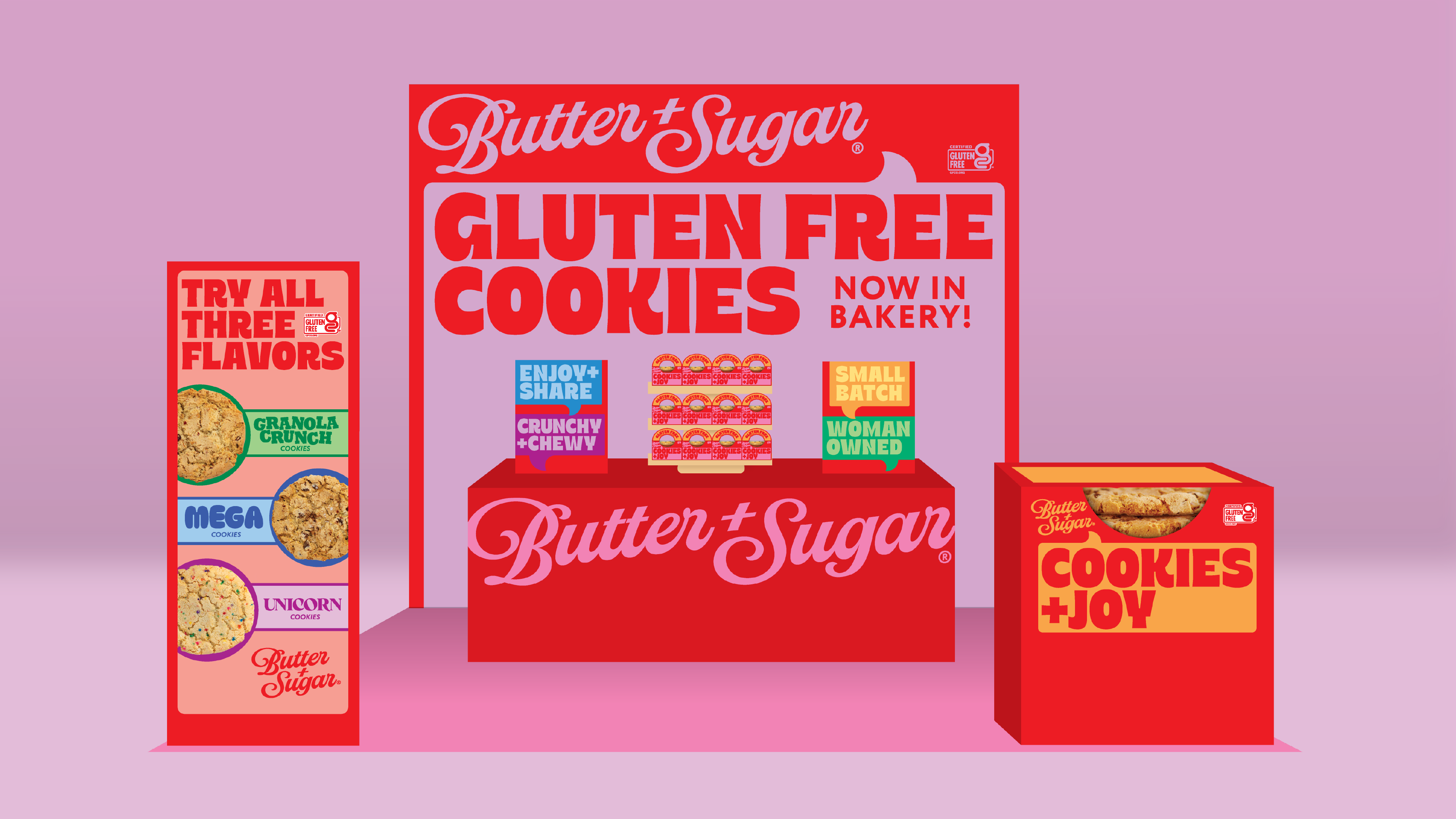
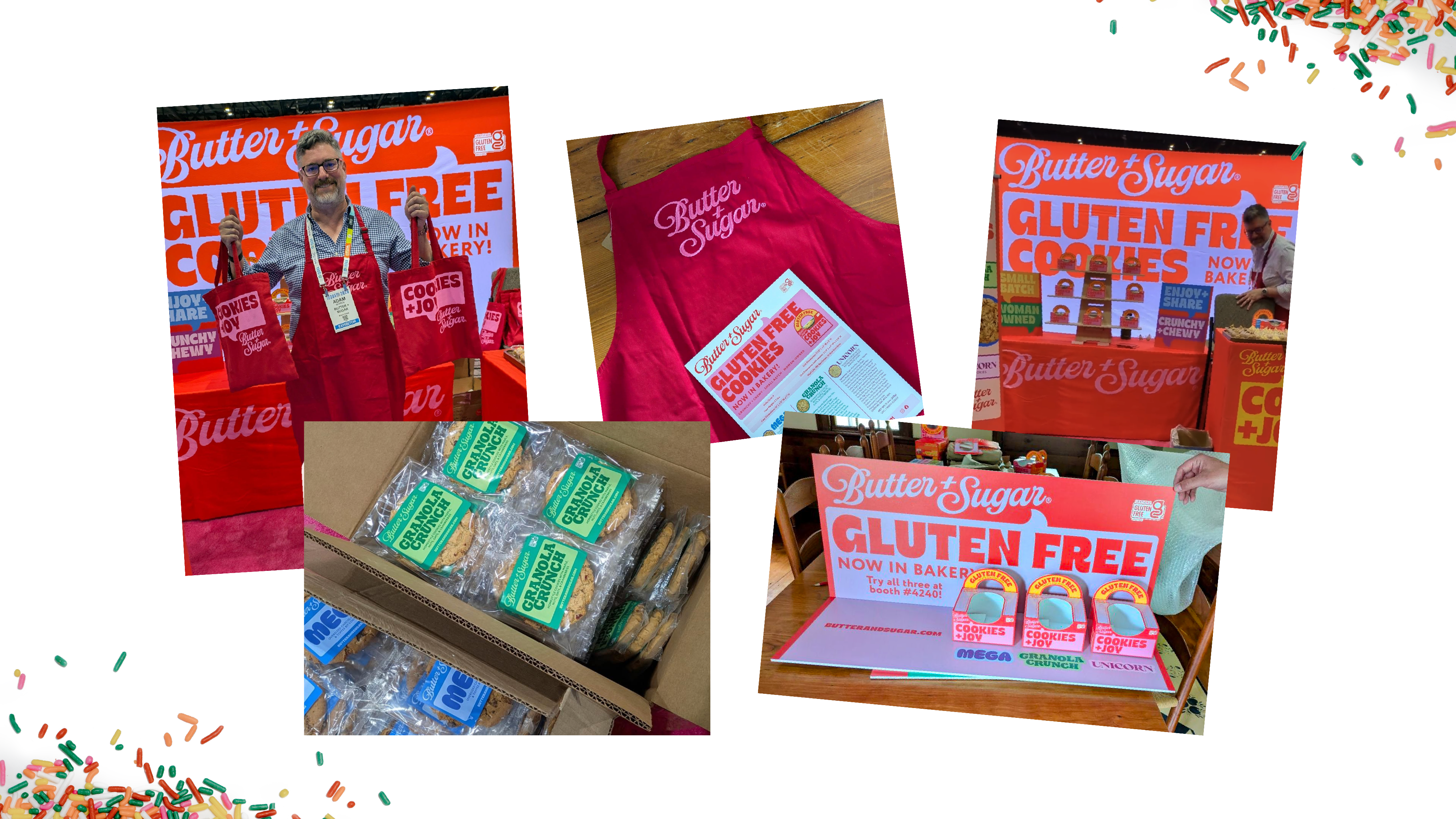
The trade show booth brought the full Butter + Sugar world to life in three dimensions — the same joyful, maximalist brand energy that lives on the packaging, now filling a booth environment designed to stop buyers in their tracks. This is where the brand story gets told in-person, where buyers decide whether Butter + Sugar belongs in their bakery section. The booth was built to make that decision easy.

The Result
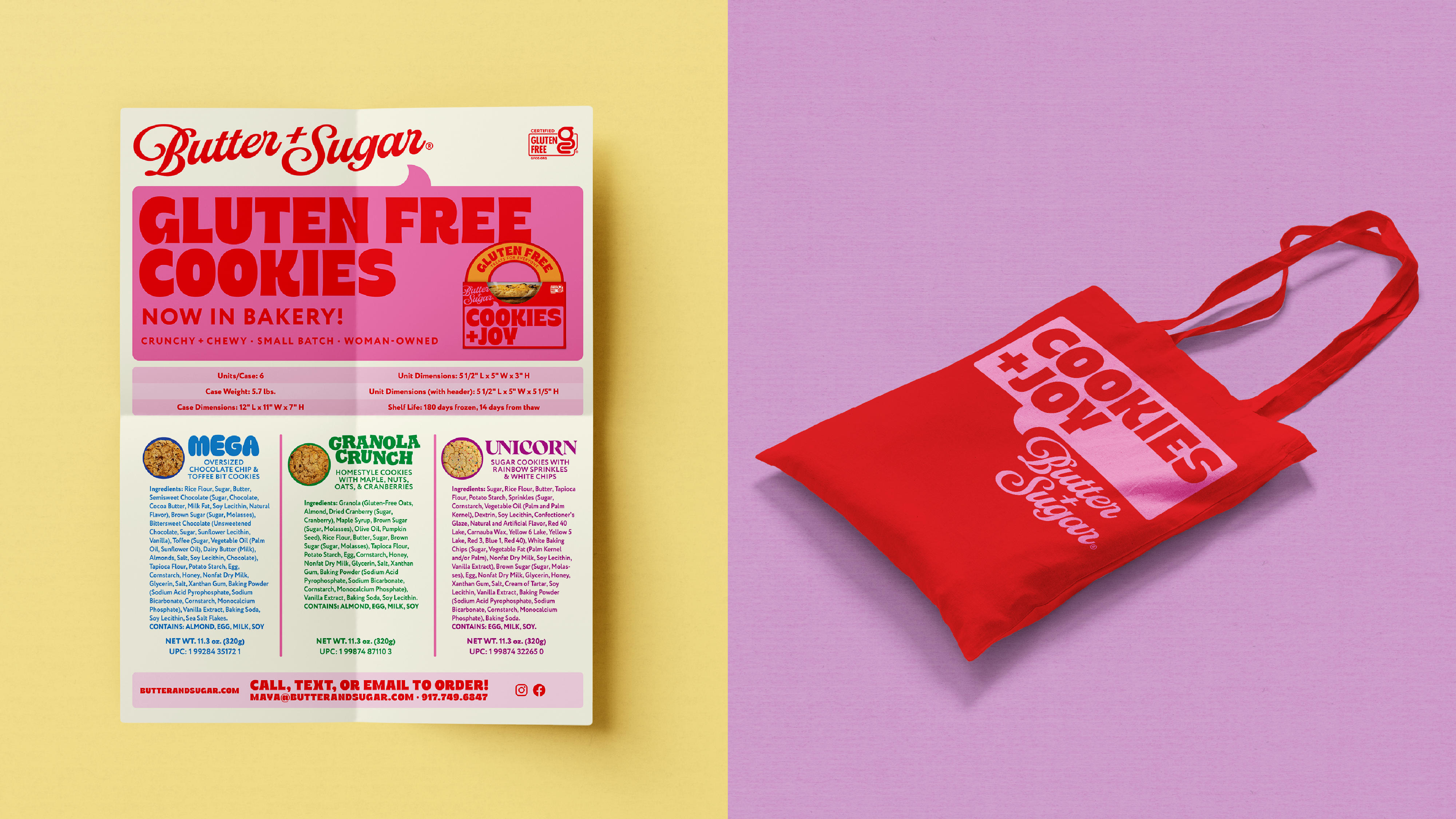
The Party Is Just Getting Started. The brand now has everything it needs to walk into a retail bakery section and own it: a strategy with genuine differentiation, an identity with personality and staying power, a packaging system that competes with the best in any category, and guidelines that let the team grow the brand confidently.
This is the kind of project that proves what brand strategy paired with great design can unlock a strong launch and growth in retail.
Butter + Sugar wasn’t looking for a prettier version of what already existed in the gluten-free aisle. The brand was looking to rewrite the rules, show every gluten-free treat seeker that there’s a seat at the table, that the cookie is delicious, and the party is absolutely for them.
Ready to make your brand impossible to ignore?
Whether you’re entering a new channel, relaunching a line, or building from scratch — great design sparks trial, drives velocity, and builds the kind of loyalty that defends shelf space.