A Brooklyn Original Since 1932
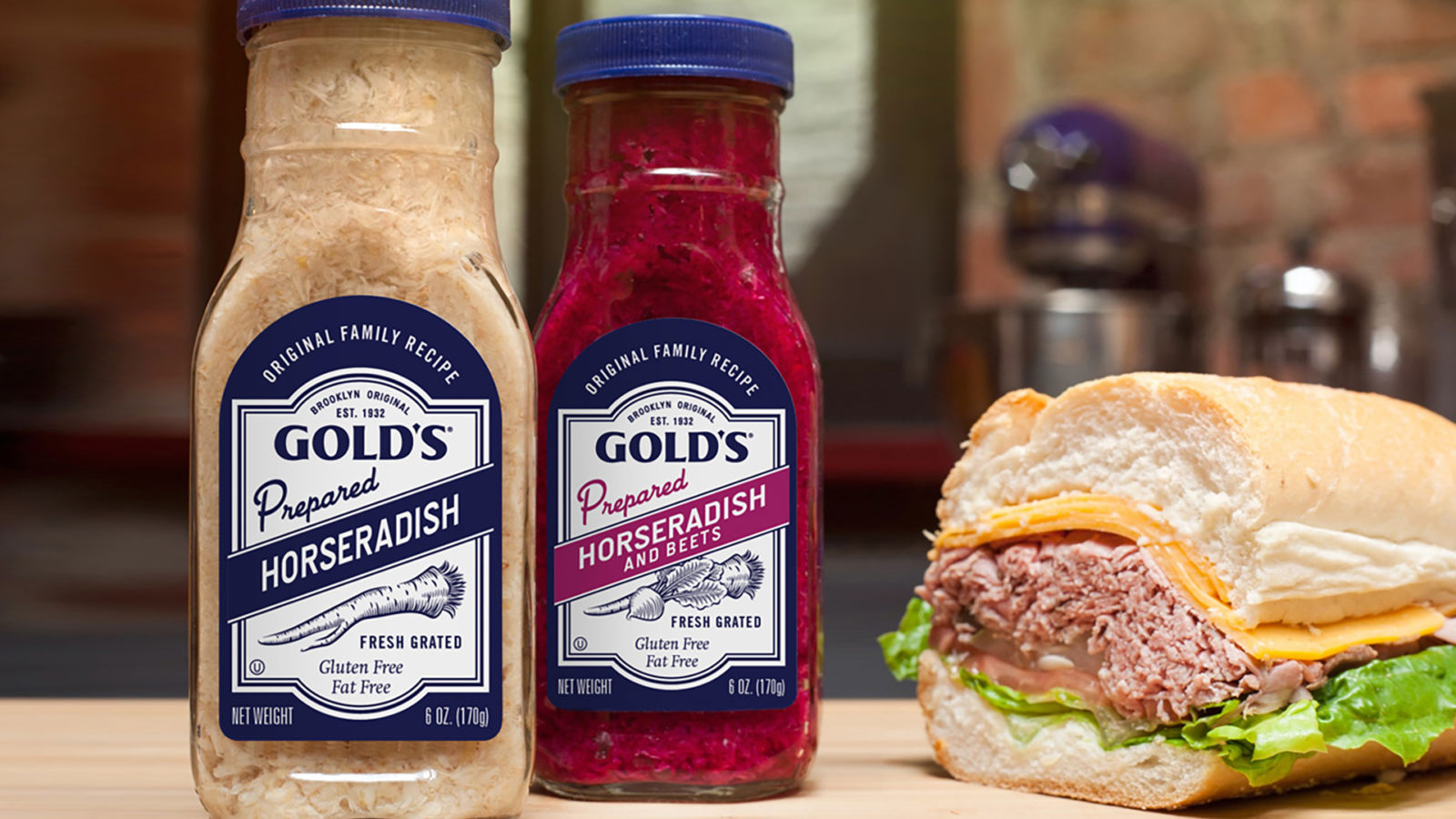
Gold’s Pure Foods is known for its regional appeal, natural ingredients, and heritage-earned audiences. Our packaging and identity design maintained the old world cues while updating the design system to stretch across many products.
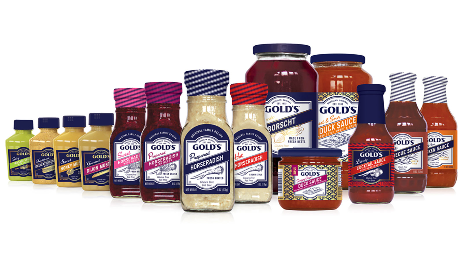
Brands with such large SKU counts require thoughtful designs that do more than stand out on crowded shelves. Gold’s stands for a family recipe—developed in their Brooklyn kitchen in 1932 and delivered by bicycle across they city. Refreshing the packaging design to hold the shield and the diagonal banner, we established this elaborate, rigorous design system that accounts for a variety of shapes and formats, while still maintaining the overarching brand equity.
The hand-drawn ingredient illustrations help bring the fresh flavor forward. The script font descriptor adds a bit more info and whets the appetite—and adds another point of differentiation in the line. The patterns behind the shield allowed further differentiation, especially for the more Chinese or seafood inspired flavors. The striped neck wraps could also take on color coding for yet another way to tell one sauce from another—aiding in the shopping experience for the consumer.
Overview
Client: Gold’s Pure Foods
Delivered: Logo design, packaging redesign, packaging system, line extensions, supplemental marketing materials, innovation.