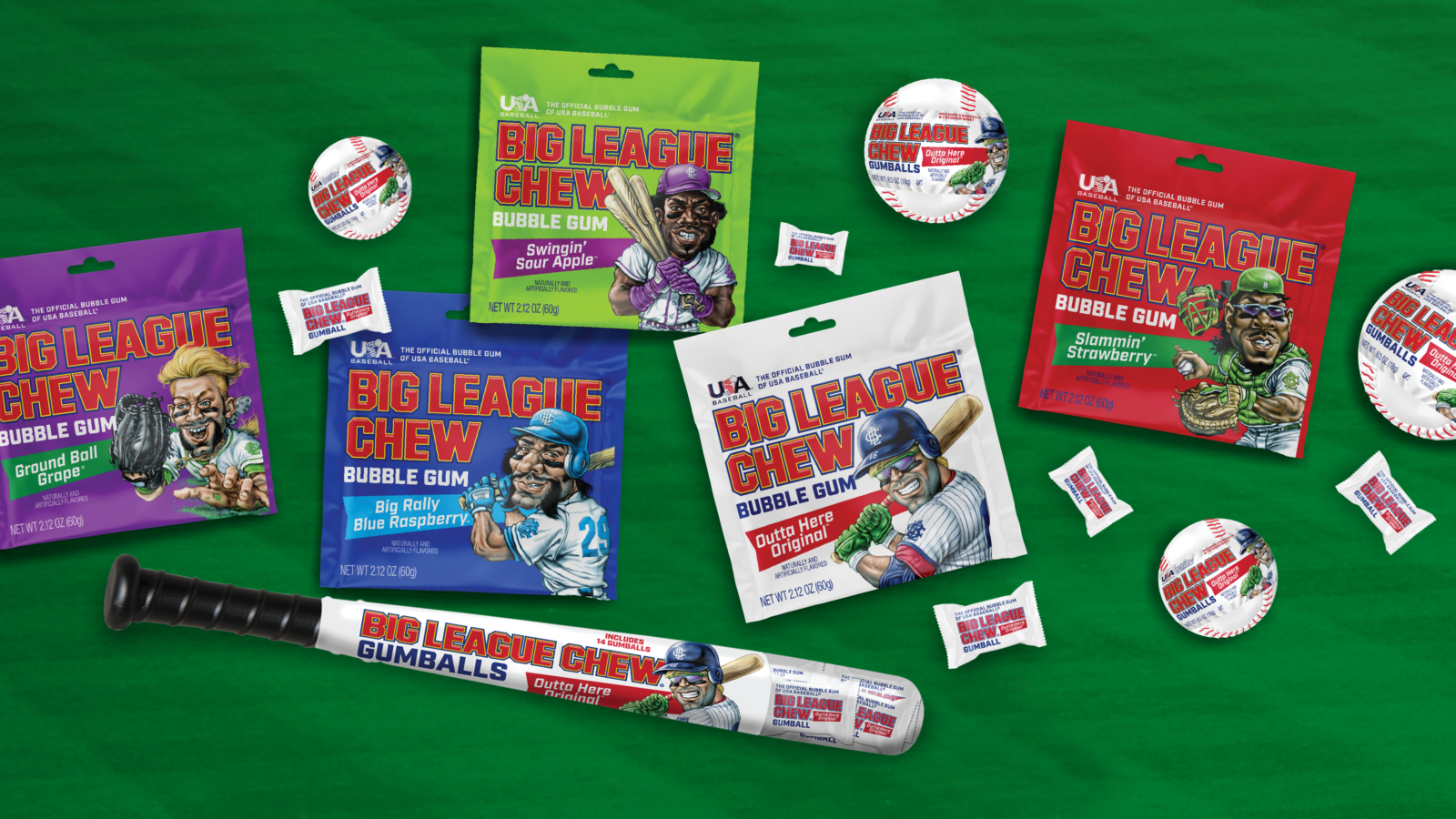
Big League Chew
Case study coming soon
Where do you want to grow?
We believe good brands start good stories.
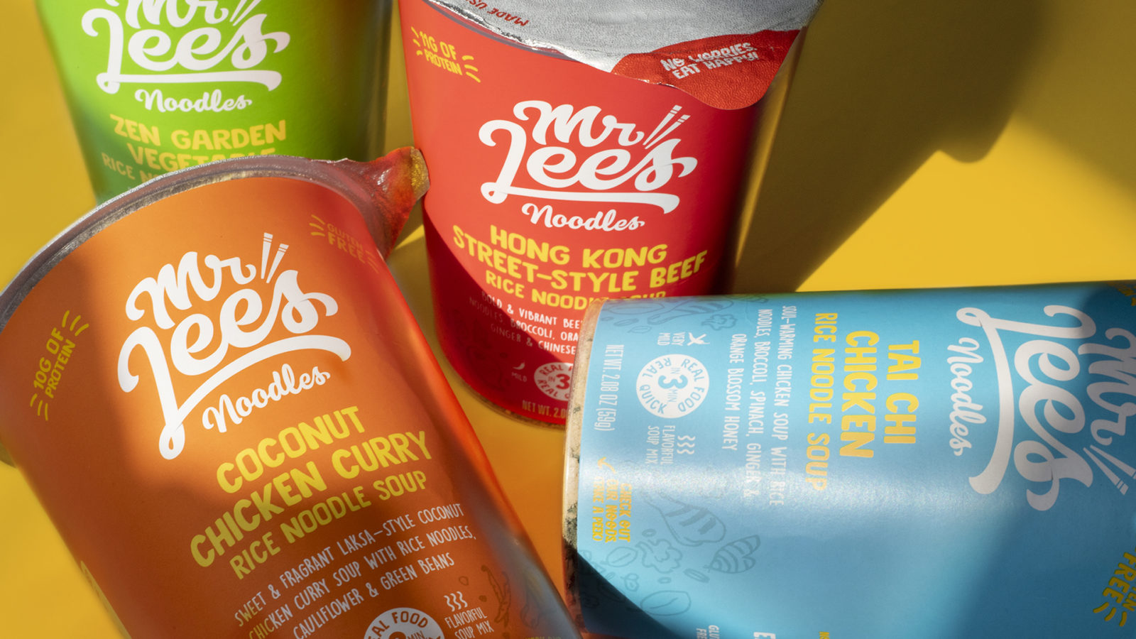
Mr. Lee's
Package Design Update, Line Extension, Illustration
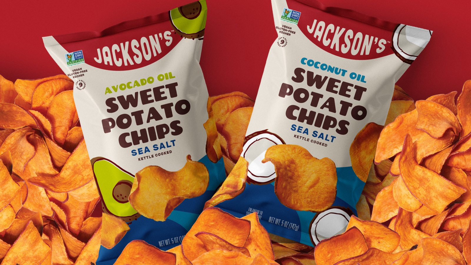
Jackson's Chips
Branding Refresh, Package Design Update, Package Design System, Line Extension, Illustration
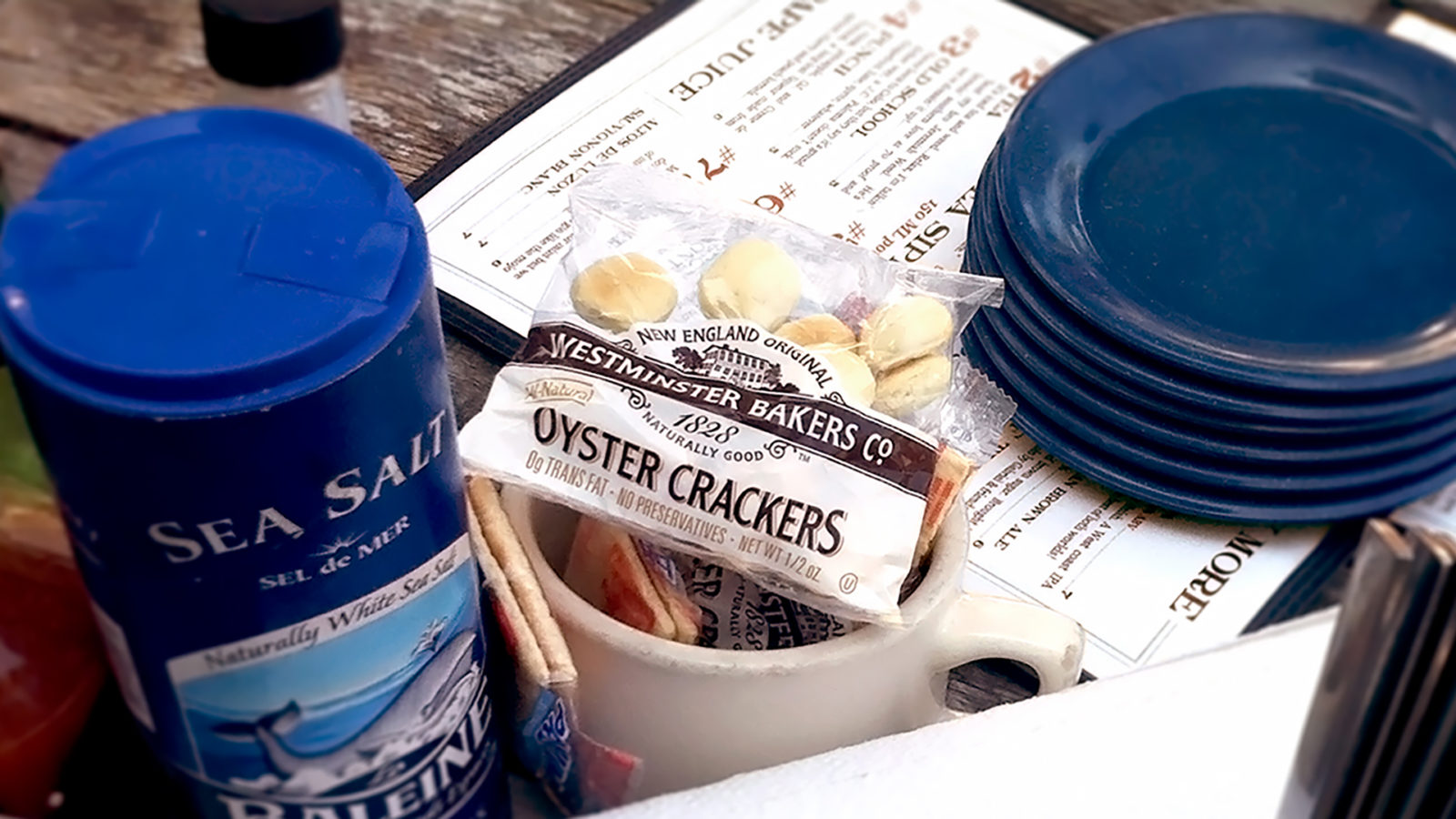
Westminster Bakers
Logo designs, packaging redesign, packaging system, line extensions, supplemental marketing materials.
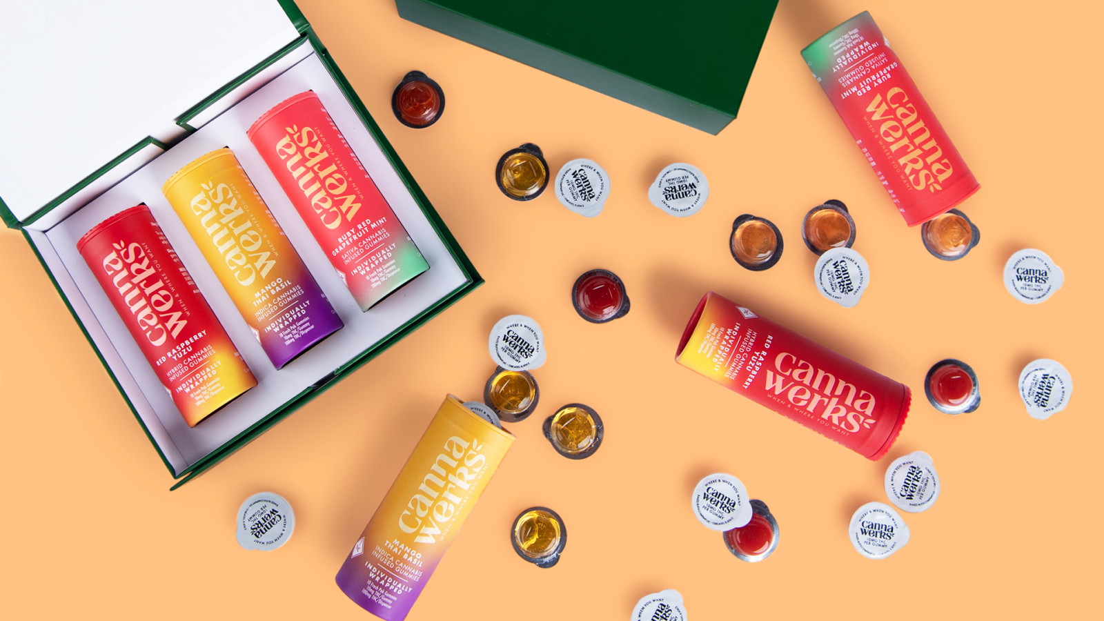
CannaWerks
Brand Strategy, Brand Identity, Packaging Design, Messaging, Website
Eat with Your Eyes
We design love at first sight—brands and packaging that go home with your consumer.

Branding & Identity Work
Brand Identity Design, Branding, Logo Refresh & Redesign, Brand Strategy, Brand Family Design
Who we are
We love long walks in grocery stores and see the potential in everything. We’re design nerds, astute observers, seekers of truth, and know the business. We offer big brand experience with the agility and responsiveness of a smaller, dedicated team.

Brand Identity
Identity is so much more than a logo. It all starts with sound design thinking. Through a deep dive and lots of questions, we try to boil the brand down to an essence. This essence drives the creative exploration and guides the organization.
Packaging
Design
You only have 3-4 seconds to capture someone’s attention on-shelf. A compelling and differentiated package design can help you get into someone’s hand and eventually their cart. Packaging is your silent sales person, and in-person influencer.
Naming
A name is not just a name. A name should spark interest and start the emotional connection with the consumer. We name brands, subbrands, develop nomenclature systems, even craft product descriptors and taglines.

