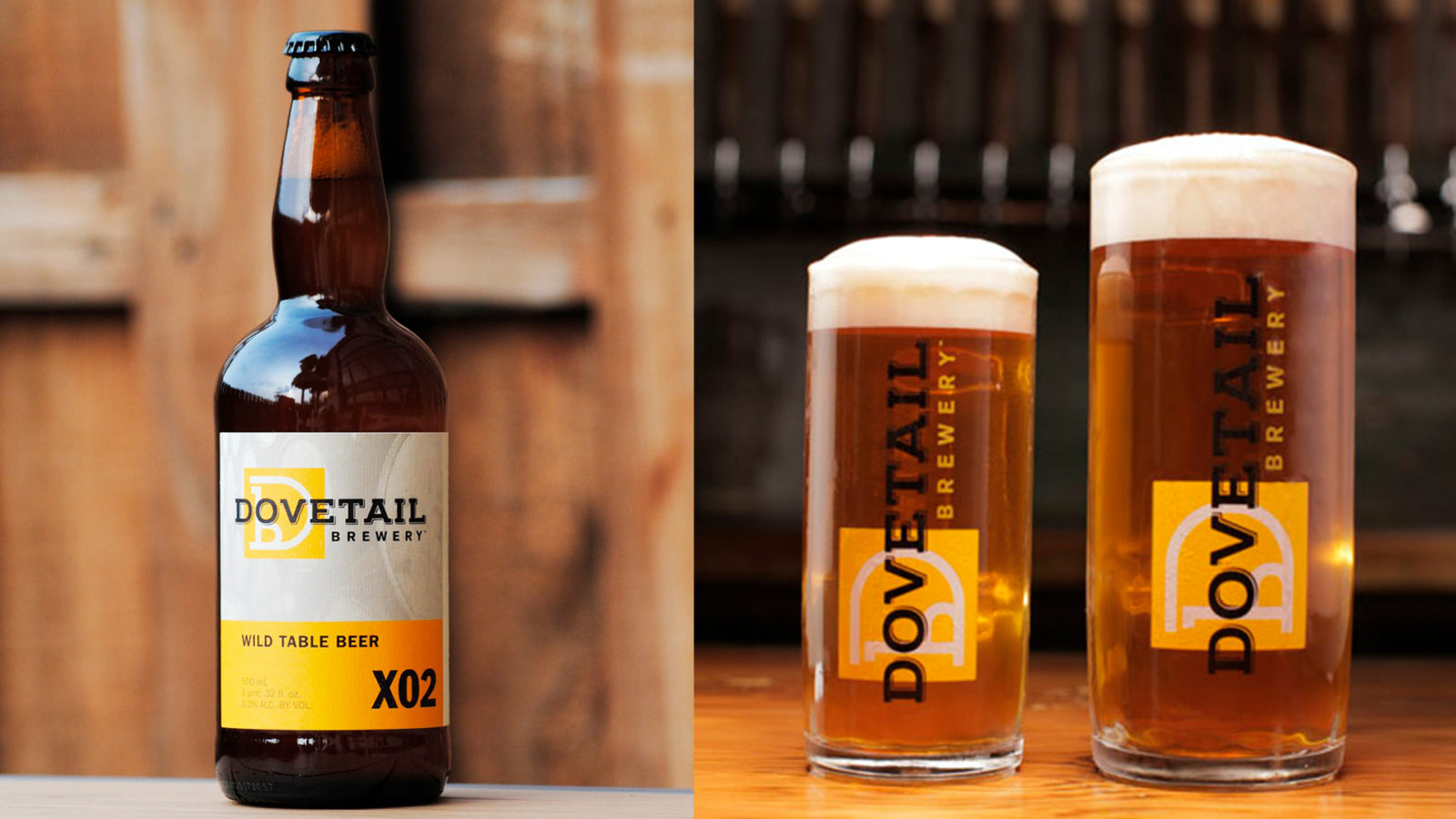
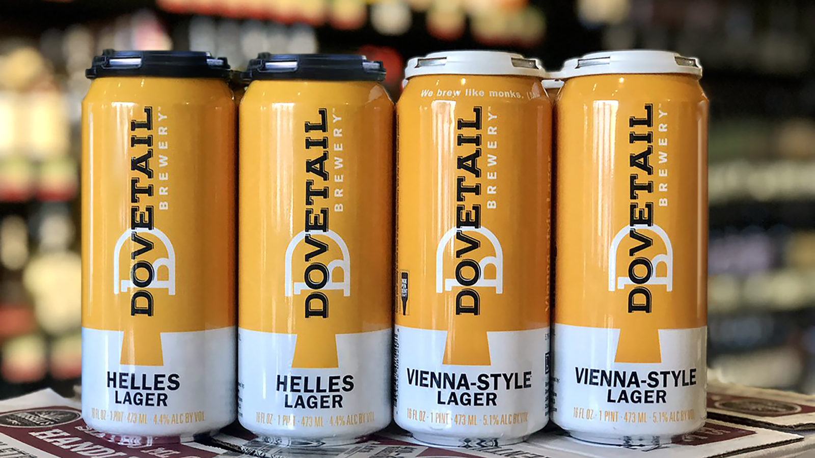
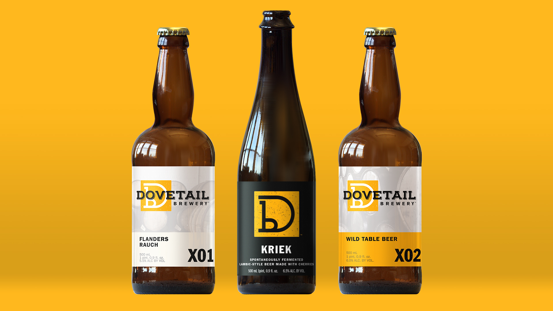
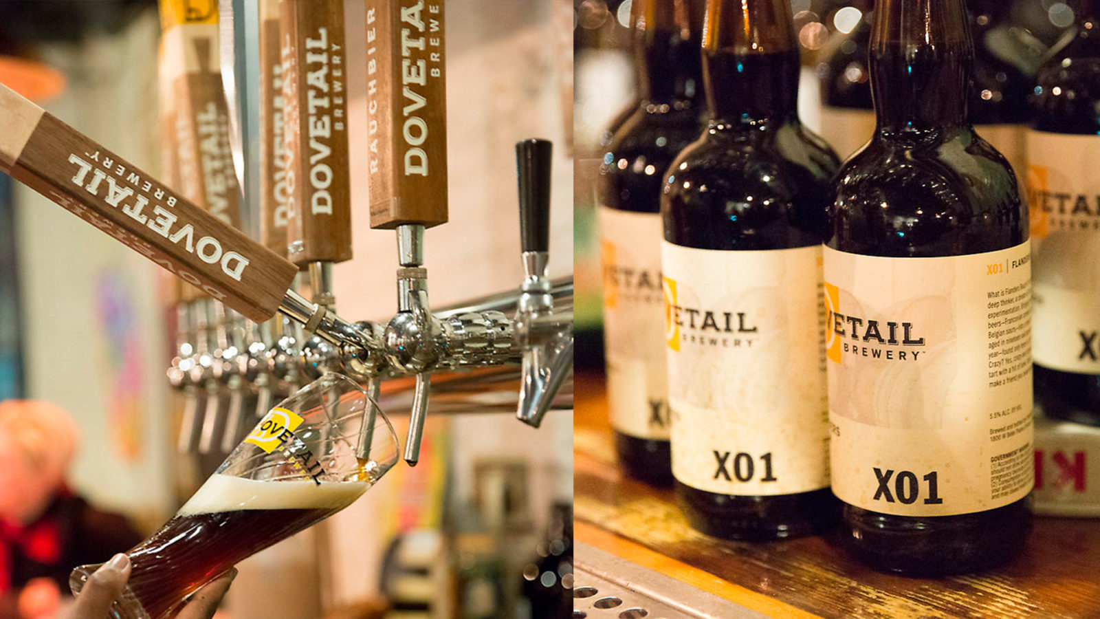
Old World methods meet modern chill
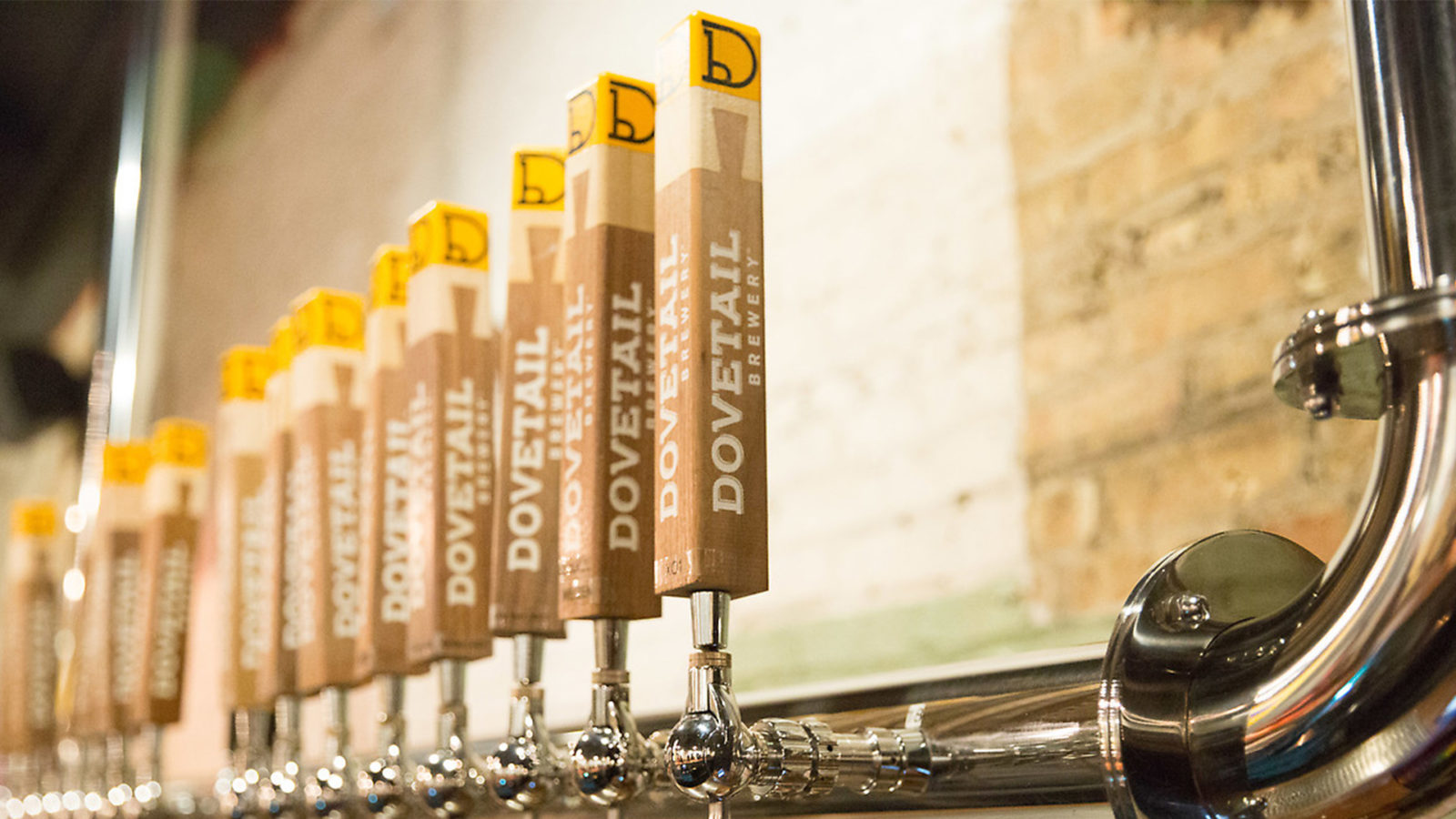
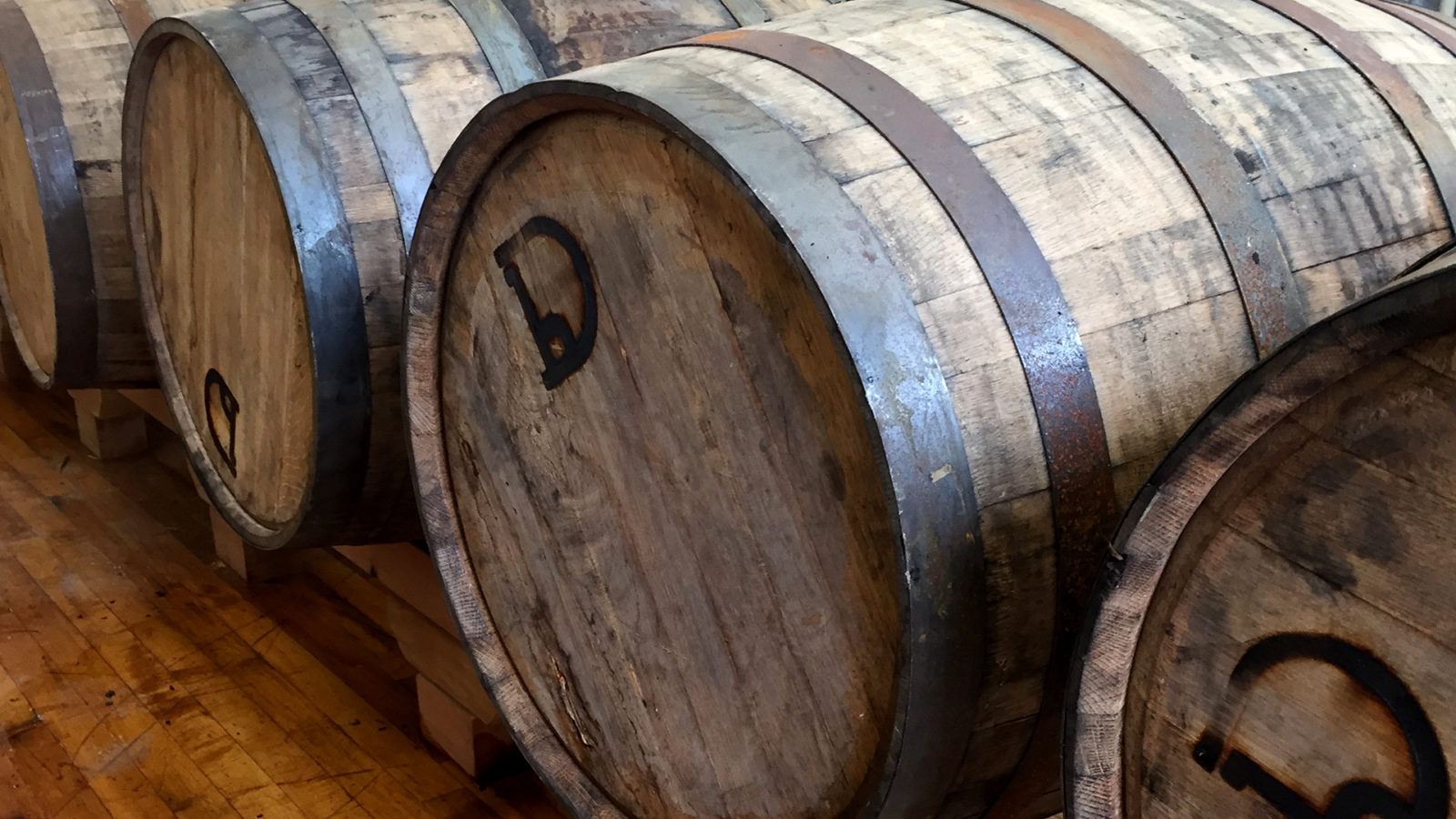
Dovetail Brewery is the toast of the Midwestern craft beer scene, a reputation for excellent European-style beer earned since their 2016 launch. Their name is based on the dovetail joint, reportedly the strongest joint in carpentry, and this visual metaphor signaled the merger of old-world craft and a modern, chill vibe. Our team designed a brand identity that represented this duality. The brand symbol suggests a maker’s mark, including the “D” and “b” initials. When Dovetail made the leap to bottled releases and cans, we extended the design to perfectly align with the brand’s clean, modern-plus-traditional ethos, while also providing show-stopping retail power.
Overview
Client: Dovetail Brewery
Delivered: Logo design, package design system, brand standards book, line extension, marketing materials, environmental graphics
please click through for image credit.